shadcn animated
A growing set of animated shadcn/ui components powered by Motion, available as an npm package and CLI.
- Category
- Animations
- Added
- GitHub stars
- 28
- License
- MIT
- Price
- Free
About
About shadcn animated
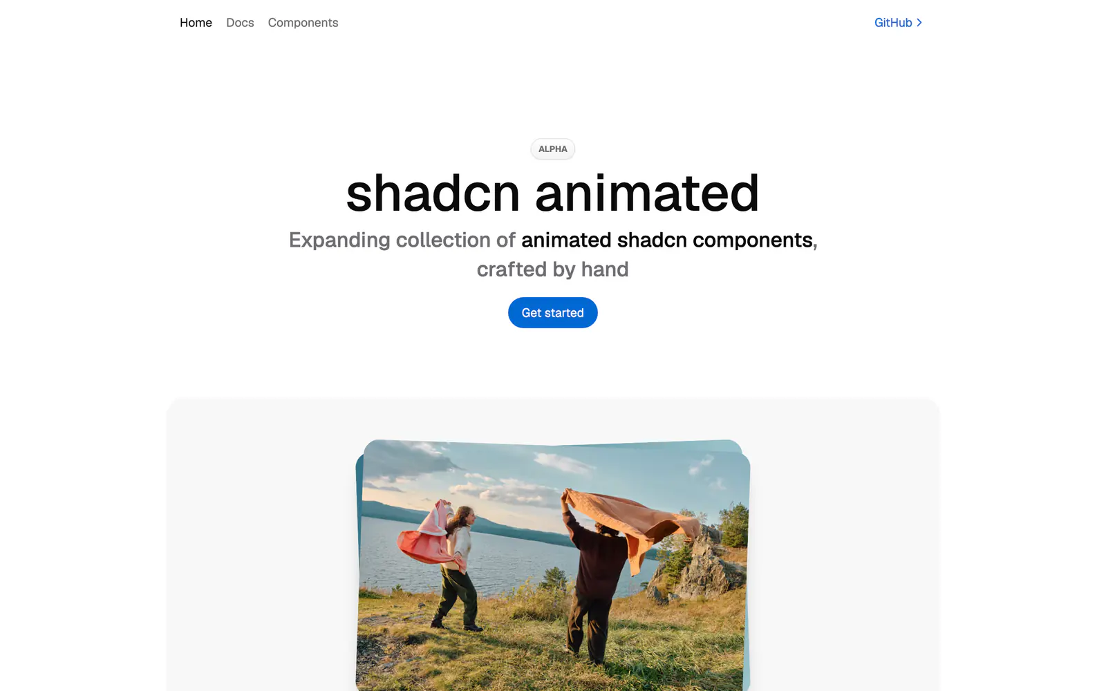
shadcn animated is an expanding collection of animated shadcn/ui components made by hand by @sopocodes. The demo covers an image card, button, icon toggle, navigation buttons, tabs, accordion and checkboxes, with motion powered by Motion. The site marks the project as alpha, and its GitHub topics list TypeScript, Tailwind CSS and micro-interactions.
You can install the package with npm i shadcn-animated, then add pieces with its CLI, for example npx shadcn-animated add button. The docs site holds examples, usage and installation steps. The repository carries an MIT license and has 28 stars. It suits developers who want familiar shadcn/ui components with a little more movement and who accept an early-stage library.
shadcn animated features
5 features
- Animated image card and button
- Icon toggle and navigation buttons
- Animated tabs and accordion
- Add components with the shadcn-animated CLI
- Live examples and install docs
Install shadcn animated
1 command
Terminal
$ npx shadcn-animated add buttonWhat you can build with shadcn animated
3 use cases
- Giving primary buttons subtle motion in a product UI
- Adding an animated icon toggle to a toolbar
- Testing an alpha animation set in a side project
Links
1 link
Animations
Similar to shadcn animated
More animations like shadcn animated: the closest by what they do, then the most starred.
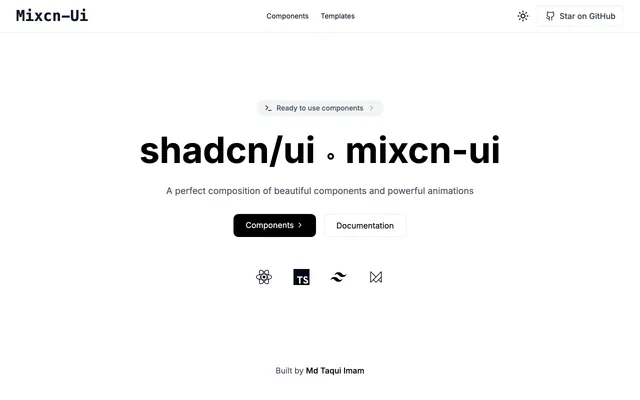 Mixcn-UIAnimationMixcn-UI is a React and TypeScript component library with Framer Motion animations for Next.js, built to sit beside shadcn/ui and Tailwind CSS.
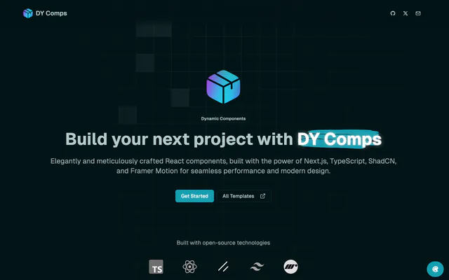
 DY CompsAnimationDY Comps is a free, open-source set of React components and templates built on Next.js, TypeScript, Tailwind CSS, shadcn/ui and Framer Motion.
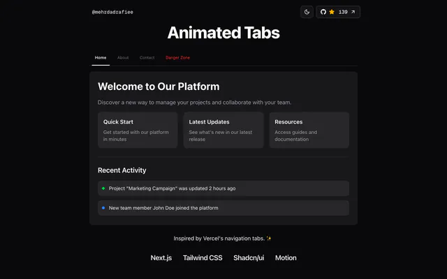
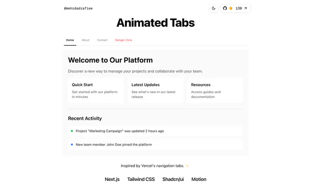 Animated TabsAnimationAnimated Tabs is an open-source Next.js component that mimics Vercel's navigation tabs, built with shadcn/ui, Tailwind CSS and Motion. Clone and run it.
 Animated HeaderAnimationAnimated Header is an open-source Next.js demo of a Vercel-style top navigation that reacts to scrolling, built with shadcn/ui, Tailwind CSS and Motion.
 beUIAnimationbeUI ships 145 animated React components and 71 React Native ones, from morphing modals to toast stacks. Install through the shadcn CLI or copy the source.
 Animate UIAnimationAnimate UI swaps animated primitives into your Radix UI, Base UI or React Aria components. One CLI command animates a shadcn/ui project with Motion.


Pricing
Ship it with Pro
The directory is free. Pro adds 6,000+ blocks, 14 premium templates and the MCP server, so your AI editor installs them for you.
4.9/5 out of 5 · 150+ reviewsfrom 150+ founders and developers.
- Secure checkout via Stripe
- Code lives in your repo
- Keep what you've shipped if you cancel
- License terms
FAQ
Frequently asked questions
What shadcn animated is, how to install it, its license and its alternatives.
The site labels it alpha, so expect changes between releases and check each component before shipping.
A growing set of animated shadcn/ui components powered by Motion, available as an npm package and CLI.
shadcn animated lists Animated image card and button, Icon toggle and navigation buttons, Animated tabs and accordion, Add components with the shadcn-animated CLI and Live examples and install docs.
The directory lists these uses for shadcn animated: Giving primary buttons subtle motion in a product UI, Adding an animated icon toggle to a toolbar and Testing an alpha animation set in a side project.
shadcn animated is made by sopo, at https://github.com/sopo. Its site is https://github.com/sopo/shadcn-animated.
shadcn animated was added to the directory on October 16, 2026.
shadcn animated is in Animations. Motion libraries and animated components that bring transitions, text effects and interactive backgrounds to shadcn/ui projects.
Components, Animation, Motion, TypeScript, Tailwind CSS, CLI, MIT and Open source. Each tag has a page listing the other resources that carry it.
Yes. shadcn animated's page has a Live tab beside the screenshot that loads its site in a frame.
Install the package with npm i shadcn-animated, then run npx shadcn-animated add followed by the component name, such as button.
shadcn animated lists this command: `npx shadcn-animated add button`. Its docs are at https://shadcn-animated.vercel.app.
Yes, according to its listing: shadcn animated installs with `npx shadcn-animated add button`.
shadcn animated's repository is https://github.com/sopo/shadcn-animated.
shadcn animated's docs are at https://shadcn-animated.vercel.app.
GitHub lists shadcn animated under the MIT license. Read the license file in its repository for the terms.
The directory records no price for shadcn animated. Its site, https://github.com/sopo/shadcn-animated, is where its pricing, if any, is stated.
No. shadcn animated is made by sopo and listed here as a link. A shadcn.io Pro plan covers shadcn.io's own blocks, templates and tools.
Other resources in Animations, newest first: Mixcn-UI, DY Comps, Animated Tabs and Animated Header. Their pages are linked under Similar to shadcn animated.
Open its category, Animations, or one of its tags (Components, Animation and Motion): each page lists the resources that share it.
4.9 out of 5 from 150+ developers


Found your stack? Ship it.
6,000+ blocks, premium templates and MCP in every Pro plan. The directory stays free.
Get Pro