shadcn/ui components
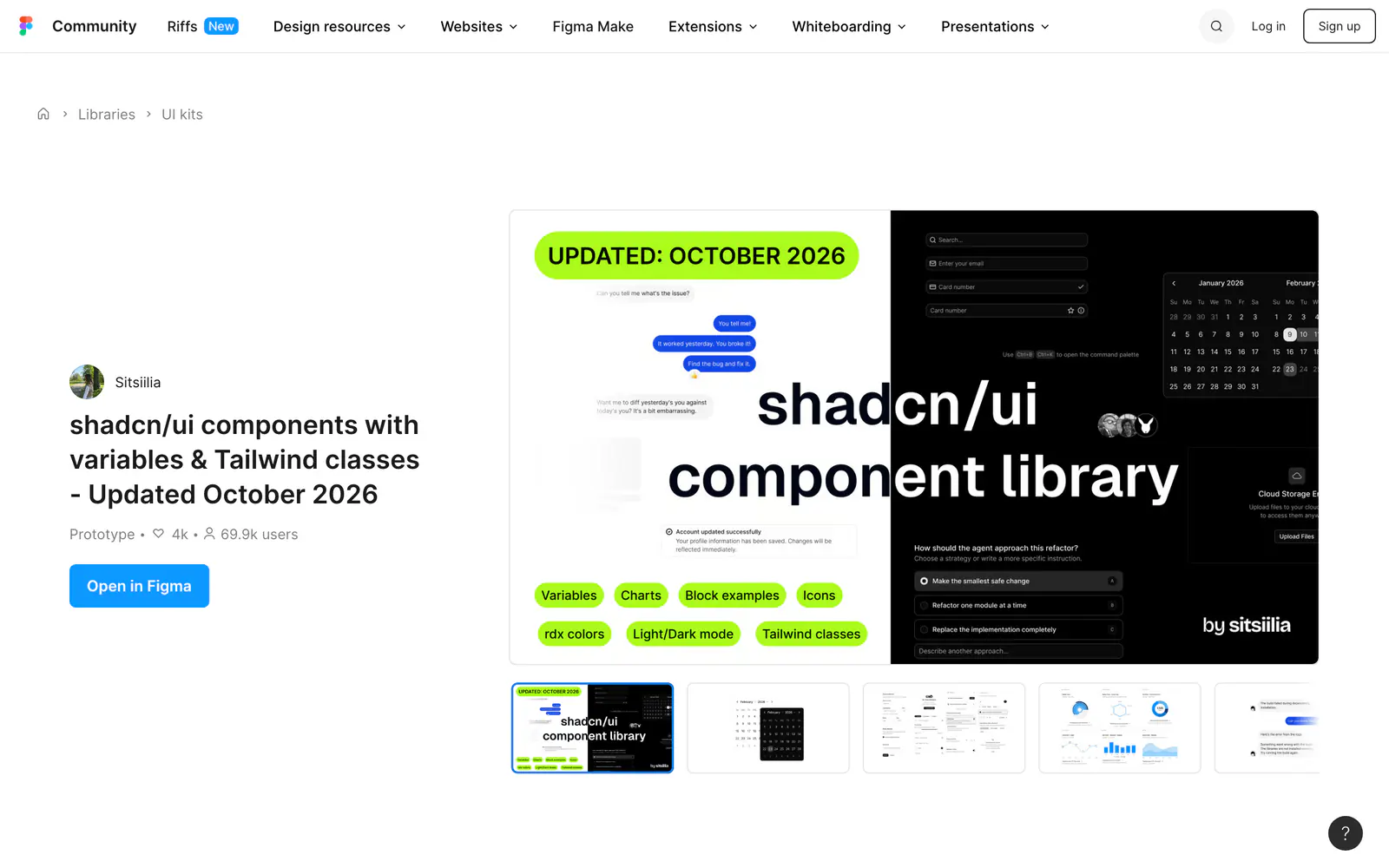
A Figma library of shadcn/ui components with light and dark modes, token variables and Tailwind classes.
- Category
- Design Systems
- Added
About
About shadcn/ui components
This Figma Community library by Sitsiilia recreates shadcn/ui components with dark and light mode support. It is built on Tailwind classes, Radix color scales and token-based variables, so you change a theme without touching individual components. A companion shadcn create plugin swaps themes, icons, radius and fonts across the whole file.
The update log shows steady changes through October 2026, including new Code block and Trace components, Message and Scroller components, Remix and Phosphor icon sets, button groups, signup and OTP screens, and empty states. You duplicate the file from Figma Community. It suits designers who want mockups that track current shadcn/ui releases.
shadcn/ui components features
5 features
- Light and dark mode
- Token-based Figma variables
- Tailwind classes and Radix color scales
- Companion shadcn create plugin
- Remix and Phosphor icons included
What you can build with shadcn/ui components
3 use cases
- Designing screens with current shadcn/ui components
- Swapping a file's theme, radius and fonts in seconds
- Prototyping signup and OTP flows
Design Systems
Similar to shadcn/ui components
More design systems like shadcn/ui components: the closest by what they do, then the most starred.
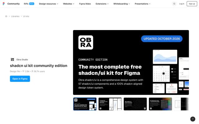 Obra shadcn/ui KitDesign kitObra's shadcn/ui kit for Figma recreates the components as a composable library with Tailwind colors and Lucide icons, with a Pro edition for more.
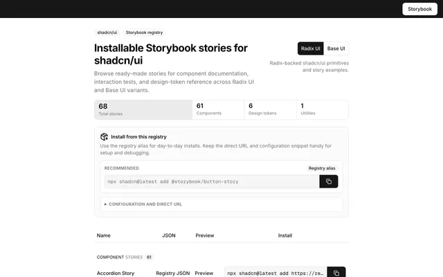 Shadcn Storybook RegistryDesign kitShadcn Storybook Registry offers 68 installable stories for shadcn/ui components, tokens and utilities, covering Radix UI and Base UI variants.
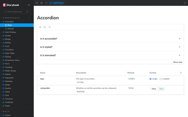
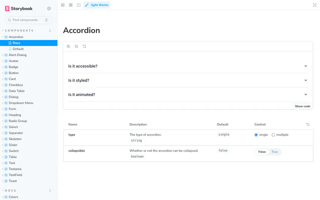 fellipeutaka UI StorybookDesign kitA Storybook by fellipeutaka that registers shadcn/ui components, from Accordion and Button to Data Table and Toast, with docs pages and a light theme.
Pricing
Ship it with Pro
The directory is free. Pro adds 6,000+ blocks, 14 premium templates and the MCP server, so your AI editor installs them for you.
4.9/5 out of 5 · 150+ reviewsfrom 150+ founders and developers.
- Secure checkout via Stripe
- Code lives in your repo
- Keep what you've shipped if you cancel
- License terms
FAQ
Frequently asked questions
What shadcn/ui components is, how to install it, its license and its alternatives.
Yes. The library points to a shadcn create plugin that swaps themes, icons, radius and fonts across the whole file.
It keeps an update log, with the latest entry on 15.10.26 adding the Code block and Trace components.
A Figma library of shadcn/ui components with light and dark modes, token variables and Tailwind classes.
shadcn/ui components lists Light and dark mode, Token-based Figma variables, Tailwind classes and Radix color scales, Companion shadcn create plugin and Remix and Phosphor icons included.
The directory lists these uses for shadcn/ui components: Designing screens with current shadcn/ui components, Swapping a file's theme, radius and fonts in seconds and Prototyping signup and OTP flows.
The directory does not name a maker for shadcn/ui components. Its site is https://www.figma.com/community/file/1342715840824755935/shadcn-ui-components.
shadcn/ui components was added to the directory on December 27, 2024.
shadcn/ui components is in Design Systems. Figma files and Storybook catalogs that mirror shadcn/ui, for designing and documenting with the same components.
Figma, Design system, UI kit, Tailwind CSS, Dark mode, Themes and Icons. Each tag has a page listing the other resources that carry it.
No. shadcn/ui components's site cannot be framed, so its page shows screenshots of it and a link to the site.
The directory lists no install command for shadcn/ui components. Follow the instructions on its site at https://www.figma.com/community/file/1342715840824755935/shadcn-ui-components.
The directory lists no shadcn CLI command for shadcn/ui components. Check its docs at https://www.figma.com/community/file/1342715840824755935/shadcn-ui-components for how to add it.
The directory links no repository for shadcn/ui components. Its site is https://www.figma.com/community/file/1342715840824755935/shadcn-ui-components.
The directory links no separate docs for shadcn/ui components; start from its site at https://www.figma.com/community/file/1342715840824755935/shadcn-ui-components.
The directory records no license for shadcn/ui components. Check its repository or site before you use it.
The directory records no price for shadcn/ui components. Its site, https://www.figma.com/community/file/1342715840824755935/shadcn-ui-components, is where its pricing, if any, is stated.
No. shadcn/ui components is made by its own maker and listed here as a link. A shadcn.io Pro plan covers shadcn.io's own blocks, templates and tools.
Other resources in Design Systems, newest first: Obra shadcn/ui Kit, Shadcn Storybook Registry and fellipeutaka UI Storybook. Their pages are linked under Similar to shadcn/ui components.
Open its category, Design Systems, or one of its tags (Figma, Design system and UI kit): each page lists the resources that share it.
4.9 out of 5 from 150+ developers


Found your stack? Ship it.
6,000+ blocks, premium templates and MCP in every Pro plan. The directory stays free.
Get Pro