shuip
Form fields, dialogs and buttons for Next.js apps, built on shadcn/ui and installed by CLI.
- Category
- Libraries & Components
- Added
About
About shuip
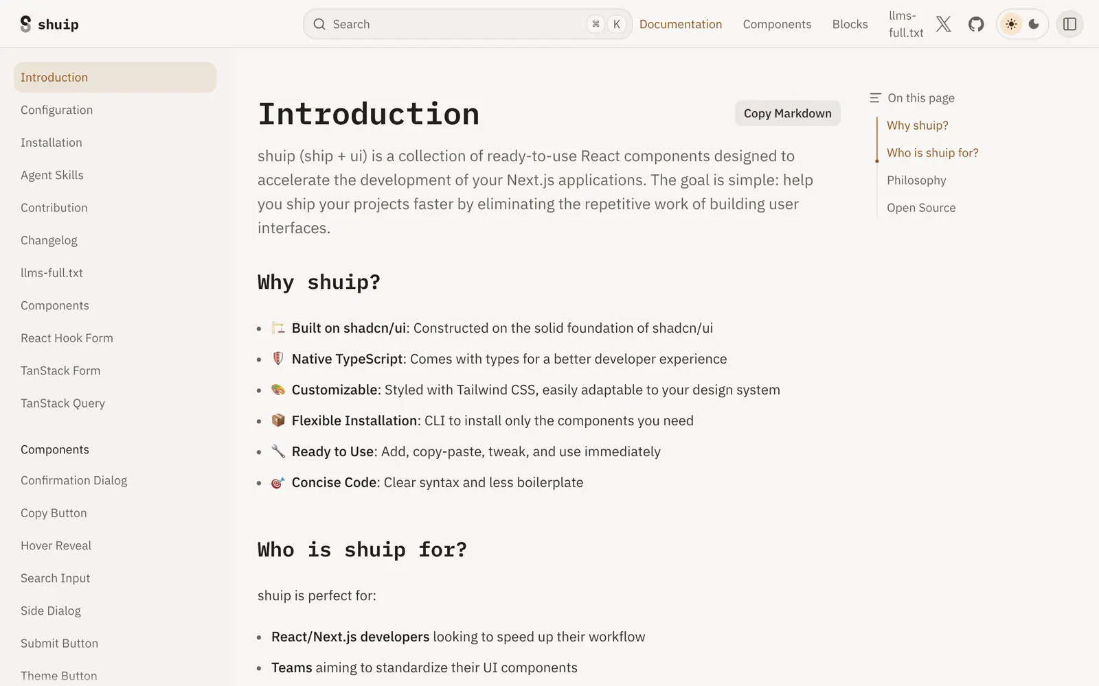
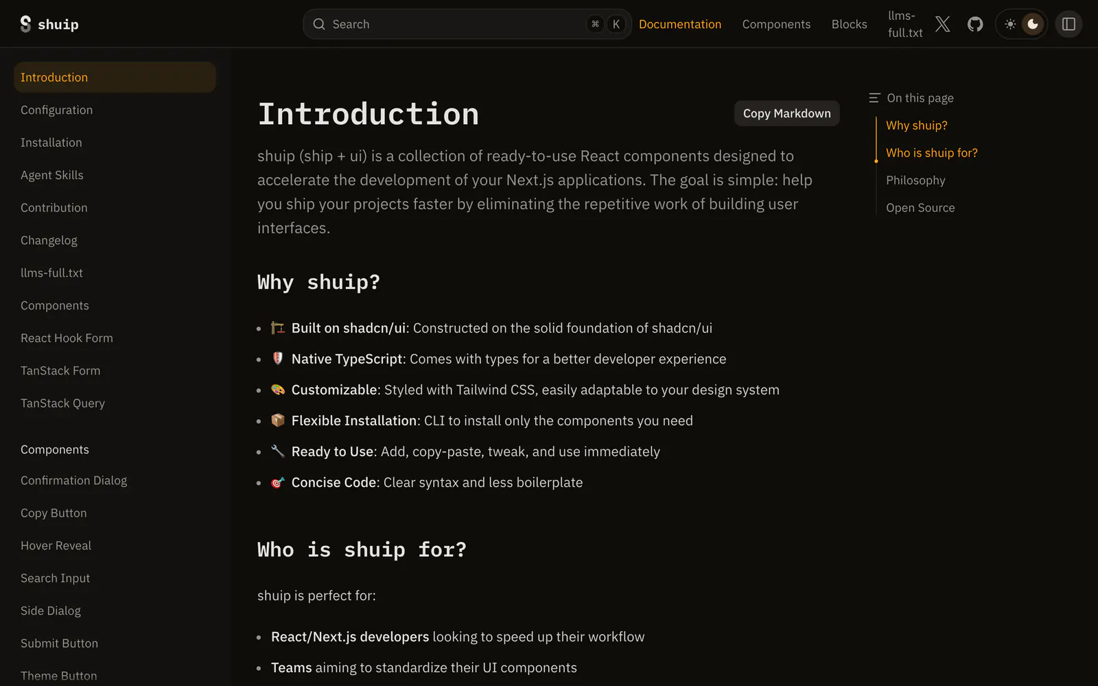
shuip, short for ship plus ui, is a set of React components that sit on top of shadcn/ui for Next.js applications. The docs list general pieces such as a confirmation dialog, copy button, side dialog, search input and theme button, plus field components for React Hook Form (address, combobox, date range, password, number and more) and a matching set for TanStack Form. A TanStack Query section is also listed.
A CLI installs only the components you pick, and the code is copied in for you to tweak. Types are native TypeScript and styling is Tailwind CSS. The docs also offer an llms-full.txt file and agent skills. It suits freelancers and teams who keep rebuilding the same submit buttons and validated inputs.
shuip features
6 features
- Confirmation dialog and side dialog
- Field components for React Hook Form
- Matching field set for TanStack Form
- Copy button, search input and theme button
- CLI to install only chosen components
- llms-full.txt and agent skills
What you can build with shuip
3 use cases
- Standardizing form fields across a Next.js product
- Adding a confirmation dialog before destructive actions
- Giving an AI coding agent docs it can read via llms-full.txt
Links
1 link
Libraries & Components
Similar to shuip
More libraries & components like shuip: the closest by what they do, then the most starred.
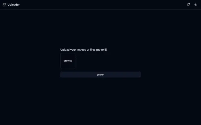
 Next.js Multi-Image UploadLibraryThis MIT-licensed uploader handles multiple images in Next.js with TypeScript, Tailwind CSS, shadcn/ui and react-hook-form, with per-image progress.
 Image Crop FieldLibraryImage Crop Field handles image upload, cropping, zoom and rotation in React, free or fixed aspect ratios, and plugs into React Hook Form. MIT licensed.
 AutoFormLibraryAutoForm renders React forms from validation schemas such as Zod, Yup and Joi, with labels, defaults, field types and realtime validation wired in.
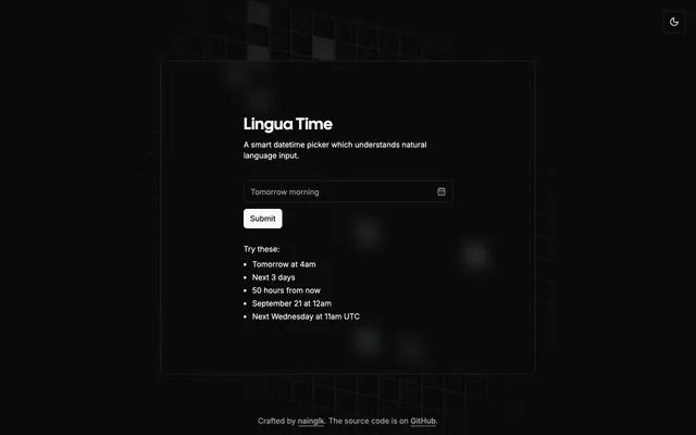
 Lingua TimeLibraryLingua Time is a shadcn date and time picker that parses natural language like Tomorrow at 4am and works with React Hook Form. MIT licensed.
 Country State DropdownLibraryCountry State Dropdown is a Next.js demo of linked country and state selects built with Tailwind CSS, shadcn/ui and Zustand. Copy it into your forms.
 TableCraftLibraryTableCraft pairs a Drizzle ORM query engine with a TanStack Table UI: server-side filtering, sorting, search, export and URL state, MIT licensed.
Pricing
Ship it with Pro
The directory is free. Pro adds 6,000+ blocks, 14 premium templates and the MCP server, so your AI editor installs them for you.
4.9/5 out of 5 · 150+ reviewsfrom 150+ founders and developers.
- Secure checkout via Stripe
- Code lives in your repo
- Keep what you've shipped if you cancel
- License terms
FAQ
Frequently asked questions
What shuip is, how to install it, its license and its alternatives.
The docs list field components for React Hook Form and for TanStack Form, with a separate section for TanStack Query.
Form fields, dialogs and buttons for Next.js apps, built on shadcn/ui and installed by CLI.
shuip lists Confirmation dialog and side dialog, Field components for React Hook Form, Matching field set for TanStack Form, Copy button, search input and theme button, CLI to install only chosen components and llms-full.txt and agent skills.
The directory lists these uses for shuip: Standardizing form fields across a Next.js product, Adding a confirmation dialog before destructive actions and Giving an AI coding agent docs it can read via llms-full.txt.
The directory does not name a maker for shuip. Its site is https://shuip.plvo.dev/docs.
shuip was added to the directory on June 10, 2025.
shuip is in Libraries & Components. Component libraries and standalone components built on shadcn/ui, covering the data tables, pickers, editors and charts the core set leaves out.
Components, Forms, React Hook Form, TanStack, Next.js, TypeScript, Tailwind CSS and shadcn CLI. Each tag has a page listing the other resources that carry it.
Yes. shuip's page has a Live tab beside the screenshot that loads its site in a frame.
No. A CLI installs only the components you need, and you can also copy the code by hand.
The directory lists no install command for shuip. Follow its docs at https://shuip.plvo.dev/docs.
The directory lists no shadcn CLI command for shuip. Check its docs at https://shuip.plvo.dev/docs for how to add it.
The directory links no repository for shuip. Its site is https://shuip.plvo.dev/docs.
shuip's docs are at https://shuip.plvo.dev/docs.
The directory records no license for shuip. Check its repository or site before you use it.
The directory records no price for shuip. Its site, https://shuip.plvo.dev/docs, is where its pricing, if any, is stated.
No. shuip is made by its own maker and listed here as a link. A shadcn.io Pro plan covers shadcn.io's own blocks, templates and tools.
Other resources in Libraries & Components, newest first: Next.js Multi-Image Upload, Image Crop Field, AutoForm and Lingua Time. Their pages are linked under Similar to shuip.
Open its category, Libraries & Components, or one of its tags (Components, Forms and React Hook Form): each page lists the resources that share it.
4.9 out of 5 from 150+ developers


Found your stack? Ship it.
6,000+ blocks, premium templates and MCP in every Pro plan. The directory stays free.
Get Pro