Stateful Button
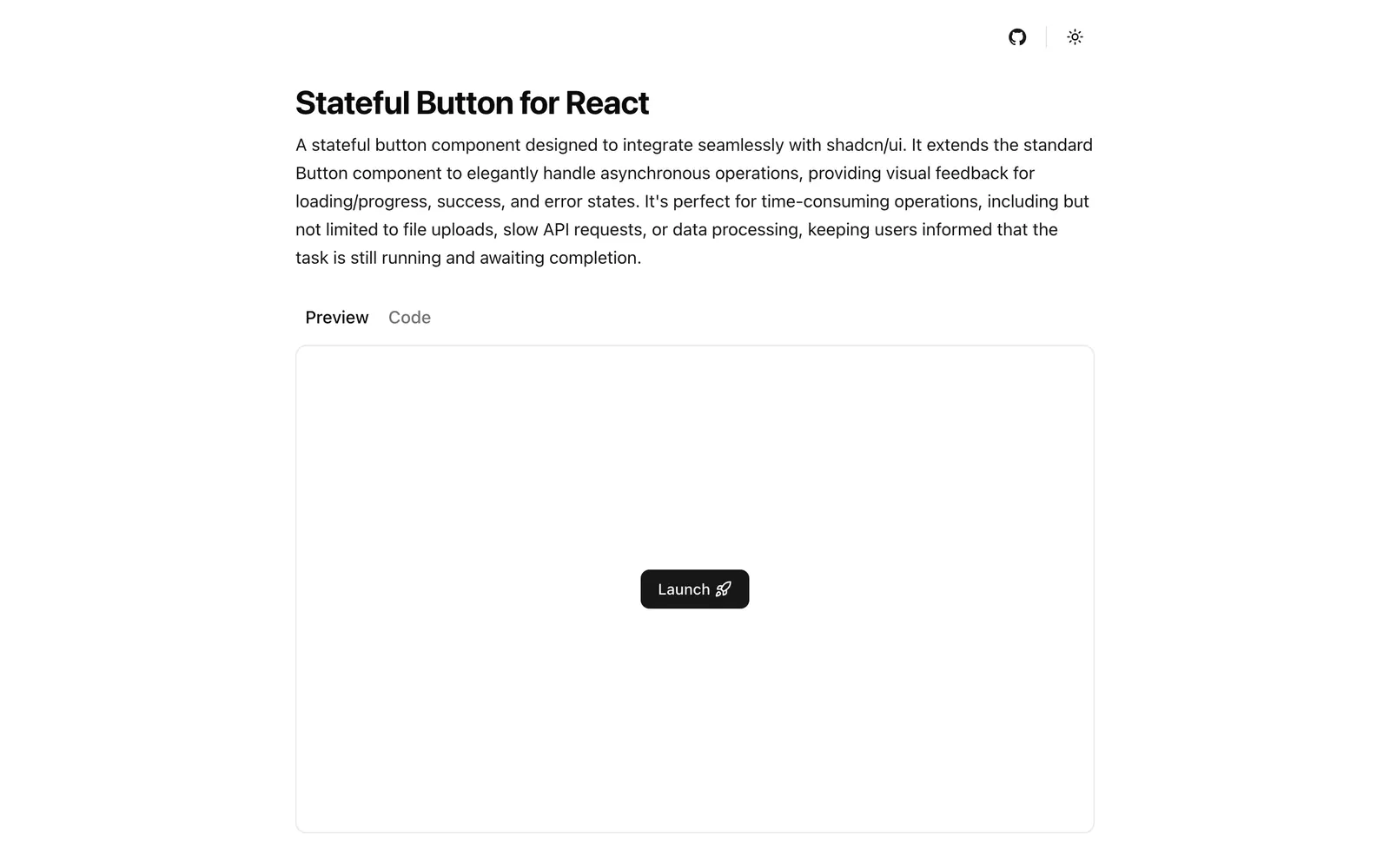
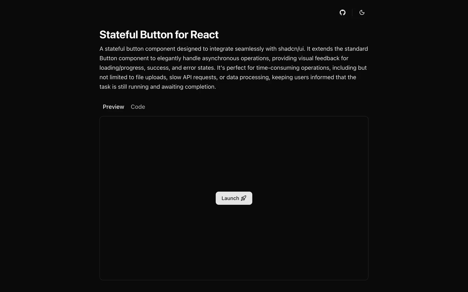
A shadcn/ui button that shows loading, success and error states while an async action runs.
- Category
- Libraries & Components
- Added
- GitHub stars
- 17
- License
- MIT
- Price
- Free
About
About Stateful Button
Stateful Button is a React component that extends the standard shadcn/ui Button so it can report the life of an async action. It moves between idle, loading or progress, success and error states, and settles on its own: a resolved promise from onClick gives success, a rejected one gives error. State transitions run on an XState machine, and ARIA messages tell screen reader users what is happening.
The shadcn CLI adds stateful-button.tsx to components/ui and a stateful-button-machine.ts file to lib, so you own both. Demos cover default, secondary, destructive and outline variants, with load and progress examples. The project is MIT licensed. It suits file uploads, slow API calls, checkout submits and data processing.
Stateful Button features
6 features
- Idle, loading, success and error states
- Progress variant
- XState state machine
- ARIA messages for screen readers
- Works with Promise-based handlers
- Default, secondary, destructive and outline variants
Install Stateful Button
1 command
Terminal
$ npx shadcn@latest add https://stateful-button.vercel.app/r/stateful-button.jsonWhat you can build with Stateful Button
3 use cases
- Showing upload progress inside the submit button
- Confirming a checkout payment with a success state
- Surfacing a failed API call on the button itself
Libraries & Components
Similar to Stateful Button
More libraries & components like Stateful Button: the closest by what they do, then the most starred.
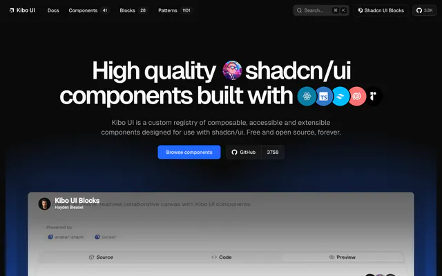
 Kibo UILibraryKibo UI is a free, open source registry of composable, accessible components for shadcn/ui, including Color Picker, QR Code, Image Zoom and Code Block.
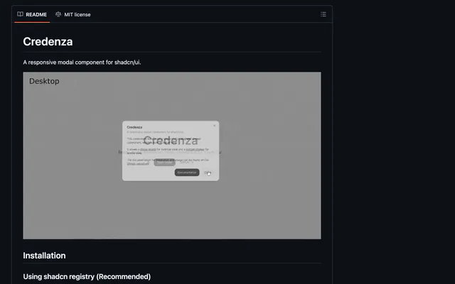
 CredenzaLibraryCredenza is a responsive modal for shadcn/ui that combines the dialog and drawer parts, so one component works on desktop and mobile. Install via the CLI.
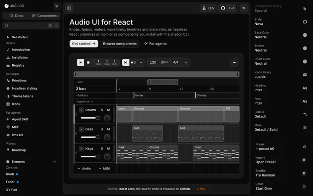
 audio/uiLibraryaudio/ui is a React library of knobs, faders, meters, waveforms and piano rolls, as headless npm primitives or shadcn registry components.
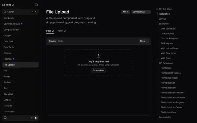
 File UploadLibraryFile Upload from Dice UI gives shadcn/ui projects a dropzone with previews, validation and progress, installed with one shadcn CLI command.
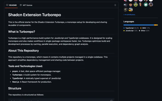
 shadcn-extensionLibraryshadcn-extension is an MIT-licensed collection of React components that extends shadcn/ui, developed in a Turborepo monorepo with Next.js docs.
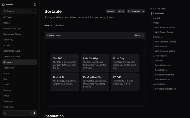
 SortableLibrarySortable from Dice UI reorders lists by drag and drop. Compose it from content, item, handle and overlay parts, and add it with the shadcn CLI.
Pricing
Ship it with Pro
The directory is free. Pro adds 6,000+ blocks, 14 premium templates and the MCP server, so your AI editor installs them for you.
4.9/5 out of 5 · 150+ reviewsfrom 150+ founders and developers.
- Secure checkout via Stripe
- Code lives in your repo
- Keep what you've shipped if you cancel
- License terms
FAQ
Frequently asked questions
What Stateful Button is, how to install it, its license and its alternatives.
It reads the result of your onClick handler. A resolved promise puts the button in success, and a rejected one puts it in error.
A shadcn/ui button that shows loading, success and error states while an async action runs.
Stateful Button lists Idle, loading, success and error states, Progress variant, XState state machine, ARIA messages for screen readers, Works with Promise-based handlers and Default, secondary, destructive and outline variants.
The directory lists these uses for Stateful Button: Showing upload progress inside the submit button, Confirming a checkout payment with a success state and Surfacing a failed API call on the button itself.
Stateful Button is made by nanyx95, at https://github.com/nanyx95. Its site is https://github.com/nanyx95/Stateful-Button-React.
Stateful Button was added to the directory on September 6, 2025.
Stateful Button is in Libraries & Components. Component libraries and standalone components built on shadcn/ui, covering the data tables, pickers, editors and charts the core set leaves out.
Components, Accessible, shadcn CLI, Registry, React, Radix UI, Open source and MIT. Each tag has a page listing the other resources that carry it.
Yes. Stateful Button's page has a Live tab beside the screenshot that loads its site in a frame.
Run npx shadcn@latest add https://stateful-button.vercel.app/r/stateful-button.json. It adds the component to components/ui and a state machine file to lib.
Stateful Button lists this command: `npx shadcn@latest add https://stateful-button.vercel.app/r/stateful-button.json`.
Yes, according to its listing: Stateful Button installs with `npx shadcn@latest add https://stateful-button.vercel.app/r/stateful-button.json`.
Stateful Button's repository is https://github.com/nanyx95/Stateful-Button-React.
The directory links no separate docs for Stateful Button; start from its site at https://github.com/nanyx95/Stateful-Button-React.
GitHub lists Stateful Button under the MIT license. Read the license file in its repository for the terms.
The directory records no price for Stateful Button. Its site, https://github.com/nanyx95/Stateful-Button-React, is where its pricing, if any, is stated.
No. Stateful Button is made by nanyx95 and listed here as a link. A shadcn.io Pro plan covers shadcn.io's own blocks, templates and tools.
Other resources in Libraries & Components, newest first: Kibo UI, Credenza, audio/ui and File Upload. Their pages are linked under Similar to Stateful Button.
Open its category, Libraries & Components, or one of its tags (Components, Accessible and shadcn CLI): each page lists the resources that share it.
4.9 out of 5 from 150+ developers


Found your stack? Ship it.
6,000+ blocks, premium templates and MCP in every Pro plan. The directory stays free.
Get Pro