Shadcn Components
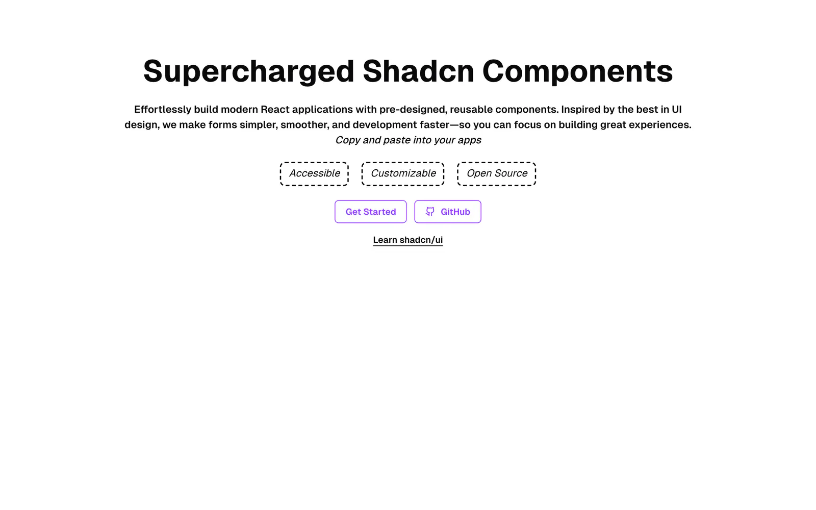
React components with simpler, type-safe react-hook-form fields, drawing on shadcn/ui and Material-UI.
- Category
- Libraries & Components
- Added
- GitHub stars
- 46
- License
- GPL-3.0
- Price
- Free
About
About Shadcn Components
This library offers pre-built React components inspired by shadcn/ui, Material-UI and the time picker from OpenStatus. Its main pitch is a simpler, more type-safe take on react-hook-form than the shadcn/ui form wrapper, with less boilerplate. Components work with date-fns for dates, framer-motion for animation, numeral for number formatting and react-hook-form for state.
Use follows the shadcn/ui pattern: copy the component code into your project, then install any dependencies it needs. The docs site lists the components as accessible, customizable and open source. GitHub reports a GPL-3.0 license while the README text mentions MIT, so check the repository before using the code in a commercial product.
Shadcn Components features
6 features
- Type-safe react-hook-form fields
- Time picker
- date-fns date handling
- numeral number formatting
- framer-motion animation
- Copy-and-paste components
What you can build with Shadcn Components
3 use cases
- Building a form with fewer lines than the stock form wrapper
- Adding a time picker to a scheduling screen
- Formatting number inputs in a pricing form
Libraries & Components
Similar to Shadcn Components
More libraries & components like Shadcn Components: the closest by what they do, then the most starred.
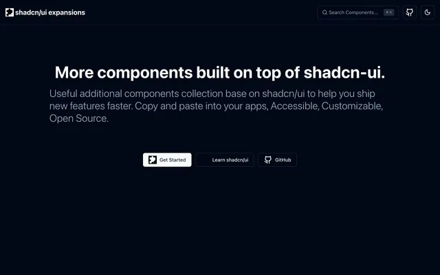
 shadcn/ui expansionsLibraryshadcn/ui expansions adds components the base set lacks: autosize textarea, datetime picker, multiple selector and infinite scroll. Copy and paste them.
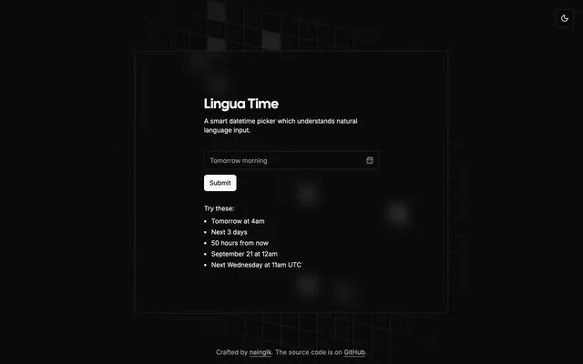
 Lingua TimeLibraryLingua Time is a shadcn date and time picker that parses natural language like Tomorrow at 4am and works with React Hook Form. MIT licensed.
 Datetime PickerLibraryDatetime Picker offers copy-paste date, time and date-time pickers for shadcn/ui with timezone support, min and max dates and react-hook-form support.
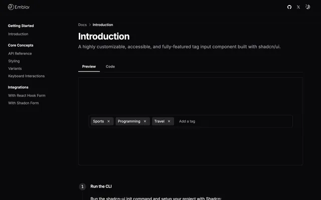
 EmblorLibraryEmblor is an npm package that adds a tag input to shadcn/ui forms. It is accessible, customizable and ready to drop into a React form with a few props.
 AutoFormLibraryAutoForm renders React forms from validation schemas such as Zod, Yup and Joi, with labels, defaults, field types and realtime validation wired in.
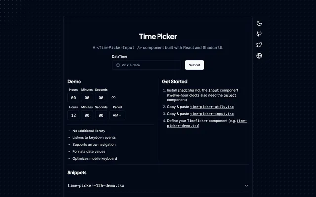
 Time PickerLibraryTime Picker from OpenStatus is a React TimePickerInput for shadcn/ui. It handles keyboard input, 12-hour clocks and mobile keyboards with no dependency.
Pricing
Ship it with Pro
The directory is free. Pro adds 6,000+ blocks, 14 premium templates and the MCP server, so your AI editor installs them for you.
4.9/5 out of 5 · 150+ reviewsfrom 150+ founders and developers.
- Secure checkout via Stripe
- Code lives in your repo
- Keep what you've shipped if you cancel
- License terms
FAQ
Frequently asked questions
What Shadcn Components is, how to install it, its license and its alternatives.
The README says it gives a simpler, more type-safe solution than the shadcn/ui react-hook-form implementation, with less boilerplate.
React components with simpler, type-safe react-hook-form fields, drawing on shadcn/ui and Material-UI.
Shadcn Components lists Type-safe react-hook-form fields, Time picker, date-fns date handling, numeral number formatting, framer-motion animation and Copy-and-paste components.
The directory lists these uses for Shadcn Components: Building a form with fewer lines than the stock form wrapper, Adding a time picker to a scheduling screen and Formatting number inputs in a pricing form.
Shadcn Components is made by slickwit, at https://github.com/slickwit. Its site is https://github.com/slickwit/supercharged-shadcn-components.
Shadcn Components was added to the directory on December 27, 2024.
Shadcn Components is in Libraries & Components. Component libraries and standalone components built on shadcn/ui, covering the data tables, pickers, editors and charts the core set leaves out.
Forms, Components, React Hook Form, Date and time, Copy and paste, Accessible, Customizable and Open source. Each tag has a page listing the other resources that carry it.
Yes. Shadcn Components's page has a Live tab beside the screenshot that loads its site in a frame.
The directory lists no install command for Shadcn Components. Follow the instructions on its site at https://github.com/slickwit/supercharged-shadcn-components.
The directory lists no shadcn CLI command for Shadcn Components. Check its docs at https://github.com/slickwit/supercharged-shadcn-components for how to add it.
Shadcn Components's repository is https://github.com/slickwit/supercharged-shadcn-components.
The directory links no separate docs for Shadcn Components; start from its site at https://github.com/slickwit/supercharged-shadcn-components.
GitHub shows GPL-3.0, but the README text says MIT. Confirm in the repository before commercial use.
GitHub lists Shadcn Components under the GPL-3.0 license. Read the license file in its repository for the terms.
The directory records no price for Shadcn Components. Its site, https://github.com/slickwit/supercharged-shadcn-components, is where its pricing, if any, is stated.
No. Shadcn Components is made by slickwit and listed here as a link. A shadcn.io Pro plan covers shadcn.io's own blocks, templates and tools.
Other resources in Libraries & Components, newest first: shadcn/ui expansions, Lingua Time, Datetime Picker and Emblor. Their pages are linked under Similar to Shadcn Components.
Open its category, Libraries & Components, or one of its tags (Forms, Components and React Hook Form): each page lists the resources that share it.
4.9 out of 5 from 150+ developers


Found your stack? Ship it.
6,000+ blocks, premium templates and MCP in every Pro plan. The directory stays free.
Get Pro