Tour Kit
A headless React toolkit for product tours, hints, checklists and announcements, friendly to shadcn/ui.
- Category
- Libraries & Components
- Added
- GitHub stars
- 68
- License
- MIT
- Price
- Free, with paid plans
About
About Tour Kit
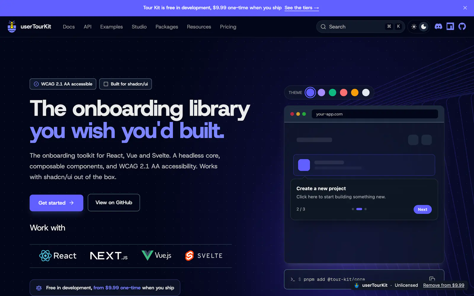
Tour Kit, branded userTourKit on its site, is a headless library for onboarding in React. The README describes 17 composable packages covering product tours, hints, checklists, announcements and microsurveys, written in TypeScript and aimed at WCAG 2.1 AA accessibility. It is designed natively for shadcn/ui yet works with other component libraries, and the site also mentions Vue and Svelte support.
Start with pnpm add @tour-kit/core and compose the Tour and TourStep components. Core tours and hints are free in development, and the site lists checklists, media, analytics, scheduling, surveys and an AI assistant as Pro packages priced from $9.99 one-time when you ship. The repository is MIT licensed. It suits teams replacing hosted onboarding SaaS with code they own.
Tour Kit features
6 features
- Tours and feature hints
- Checklists, announcements and microsurveys
- 17 composable packages
- WCAG 2.1 AA accessibility
- Headless core with shadcn/ui defaults
- Pro packages for analytics and scheduling
Install Tour Kit
1 command
Terminal
$ pnpm add @tour-kit/coreWhat you can build with Tour Kit
3 use cases
- Building a first-run product tour in a React dashboard
- Adding an onboarding checklist without a hosted service
- Showing a feature announcement to existing users
Links
1 link
Libraries & Components
Similar to Tour Kit
More libraries & components like Tour Kit: the closest by what they do, then the most starred.
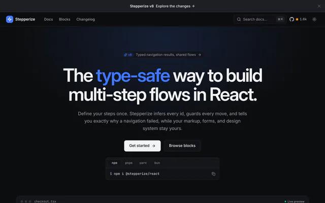
 StepperizeLibraryStepperize builds type-safe multi-step flows in React: define steps once, guard each move, and render them in your own shadcn/ui markup.
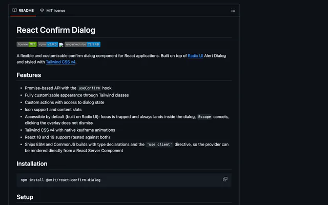
 React Confirm DialogLibraryReact Confirm Dialog is a customizable confirm dialog for React with a useConfirm hook, built on Radix UI Alert Dialog and styled with Tailwind CSS v4.
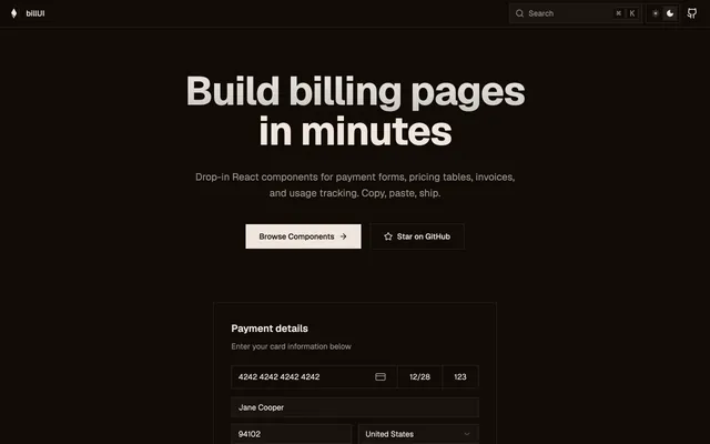
 billUILibrarybillUI provides open source billing components for React on shadcn/ui: payment forms, pricing tables, invoice history, payment methods and usage cards.
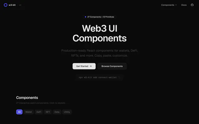
 w3-kitLibraryw3-kit offers 27 typed, accessible React components and 12 primitives for web3 dApps: wallets, DeFi, NFTs and data. MIT licensed.
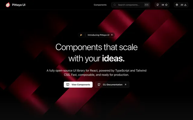
 Pittaya UILibraryPittaya UI is an MIT-licensed React library with 23+ components, live previews and a CLI that adds each one with a single npx command.
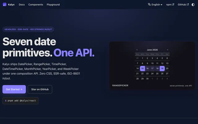
 KalyxLibraryKalyx is a headless React library with DatePicker, RangePicker, TimePicker, DateTimePicker and more, using ISO 8601 UTC strings and zero CSS.
Pricing
Ship it with Pro
The directory is free. Pro adds 6,000+ blocks, 14 premium templates and the MCP server, so your AI editor installs them for you.
4.9/5 out of 5 · 150+ reviewsfrom 150+ founders and developers.
- Secure checkout via Stripe
- Code lives in your repo
- Keep what you've shipped if you cancel
- License terms
FAQ
Frequently asked questions
What Tour Kit is, how to install it, its license and its alternatives.
A headless React toolkit for product tours, hints, checklists and announcements, friendly to shadcn/ui.
Tour Kit lists Tours and feature hints, Checklists, announcements and microsurveys, 17 composable packages, WCAG 2.1 AA accessibility, Headless core with shadcn/ui defaults and Pro packages for analytics and scheduling.
The directory lists these uses for Tour Kit: Building a first-run product tour in a React dashboard, Adding an onboarding checklist without a hosted service and Showing a feature announcement to existing users.
Tour Kit is made by domidex01, at https://github.com/domidex01. Its site is https://github.com/domidex01/tour-kit.
Tour Kit was added to the directory on May 29, 2026.
Tour Kit is in Libraries & Components. Component libraries and standalone components built on shadcn/ui, covering the data tables, pickers, editors and charts the core set leaves out.
Onboarding, Components, Accessible, React, TypeScript, Vue, Svelte, Open source and Freemium. Each tag has a page listing the other resources that carry it.
No. Tour Kit's site cannot be framed, so its page shows screenshots of it and a link to the site.
Run pnpm add @tour-kit/core, then compose the Tour and TourStep components. Other packages in the @tour-kit scope add hints and more.
Tour Kit lists this command: `pnpm add @tour-kit/core`. Its docs are at https://usertourkit.com/.
The directory lists no shadcn CLI command for Tour Kit. Check its docs at https://usertourkit.com/ for how to add it.
Tour Kit's repository is https://github.com/domidex01/tour-kit.
Tour Kit's docs are at https://usertourkit.com/.
The site says it is free in development and from $9.99 one-time when you ship. Several packages are marked Pro.
GitHub lists Tour Kit under the MIT license. Read the license file in its repository for the terms.
The directory records no price for Tour Kit. Its site, https://github.com/domidex01/tour-kit, is where its pricing, if any, is stated.
No. Tour Kit is made by domidex01 and listed here as a link. A shadcn.io Pro plan covers shadcn.io's own blocks, templates and tools.
Other resources in Libraries & Components, newest first: Stepperize, React Confirm Dialog, billUI and w3-kit. Their pages are linked under Similar to Tour Kit.
Open its category, Libraries & Components, or one of its tags (Onboarding, Components and Accessible): each page lists the resources that share it.
4.9 out of 5 from 150+ developers


Found your stack? Ship it.
6,000+ blocks, premium templates and MCP in every Pro plan. The directory stays free.
Get Pro