shadcn.io is an independent project built on shadcn/ui
Tunnel Background for Vue
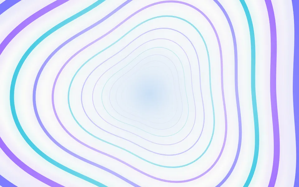
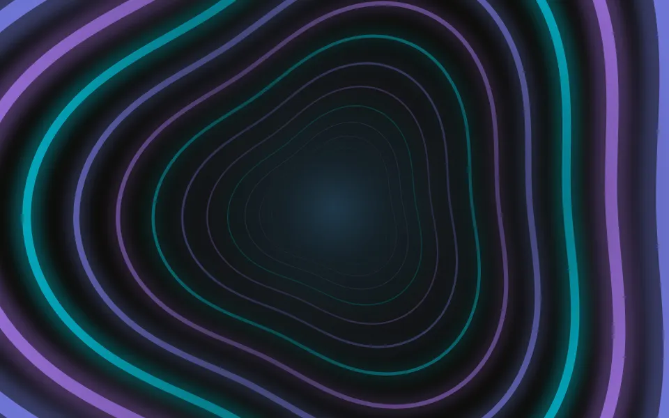
A tunnel of light rings comes toward you in perspective, round or polygonal. For Vue with Ark UI, when a launch page should pull the eye in.
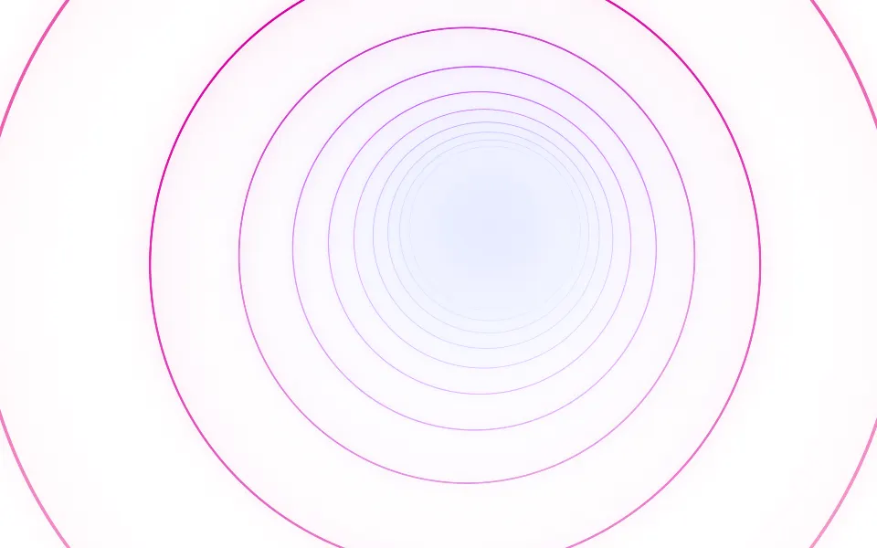
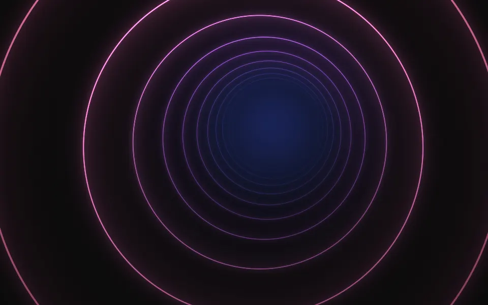
You look down a tunnel of light rings. They come toward you in true perspective: small, fine and close together at the far end, larger, thicker and faster as they near, until they pass the edges of the box, while new ones fade in at the far end. The tunnel snakes slowly, each ring can be turned a little more than the last, and sides makes the rings polygons. It's a GLSL scene on WebGL2 with no dependency: light rings on a dark surface, ink rings on a light one. The far end follows the pointer.
Use it behind a launch hero, a sign-in screen or a "coming soon" page, with the copy on the far end. For flat rings that breathe in place, use Portal; for rings that pulse outward from a logo, Ripple; for straight streaks from a vanishing point instead of closed rings, Warp. With reduced motion it holds one still frame.
Installation
Usage
<script setup lang="ts">
import { Tunnel } from "@/components/ui/tunnel";
</script>
<template>
  <Tunnel class="flex min-h-[32rem] flex-col items-center justify-center">
    <h1 class="text-5xl font-semibold">From commit to customer</h1>
  </Tunnel>
</template>
Tunnel is a container: whatever you put inside sits on top of the rings, in normal flow. It fills its own box, so give it a height or content. For a backdrop behind the whole page, render it empty with className="fixed inset-0 -z-10".
Presets
<Tunnel /><Tunnel
:colors="['#0d9488', '#34d399', '#bbf7d0']"
:sides="6"
:twist="6"
/><Tunnel
:bend="0.3"
:colors="['var(--muted-foreground)', 'var(--foreground)']"
:glow="0.3"
:lineWidth="2.5"
:shine="0"
/><Tunnel :glow="2" :intensity="1.5" :lineWidth="5" :rings="9" /><Tunnel
:colors="['#8b5cf6', '#f43f5e', '#fb923c']"
:rings="9"
:sides="3"
:spin="0.6"
:twist="-14"
/><Tunnel
:colors="['#2563eb', '#22d3ee', '#ecfeff']"
:rings="14"
:sides="4"
:twist="10"
/><Tunnel
:bend="1"
:colors="['#312e81', '#7c3aed', '#f0abfc']"
:depth="1"
:rings="22"
:shine="1"
:twist="20"
/>Each preset is a set of props, so copy one and keep tuning. Tunnel is the default. Shaft is a square tunnel that twists as it recedes, Hex and Prism do the same with six and three sides, Wormhole packs 22 rings into a long tunnel that bends hard, Neon thickens the rings and floods the walls with their light, and Mono takes its two colors from your theme.
Examples
Hero
The copy sits on the far end, where the rings are hairlines and close to the surface's own color. The headline and the line under it use the foreground color; the chip and the second button have a translucent ground of their own.
Polygon
sides={4} makes each ring a square and twist={10} turns each one 10 degrees more than the one before, so the tunnel reads as a twisted shaft. Here with rings={14} and a palette from blue to ice white on a dark surface.
In a card
origin="top" puts the tunnel's axis on the top edge, so half of it shows as arches, and fade="bottom" clears the lower part of the card for the copy. rings={8} and depth={0.35} keep it open in a small box.
Customization
Every color is a CSS color, so a theme variable works and follows a theme switch: colors={["var(--muted-foreground)", "var(--foreground)"]} draws the tunnel in your text colors. The list runs from the far end to the ring nearest you, mixed in OKLab, so two distant hues meet in a clean color.
The surface is the root's own background, bg-background by default. Give the root another (bg-slate-950, a gradient) and the rings adapt: light on a dark surface, ink on a light one. fade masks an edge, opacity turns the whole effect down, and grain adds film grain.
<template>
  <Tunnel
    class="min-h-[32rem] bg-slate-950"
    :colors='["var(--chart-3)", "var(--chart-2)", "var(--chart-1)"]'
    fade="radial"
    :sides=6
  />
</template>
Performance
It's one WebGL2 canvas and one fragment shader: a loop over the rings, 24 at most, that skips every ring too far from a pixel to light it, with two exponentials for the rings that are left and no noise. A polygon ring adds one arctangent. It draws only while it's on screen and the tab is visible, shares one frame loop with every other background on the page, and lowers its own resolution if frames run long. quality sets the render scale yourself, and paused holds the frame.
Accessibility
The rings are decoration: they're hidden from assistive tech and let every click through to your content. With reduced motion it draws one still frame and ignores the pointer. Nothing flashes: a ring fades in at the far end and leaves past the edges of the box.
Put copy on the far end and use the foreground color (text-foreground). The rings that cross the middle of the box are the far ones, thin and dim: at the default settings foreground text keeps more than 8:1 there on a light surface, and about 4.5:1 on a dark one at the worst frame, where a ring crosses a letter. The nearest rings are bright and up to 4 pixels thick, so keep small text off the outer band, or mask it with fade.
FAQ
How do I change the colors?
Pass two to eight CSS colors to colors. The first is the far end of the tunnel and the last is the ring nearest you, with the rest spread along the way. Hex, oklch() and theme variables such as var(--primary) all work, and a variable follows your theme when it changes.
Does it work on a light page?
Yes, with no prop to set. The scene reads the color behind it: on a dark surface the rings are light with a soft bloom, and on a light one they're drawn in a deeper, more saturated ink of the same colors over a faint tint, so a thin ring still holds on white. Set the surface with a class on the component, such as bg-slate-950.
How do I make a square or hexagonal tunnel?
Set sides to a number from 3 to 8: sides={4} gives squares, sides={6} hexagons. Leave it at 0 for circles. twist then turns each ring a few degrees more than the one before it, so the corners trace a spiral down the tunnel, and spin turns the whole tunnel over time.
How do I put it behind the whole page?
Render it empty with className="fixed inset-0 -z-10". It still follows the pointer there, since it listens on the window. To put it behind one section, wrap that section's content in it and give it a height, such as min-h-svh. The rings are sized by the box, so the nearest one always passes its far corner.
How fast do the rings move?
At speed={1} a ring near the edge of a laptop-sized hero moves about 60 pixels a second, and the ones near the far end barely move, as perspective has it. The pace doesn't change with rings: more rings means they follow each other more closely. speed scales it all, and speed={0} holds the frame.
Will it slow my page down?
It's a light shader: one short loop over the rings for each pixel, on the GPU, and nothing at all while it's off screen or the tab is hidden. If a device can't keep up, it renders fewer pixels by itself. For a phone-first page, quality={0.75} draws a little over half the pixels and is hard to tell apart.
Does it work with Next.js and server components?
Yes. Import it into a server component and it renders its box and your content on the server; the canvas starts in the browser and fades in over the surface. It needs WebGL2, which every current browser has. Without it the box keeps its background, or the fallback you pass.
What happens with reduced motion?
It draws one still frame of the tunnel and stops, and the pointer no longer moves the far end. The frame is the same one every time, so the page looks the same on each visit. On a phone the scene animates as usual, but touch never steers it, so scrolling isn't disturbed.
API Reference
Tunnel
data-slot="tunnel"
bend?number
How far the tunnel snakes: its far end wanders slowly around the vanishing point, from 0 (a straight tunnel) to 1.
- Default
0.6
colors?string[]
Two to eight CSS colors, from the far end of the tunnel to the ring
nearest you. Theme variables such as var(--primary) follow your theme.
- Default
["#3b5bff", "#a855f7", "#ff5fa2"]
depth?number
How far down the tunnel you see, from 0 (a short tunnel with a wide far end) to 1 (a long one whose rings close in on a point).
- Default
0.5
fade?"none" | "radial" | "top" | "bottom" | "left" | "right"
Which edges fade out to the surface: radial keeps the middle, the
others name the side that fades.
- Type
"none" | "radial" | "top" | "bottom" | "left" | "right"- Default
"none"
fallback?string
What shows until the first frame and in browsers without WebGL2: a CSS
background value that looks like the scene.
glow?number
How much light the rings throw on the walls and how bright the far end is, from 0 to 2.
- Default
1
grain?number
Film grain over the scene, from 0 to 1.
- Default
0
intensity?number
How bright the rings are.
- Default
1
interactive?boolean
Whether the scene follows the pointer and answers a press. Touch never moves it, so scrolling a page on a phone isn't disturbed.
- Default
true
lineWidth?number
The thickness of the ring nearest you, in pixels, from 1 to 6. The rings behind it are thinner.
- Default
4
opacity?number
How strongly the scene shows over the surface, from 0 to 1.
- Default
1
origin?"center" | "top" | "bottom" | "left" | "right"
Where the tunnel's axis sits: the center of the box, or the middle of one of its edges, where half of it shows.
- Type
"center" | "top" | "bottom" | "left" | "right"- Default
"center"
paused?boolean
Holds the current frame.
- Default
false
quality?number
Render scale, from 0.25 to 1, of the screen's pixels (capped at 2×). Lower is cheaper and softer.
- Default
1
rings?number
How many rings stand between you and the far end, from 4 to 24.
- Default
12
seed?number
Another moment of the tunnel's wandering.
- Default
0
shine?number
How much brighter one side of each ring is than the other, from 0 (lit
evenly) to 1. With twist, the bright side spirals down the tunnel.
- Default
0.6
sides?number
The shape of a ring: 0 for a circle, or 3 to 8 for a polygon with that many sides.
- Default
0
speed?number
Animation speed: 1 is normal, 0 holds the frame.
- Default
1
spin?number
How fast the whole tunnel turns, from -2 to 2. Negative turns it the other way.
- Default
0
time?number
A fixed moment, in seconds: draws it and doesn't animate.
twist?number
How much further each ring is turned than the one before it, in degrees, from -30 to 30.
- Default
8