shadcn.io is an independent project built on shadcn/ui
Light Pillar Background for Vue
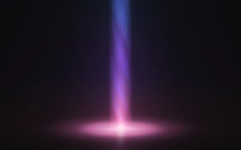
A tall column of light with wisps winding inside it, landing in a soft pool. For Vue with Ark UI, when a hero needs one vertical accent.
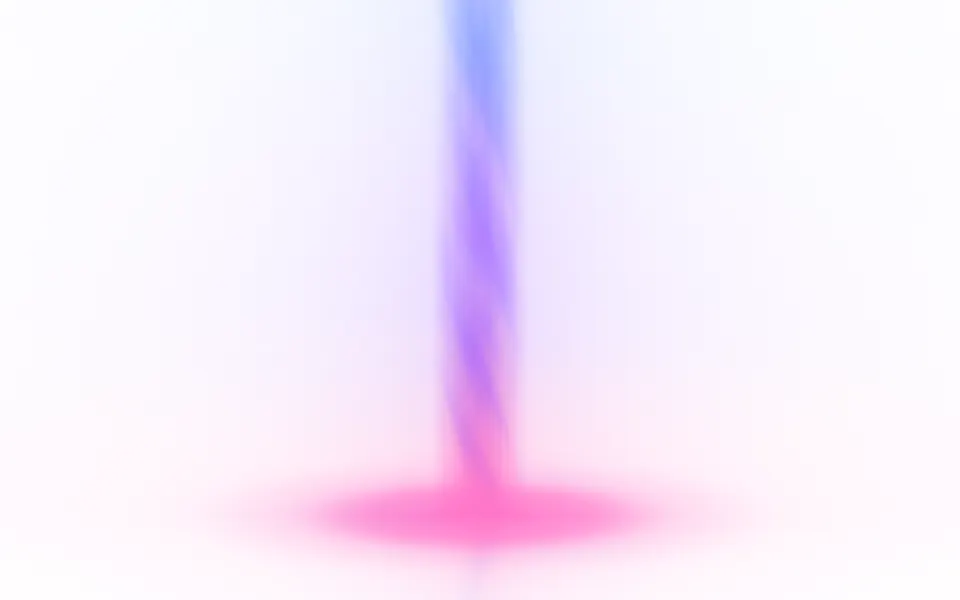
A tall column of light stands in the box and lands in a flat pool on a floor near the bottom. It's a GLSL scene on WebGL2 with no dependency: the column is shaded as a round body, wisps of noise wind around it with the near side and the far side turning opposite ways, and it's brightest at its foot and thins out as it rises. The color runs from the foot to the top through a palette you choose. On a dark surface it glows; on a light one it's a column of soft color. The top leans toward the pointer and a press sends a band of light up it.
Use it as the one vertical accent of a hero, beside the copy or behind a short headline. For shafts fanning down from the top edge, use Corona; for a bar of light with a cone under it, Lamp; for a soft light with no shape of its own, Glow. With reduced motion it holds one still frame.
Installation
Usage
<script setup lang="ts">
import { LightPillar } from "@/components/ui/light-pillar";
</script>
<LightPillar
  className="flex min-h-[34rem] flex-col items-start justify-center px-12"
  position={0.78}
>
  <h1 className="text-5xl font-semibold">One place for every alert</h1>
</LightPillar>
Light Pillar is a container: whatever you put inside sits on top of the light, in normal flow. It fills its own box, so give it a height or content. For a backdrop behind the whole page, render it empty with className="fixed inset-0 -z-10".
Presets
<LightPillar /><LightPillar
:base="1.6"
:colors="['#a5f3fc', '#22d3ee', '#2563eb']"
:core="0.2"
:glow="0.8"
:softness="0.9"
:swirl="0.3"
:width="0.3"
/><LightPillar
:colors="['#f0abfc', '#818cf8', '#22d3ee']"
:length="1.6"
:position="0.4"
:tilt="18"
/><LightPillar
:colors="['#ffd166', '#ff7a3d', '#d7263d']"
:detail="1"
:swirl="1.4"
:tilt="-6"
:width="0.16"
/><LightPillar
:base="1.4"
:colors="['#c4b5fd', '#a5b4fc', '#93c5fd']"
:core="0"
:detail="0.2"
:glow="1"
:softness="1"
:width="0.24"
/><LightPillar
:base="0.6"
:colors="['var(--foreground)', 'var(--muted-foreground)']"
:core="0.3"
:intensity="0.7"
/><LightPillar
:base="0.6"
:colors="['#bae6fd', '#38bdf8', '#2563eb']"
:core="1"
:glow="0.3"
:length="2"
:softness="0.1"
:swirl="1.6"
:width="0.045"
/>Each preset is a set of props, so copy one and keep tuning. Beacon is the default. Beam widens the column to a soft cyan shaft with a large pool, Needle narrows it to a thin bright line that stays lit to the top, and Comet leans it 18 degrees. Mono takes its two colors from your theme.
Examples
Hero
position={0.78} stands the pillar in the right quarter of the box, and the copy is aligned to the left, on the plain surface. The glow around the pillar reaches the copy as a faint tint.
Colors
colors runs from the foot to the top: here gold, orange and crimson on a dark surface, with a wider column (width={0.16}), tighter winding (swirl={1.4}), detail at 1 and a lean of 6 degrees to the left.
In a card
floor={0.42} lifts the pool to the middle of the card, so the text under it sits on a plain surface, and tilt={12} with position={0.76} sends the column out through the top right corner.
Customization
colors takes two to four CSS colors, from the foot to the top, mixed in OKLab. A theme variable works and follows a theme switch. position, floor and tilt place the pillar; width and softness shape the column; swirl and detail set the wisps inside it; core, glow and base set the bright line, the glow around it and the pool; length is how far up the light carries.
The surface is the root's own background, bg-background by default. Give the root another (bg-slate-950, an image, a gradient) and the light adapts: it adds to a dark surface and tints a light one, where a pale color is deepened so it still shows. fade masks an edge, opacity turns the whole effect down, and grain adds film grain.
<LightPillar
  className="min-h-[32rem] bg-zinc-950"
  colors={["var(--chart-1)", "var(--chart-2)", "var(--chart-3)"]}
  grain={0.15}
  length={1.6}
  width={0.1}
/>
Performance
It's one WebGL2 canvas and one fragment shader: five samples of simplex noise a pixel (two for the wisps on each side of the column, one for the threads), a few exponentials for the glow and the pool, and no loop beyond the four presses it remembers. It draws only while it's on screen and the tab is visible, shares one frame loop with every other background on the page, and lowers its own resolution if frames run long. quality sets the render scale yourself, and paused holds the frame.
Accessibility
The light is decoration: it's hidden from assistive tech and lets every click through to your content. With reduced motion it draws one still frame and ignores the pointer. Nothing flashes: a press sends one band of light up the pillar, and it fades within two seconds.
Copy beside the pillar sits on a nearly plain surface: the headline in the hero demo measures 15:1 on dark and on light. A headline that crosses the pillar is still readable with the default colors: white text over the column measures 5.8:1 at its worst on dark, and dark text 9.9:1 on light. Keep text off the pool, which is the brightest part, and check the contrast again if you raise intensity or use paler colors.
FAQ
How do I change the colors of the pillar?
Pass two to four CSS colors to colors. The first is the foot of the pillar and its pool, the last is the top, and the wisps shift the color a little as they turn. Hex, oklch() and theme variables such as var(--primary) all work, and a variable follows your theme when it changes.
Does it work on a light page?
Yes, with no prop to set. The scene reads the color behind it. On a dark surface the pillar adds light and its foot runs nearly white. On a light one, where nothing can be brighter than the page, it's drawn as a column of soft color with a tinted pool, and a pale or white color is darkened a little so it doesn't vanish.
How do I put the pillar beside my headline?
Set position: 0 is the left edge of the box, 1 the right edge, 0.5 the middle. position={0.78} with left-aligned copy is the layout of the hero demo. tilt leans the pillar, in degrees, if you want it to point away from the text.
Can I remove the pool or move the floor?
base={0} removes the pool, and the pillar then ends at the floor with a short reflection under it. floor moves that line, from 0 at the bottom of the box to 0.5 at its middle. At 0 the pillar runs to the bottom edge and only the upper half of the pool shows.
How do I put it behind the whole page?
Render it empty with className="fixed inset-0 -z-10". It still follows the pointer there, since it listens on the window. To light one section, wrap that section's content in it and give it a height, such as min-h-[34rem].
Does it work with Next.js and server components?
Yes. Import it into a server component and it renders its box and your content on the server; the canvas starts in the browser, and the pillar comes down from the top and the pool spreads when it lands. It needs WebGL2, which every current browser has. Without it the box keeps its background, or the fallback you pass.
API Reference
LightPillar
data-slot="light-pillar"
base?number
How large the pool of light is where the pillar lands, from 0 (none) to 2.
- Default
1
colors?string[]
Two to four CSS colors, from the foot of the pillar to its top. Theme
variables such as var(--primary) follow your theme.
- Default
["#ff74c8", "#9d5cff", "#5f7bff"]
core?number
How strong the bright line down the middle of the pillar is, from 0 to 1.
- Default
0.5
detail?number
How much fine structure the wisps inside the pillar have, from 0 to 1.
- Default
0.5
fade?"none" | "radial" | "top" | "bottom" | "left" | "right"
Which edges fade out to the surface: radial keeps the middle, the
others name the side that fades.
- Type
"none" | "radial" | "top" | "bottom" | "left" | "right"- Default
"none"
fallback?string
What shows until the first frame and in browsers without WebGL2: a CSS
background value that looks like the scene.
floor?number
Where the floor sits, from 0 (the bottom of the box) to 0.5.
- Default
0.14
glow?number
How far the soft glow around the pillar spreads, from 0 (none) to 1.
- Default
0.5
grain?number
Film grain over the scene, from 0 to 1.
- Default
0
intensity?number
How bright the light is.
- Default
1
interactive?boolean
Whether the scene follows the pointer and answers a press. Touch never moves it, so scrolling a page on a phone isn't disturbed.
- Default
true
length?number
How far up the light carries, as a share of the space above the floor: at 1 it has thinned out by the top of the box, at 2 it's still bright there.
- Default
1
opacity?number
How strongly the scene shows over the surface, from 0 to 1.
- Default
1
paused?boolean
Holds the current frame.
- Default
false
position?number
Where the pillar stands across the box, from 0 (the left edge) to 1 (the right edge).
- Default
0.5
quality?number
Render scale, from 0.25 to 1, of the screen's pixels (capped at 2×). Lower is cheaper and softer.
- Default
1
softness?number
How soft the sides of the pillar are, from 0 (a clear tube of light) to 1 (a haze).
- Default
0.5
speed?number
Animation speed: 1 is normal, 0 holds the frame.
- Default
1
swirl?number
How tightly the wisps wind around the pillar, from 0 (straight up) to 1.6.
- Default
1
tilt?number
How far the pillar leans, in degrees: positive tips its top to the right, negative to the left.
- Default
0
time?number
A fixed moment, in seconds: draws it and doesn't animate.
width?number
The pillar's width, as a share of the box's shorter side.
- Default
0.13