shadcn.io is an independent project built on shadcn/ui
Installation
The command adds the example above to components/charts/ and, the first time, the chart kit to components/ui/charts/. Both are source files in your project from then on: read them, change them, delete what you don't use.
Usage
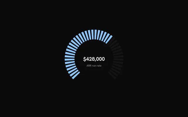
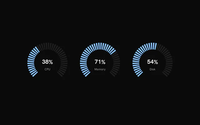
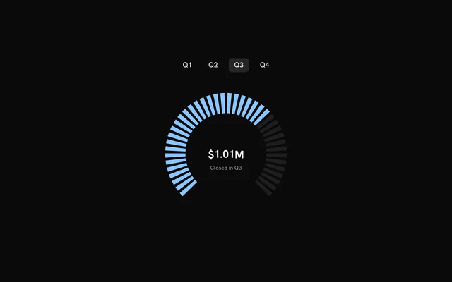
value is the fill, from 0 to 100. The number in the middle is a separate prop, centerValue, so a gauge filled to 66% can show revenue. Leave it out and there's no label.
<script lang="ts">
import { Gauge } from "@/components/ui/charts";
</script>

<Gauge
  ariaLabel="Storage used"
  centerValue={72}
  defaultLabel="Storage used"
  inactiveFillOpacity={0.4}
  suffix="%"
  value={72}
/>
Anatomy
The gauge is one component and every layer is a prop. The arc-only layers (ruler, needle, zones, sector, progress ring, dots, glow, center disc) claim room from the outside in, and the track shrinks to fit them.
<Gauge
  arcStyle="solid"
  centerValue={78}
  defaultLabel="Disk"
  needle="triangle"
  ruler
  suffix="%"
  value={78}
  {zones}
/>Gauge: The track, the fill, the label and any dial layers you turn on.
Arcs and notches
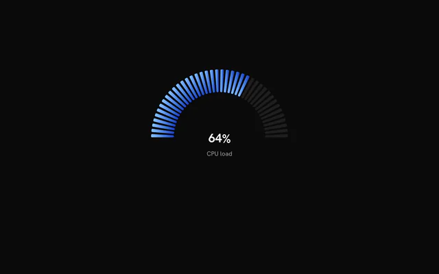
startAngle and endAngle are in degrees, with 0 pointing right and angles running clockwise. The default 135 to 405 opens at the bottom, and 180 to 360 is the top half.
totalNotches (40), spacing (the share of the track left as gaps, 25%) and notchCornerRadius shape the notches. useGradient shades the lit ones across --chart-1 to --chart-5, or between the two colors of activeGradient.
Linear gauges
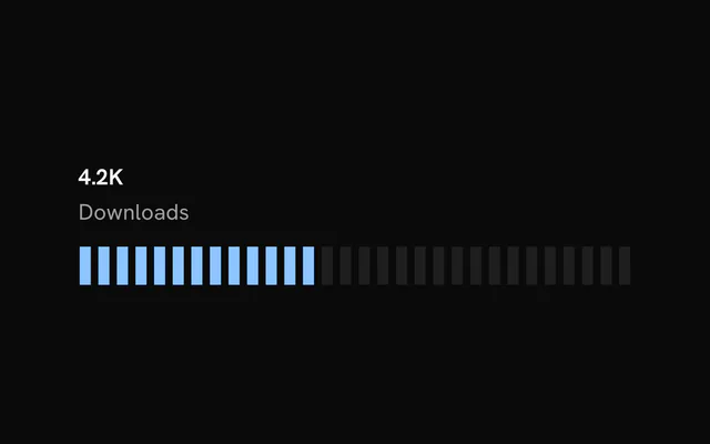
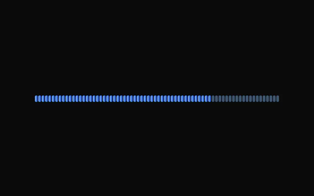
orientation="linear" lays the notches along a straight track that fills its container. labelPlacement puts the label on any side of it and labelAlign at its start, center or end. linearHeight (24 px) sets the thickness.
The dial layers below are for arcs only. A linear gauge ignores them.
Notches, a solid arc or no track
arcStyle="solid" swaps the notches for one rounded stroke, arcThickness thick. "none" drops the track altogether and leaves the value to a sector, a progress ring or dots.
Rulers
ruler adds a scale of ticks inside the track that brightens up to the value. Pass options to move it outside with position, set ticks and majorEvery, and number it with labels: every major tick, the two "ends", or your own min, max and format.
Needles
needle takes a variant, "line", "gradient", "triangle" or "polygon", or options. length is a fraction of the reach, and tip ends it inside the track, at its outer edge or past the outermost layer.
Zones
zones marks ranges on the 0 to 100 scale, a red stretch past 85 for instance. By default each is a thin band around the track. zoneDisplay="fill" colors the fill itself where it crosses a zone, and "both" does both.
Sectors, rings and dots
sector fills a wedge from the start to the value, with a conic or radial gradient or a flat color, which can be a pattern. progressRing adds a thin ring around the track, dots rings of dots that light up to the value, and glow a bloom on the fill.
centerDisc puts a ringed disc behind the label. Each takes true for its defaults or an options object.
Customization
The kit is in your project, in components/ui/charts/: your framework's components over a shared core/. Change a default there and every chart picks it up.
class goes on the chart's container, so size and spacing are utility classes.
Children go into a hidden <defs>. Put a PatternLines or a gradient there and point activeFill, inactiveFill or a sector's color at it with url(#id). The ids are global to the page, so give each gauge its own.
<Gauge activeFill="url(#quota-stripes)" inactiveFillOpacity={0.4} value={64}>
  <PatternLines
    height={6}
    id="quota-stripes"
    orientation={["diagonal"]}
    stroke="var(--chart-1)"
    strokeWidth={1.5}
    width={6}
  />
</Gauge>
Loading state
There's no loading state. Render the gauge at value={0} until the reading arrives, and the fill sweeps up from zero when it does.
Animation
On mount the track fades in, then the fill sweeps up from zero on a spring with no bounce, lighting each notch as it passes. The needle, sector, ring and dots ride the same sweep.
A new value carries on from wherever the fill is, at the speed it already has, so a gauge fed every second never snaps back. enterTransition replaces the spring ({ type: "spring", visualDuration: 0.9, bounce: 0 }), and enterStaggerScale the pause before the sweep starts.
With reduced motion turned on, the gauge draws at its value with no sweep.
Theming
Every color in the kit is one of your theme's tokens or a mix of them, except --chart-positive, a fixed green. A preset or the .dark class restyles the chart, and overriding a token in your CSS changes it everywhere.
Lit notches are --chart-1 and unlit ones your theme's --border at 80% opacity, unless you set activeFill and inactiveFill. With useGradient, the fill runs through the five chart colors.
Needles, rulers and the center disc's ring are drawn in --foreground, and a progress ring's remainder in --muted-foreground. Each has a prop to change it.
| Token | Default | Paints |
|---|---|---|
--chart-1 | your theme's | the first series |
--chart-2 | your theme's | the second series |
--chart-3 | your theme's | the third series |
--chart-4 | your theme's | the fourth series |
--chart-5 | your theme's | the fifth series |
:root {
  --chart-label: var(--foreground);
}
Accessibility
A gauge is one image with nothing to step through, so it takes no tab stop. It's announced by its name, "Gauge: 72%" unless you pass ariaLabel.
Once you name it, the reading moves to ariaDescription, so a screen reader still says the value. Pass your own description to say more, such as the limit.
API reference
Svelte takes the same props as React, with class for className. Render props are snippets, listed below by their names. Keep data in $state.raw so the chart sees each new array.
Gauge
orientation?GaugeOrientation
"arc" draws the notches around an arc; "linear" lays them out along a horizontal track.
- Default
"arc"
valuenumber
Fill level from 0 to 100: the share of notches drawn in the active colour.
totalNotches?number
Number of notches.
- Default
40
spacing?number
Share of the track, in percent, reserved for the gaps between notches.
- Default
25
notchCornerRadius?number
Radius in pixels used to round the corners of each notch. 0 keeps them sharp; large values are limited by the notch size and approach a capsule shape.
- Default
0
uniformWidth?boolean
true draws notches with parallel sides; false tapers them toward the centre (arc) or midline (linear). Defaults to false for arc gauges and true for linear gauges.
startAngle?number
Angle where the arc starts, in degrees. Arc gauges only.
- Default
135
endAngle?number
Angle where the arc ends, in degrees. Arc gauges only.
- Default
405
useGradient?boolean
Colour the notches along a gradient instead of one solid colour.
- Default
false
activeGradient?readonly [string, string]
[from, to] colours for the active notches, interpolated along the notch index. Used when useGradient is on; defaults to --chart-1 to --chart-5.
inactiveGradient?readonly [string, string]
[from, to] colours for the inactive notches. Used when useGradient is on; defaults to activeGradient.
centerValue?number
Number shown in the label, which is drawn only when this is set. It is independent of value, so it can show a related figure such as revenue.
defaultLabel?string
Caption shown under (arc) or next to (linear) the centerValue.
- Default
"Total"
prefix?string
Text shown before the centerValue, for example "$".
suffix?string
Text shown after the centerValue, for example "%".
formatOptions?GaugeStatFormat
Number format for the centerValue, in Intl.NumberFormat terms (notation, currency, fraction digits and so on).
- Default
{ maximumFractionDigits: 0, notation: "standard" }
labelPlacement?GaugeLabelPlacement
Where the label sits relative to a linear track. Arc gauges always draw the label in the centre.
- Default
"top"
labelAlign?GaugeLabelAlign
Alignment of the label across the linear track: "start", "center" or "end".
- Default
"start"
inactiveFill?string
Colour of the inactive notches. Defaults to the --border colour.
activeFill?string
Colour of the active notches. Takes precedence over the gradient options. Defaults to --chart-1.
inactiveFillOpacity?number
Fill opacity of the inactive notches, from 0 to 1.
- Default
0.8
activeFillOpacity?number
Fill opacity of the active notches, from 0 to 1.
- Default
1
children?Snippet
SVG definitions (a pattern tile such as PatternLines) the gauge renders in a hidden <defs>, so activeFill, inactiveFill or a sector's color can paint with url(#id). Their ids are the page's: give each gauge its own.
class?string
Extra class name for the root element.
width?number
Fixed width in pixels. Omit to fill the parent. An arc gauge is fixed-size only when both width and height are set.
height?number
Fixed height in pixels. For a linear gauge this is the track thickness; when omitted the thickness is linearHeight.
minWidth?number
Minimum width in pixels when the gauge fills its parent.
- Default
300 for arc gauges, 200 for linear gauges
notchLengthPercent?number
Length of the notches as a percentage of their full length, clamped to 5 to 100.
- Default
100
notchWidthPercent?number
Width of each notch as a percentage of its slot, along the track. Linear gauges only.
- Default
80
linearHeight?number
Track thickness in pixels when height is not set. Linear gauges only.
- Default
24
ruler?boolean | GaugeRulerOptions
Arc only: the scale ticks inside (or outside) the notches, brightening up to the value. true for the defaults, or options.
- Type
boolean | GaugeRulerOptions
needle?boolean | GaugeNeedleVariant | GaugeNeedleOptions
Arc only: a pointer that sweeps to the value. true (the gradient needle), a variant name, or options.
- Type
boolean | GaugeNeedleVariant | GaugeNeedleOptions
arcStyle?GaugeArcStyle
Arc only: notches, one rounded solid stroke, or none (a sector, ring or dots carry the value).
- Default
"notches"
arcThickness?number
Arc only: the solid stroke's thickness as a fraction of the gauge size.
- Default
0.035
zones?readonly GaugeZone[]
Arc only: coloured ranges on the 0–100 scale, such as a red zone; later zones win where they overlap.
zoneDisplay?GaugeZoneDisplay
How zones render: a thin band ringing the track, the fill taking the zone colour, or both.
- Default
"band"
sector?boolean | GaugeSectorOptions
Arc only: a filled wedge from the start to the value (conic, radial, flat or pattern).
- Type
boolean | GaugeSectorOptions
progressRing?boolean | GaugeProgressRingOptions
Arc only: a thin value ring around the track.
- Type
boolean | GaugeProgressRingOptions
dots?boolean | GaugeDotsOptions
Arc only: concentric rings of dots that light up to the value.
- Type
boolean | GaugeDotsOptions
glow?boolean | GaugeGlowOptions
Arc only: a soft glow on the fill (lit notches, the solid arc, the progress ring).
- Type
boolean | GaugeGlowOptions
centerDisc?boolean | GaugeCenterDiscOptions
Arc only: a ringed disc behind the centre label.
- Type
boolean | GaugeCenterDiscOptions
enterTransition?GaugeEnterTransition
Transition of the fill's sweep (and of the needle, sector, ring and dots riding it), in the shape used by the motion library (type, duration or visualDuration in seconds, bounce, ease, spring values). Notches light up in order as the sweep passes them; a new value sweeps on from wherever the fill is, keeping its speed.
- Default
{ type: "spring", visualDuration: 0.9, bounce: 0 }
enterStaggerScale?number
Scales the delay between the track fading in and the fill starting to sweep (limited to 0.25 to 2.5).
- Default
1
geometryScrubbing?boolean
Draw at the value at once, with no fade or sweep (bklit's Studio sets it while a geometry control is scrubbed).
ariaLabel?string
Accessible name of the gauge.
- Default
"Gauge: <value>%"
ariaDescription?string
Longer accessible description of the gauge, written as the svg's <desc>. Defaults to the reading ("72%") when ariaLabel is set, so a named gauge still announces its value.
Examples
21 examples on Svelte, each live with its code and its own install command.