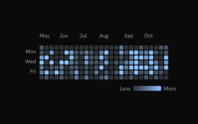
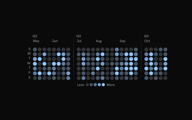
shadcn.io is an independent project built on shadcn/ui
Installation
The command adds the example above to components/charts/ and, the first time, the chart kit to components/ui/charts/. Both are source files in your project from then on: read them, change them, delete what you don't use.
Usage
data is one column per week, each holding its seven days as { bin, count, date }, Sunday first.
<script lang="ts">
import {
  HeatmapCells,
  HeatmapChart,
  type HeatmapColumn,
  HeatmapTooltip,
  HeatmapXAxis,
  HeatmapYAxis,
} from "@/components/ui/charts";

// Commits per day, one array per week, Sunday first.
const weeks = [
  [0, 2, 3, 1, 4, 2, 0],
  [1, 3, 0, 2, 5, 1, 0],
  [0, 4, 2, 3, 2, 0, 1],
  [0, 1, 1, 4, 3, 2, 0],
  [2, 5, 3, 0, 1, 3, 0],
  [0, 2, 4, 2, 6, 1, 0],
];

const data: HeatmapColumn[] = weeks.map((days, week) => ({
  bin: week,
  bins: days.map((count, day) => ({
    bin: day,
    count,
    date: new Date(2026, 8, 6 + week * 7 + day),
  })),
}));

const formatCommits = (count: number) =>
  count === 1 ? "1 commit" : `${count} commits`;
</script>

<HeatmapChart ariaLabel="Commits per day" {data}>
  <HeatmapCells />
  <HeatmapXAxis />
  <HeatmapYAxis />
  <HeatmapTooltip formatLabel={formatCommits} />
</HeatmapChart>
Anatomy
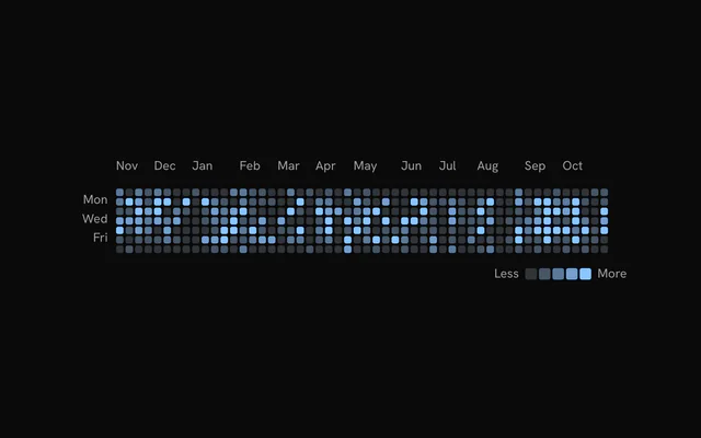
HeatmapCells draws the grid, so a chart without it is empty. The legend sits outside the chart, and HeatmapInteractionProvider is what links the two.
<HeatmapInteractionProvider>
  <HeatmapInteractionBoundary class="flex flex-col gap-3">
    <HeatmapChart {data}>
      <HeatmapCells />
      <HeatmapXAxis />
      <HeatmapYAxis />
      <HeatmapSeparator groupBy="quarter" showLabels />
      <HeatmapTooltip />
    </HeatmapChart>
    <HeatmapLegend />
  </HeatmapInteractionBoundary>
</HeatmapInteractionProvider>HeatmapChart: Sizes the cells to the width and maps each count to a level.HeatmapCells: The day cells, their hover dimming and their keyboard focus.HeatmapXAxis: Month names above the columns.HeatmapYAxis: Weekday names, on every other row unless you settickFilter.HeatmapSeparator: Gaps and lines between groups of columns, such as quarters.HeatmapTooltip: The hovered day's date and count.HeatmapLegend: The Less to More scale, as swatches or one gradient bar.HeatmapInteractionProvider: Shares the hover between the chart and a legend outside it.HeatmapInteractionBoundaryinside it clears the legend's hover when the pointer leaves.
Levels, colors and patterns
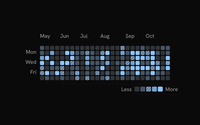
Counts fall into five levels: 0, 1, 2, 3, and 4 or more. levelStyles gives each level a color and, with fillMode: "pattern", a pattern preset such as "diagonal". Pass the same array to HeatmapLegend so its swatches match.
To recolor without patterns, levelColors takes the five colors alone. For a scale of your own, pass colorScale, a function from a count to a color.
Week start and faded rows
weekStartDay={1} starts the grid on Monday. Keep your data Sunday first: only the rows rotate.
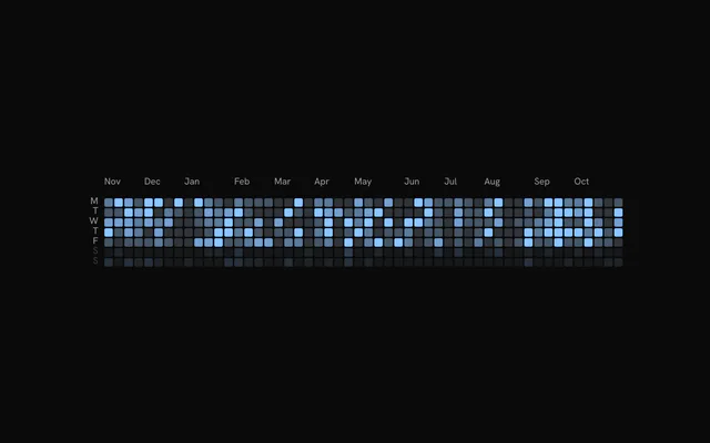
rowOpacity on HeatmapCells takes one opacity per displayed row. Give HeatmapYAxis the same array so the weekend labels fade with their cells.
Quarters and other groups
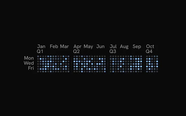
Add <HeatmapSeparator groupBy="quarter" showLabels /> and each calendar quarter opens with a gap, a line and its label. spacing widens the gap, a gradient fades the line's ends and strokeStyle="dashed" dashes it.
For fixed groups instead of quarters, use groupBy="every" with every={4}. The example also sets xDomain to show January to October only.
Linking the legend
Wrap the chart and the legend in HeatmapInteractionProvider. Hovering a day then lights its level's swatch, and hovering a swatch dims every day outside that level.
inactiveOpacity, inactiveScale and activeScale set how far the rest fade and how much the hovered cell grows. Give the cells and the legend the same values. variant="gradient" turns the legend into one bar.
Cell size and scrolling
Cells shrink to fit the width by default. For a fixed size, set binSize in pixels and put the chart in an overflow-x-auto element: a long range then scrolls sideways. layout="fill" goes the other way and grows the cells to fill the parent's height as well.
Many cells
Each cell is an SVG element, so past about 3,000 cells, such as a year of days by hour, pass renderer={canvasRenderer} to <HeatmapCells>. The cells paint on one canvas while the axes, labels, hovered cell and tooltip stay SVG.
On a canvas the cells reveal in one left-to-right sweep, dim together on hover, and can't take pattern fills.
Customization
The kit is in your project, in components/ui/charts/: your framework's components over a shared core/. Change a default there and every chart picks it up.
class goes on the chart's container, so size and spacing are utility classes.
The tooltip's second line says "N contributions" until you pass formatLabel, which gets the count and the date. hideDelay (120 ms) keeps the panel up while the pointer crosses the gap between two cells.
Month, weekday and quarter labels take a text color class through class or labelClassName. For dots instead of squares, set cornerRadius={999} on HeatmapCells and on HeatmapLegend.
<HeatmapTooltip
  formatLabel={(count) => (count === 1 ? "1 deploy" : `${count} deploys`)}
  hideDelay={80}
/>
Loading state
With status="loading" the cells turn into a shimmering skeleton of the same grid, and the pointer is ignored. On "ready" the real cells play in as a wave. loadingLabel puts a line of text over the skeleton.
<HeatmapChartLoading /> is the placeholder on its own. It reads only the shape of data, so pass the weeks you expect with zero counts.
Animation
The cells fade in column by column, a wave that crosses the grid in animationDuration (1100 ms), and each cell settles over 450 ms. enterStaggerScale stretches or tightens the wave, and animationDuration={0} drops it.
Change revealSignature to play the wave again, for example when the reader picks another year. animate={false} turns off the wave and the loading shimmer. With reduced motion the cells appear at once and the tooltip jumps between days instead of gliding.
Theming
Every color in the kit is one of your theme's tokens or a mix of them, except --chart-positive, a fixed green. A preset or the .dark class restyles the chart, and overriding a token in your CSS changes it everywhere.
The five levels default to --chart-scale-01 through --chart-scale-05, which mix --chart-1 into --muted in steps. Change --chart-1 and the whole scale follows it.
| Token | Default | Paints |
|---|---|---|
--chart-scale-01 | --chart-1 at 10% over --muted | the low end of a color scale |
--chart-scale-05 | --chart-1 | the high end of a color scale |
--chart-1 | your theme's | the first series |
--chart-label | --muted-foreground | tick labels |
--chart-tooltip-background | --popover | the tooltip panel |
--chart-tooltip-foreground | --popover-foreground | the tooltip's values |
--chart-tooltip-muted | --muted-foreground | the tooltip's labels |
:root {
  --chart-label: var(--foreground);
  --chart-tooltip-background: var(--card);
}
Accessibility
The chart is an image named by ariaLabel ("Heatmap chart" by default). Put the unit and the range in it, "Commits per day, 2026" rather than "Heatmap", and the takeaway in ariaDescription.
The arrow keys move through the grid the way it reads: left and right by week, up and down by day. They stop at the edges and skip the empty cells before the first day and after the last.
- Tab
- Moves focus to the chart.
- Arrow Right
- Moves to the same weekday in the next week.
- Arrow Left
- Moves to the same weekday in the previous week.
- Arrow Down
- Moves to the next day.
- Arrow Up
- Moves to the previous day.
- Home
- Jumps to the first day.
- End
- Jumps to the last day.
API reference
Svelte takes the same props as React, with class for className. Render props are snippets, listed below by their names. Keep data in $state.raw so the chart sees each new array.
HeatmapChart
dataHeatmapColumn[]
Column data: one entry per week (or category) with the row bins inside.
xDomain?[Date, Date]
Visible time range. Only week columns that overlap the domain are drawn.
sizingColumnCount?number
Week columns to size the cells for while xDomain is set, so the cell size holds while scrubbing the domain (the filtered columns can vary by one at its edges).
layout?"fluid" | "fill"
"fluid": the width drives square cells and the chart height hugs the grid (GitHub style). "fill": the chart takes its parent's height and the square cells grow to the largest size that fits both the width and that height.
- Type
"fluid" | "fill"- Default
"fluid"
margin?Readonly<Partial<HeatmapMargin>>
Chart margins in pixels. Omitted sides keep their default.
- Type
Readonly<Partial<HeatmapMargin>>- Default
{ top: 28, right: 16, bottom: 0, left: 40 }
binSize?number
Fixed cell size in pixels. When 0, cells are square and sized to fit the available width.
- Default
0
gap?number
Gap between cells in pixels.
- Default
2
colorScale?(count: number | null | undefined) => string
Replaces the default level color scale. Receives a count and returns a CSS color.
- Type
(count: number | null | undefined) => string
levelColors?HeatmapLevelColors
Colors for the five levels of the Less to More scale (empty plus four activity levels).
- Default
the `--chart-scale-01` to `--chart-scale-05` CSS variables
levelStyles?HeatmapLevelStyles
Per-level fill styles (color and optional pattern). Takes precedence over levelColors.
aspectRatio?string
CSS aspect ratio of the outer container, for example "2 / 1". Omit to fill the parent.
class?string
Additional class name for the chart container.
status?ChartStatus
Data status. "loading" draws the shimmering skeleton cells.
- Default
"ready"
loadingLabel?string
Centered label shown while status is "loading".
animationDuration?number
Enter animation duration in milliseconds: how long the column wave takes to cross the grid. 0 disables the cell entrance.
- Default
1100
enterTransition?HeatmapEnterTransition
Enter transition of the column wave, as the line chart's reveal reads it: duration (seconds) replaces animationDuration, and a "tween"'s ease (a cubic-bezier tuple or "linear") paces the wavefront. Each cell then settles in over 450 ms.
- Default
undefined (`animationDuration` on the reveal ease, cubic-bezier(0.85, 0, 0.15, 1))
revealSignature?string
Changing this string replays the enter animation.
- Default
""
enterStaggerScale?number
Scales the wave stagger between cells (1 is the default pacing).
- Default
1
animate?boolean
Plays the enter fade-in and the loading shimmer. Set to false for no motion.
- Default
true
loadingOpacity?number
Chart opacity while status is "loading".
- Default
1
showLoadingCells?boolean
Shows the shimmering skeleton cells while loading.
- Default
true
loadingCellMaxOpacity?number
Highest opacity (0 to 1) the loading cells animate toward.
- Default
0.85
loadingCellRandomness?number
Share of cells (0 to 1) that take part in the loading shimmer.
- Default
1
columnSeparators?HeatmapSeparatorParsedConfig
Inserts horizontal gaps between groups of columns. A HeatmapSeparator child overrides it.
weekStartDay?HeatmapWeekStartDay
First row of the grid: 0 is Sunday (GitHub default), 1 Monday, and so on. Rotates the rows for display without reshaping your data.
- Default
0
children?ReactNode
HeatmapCells, HeatmapXAxis, HeatmapYAxis, HeatmapTooltip and HeatmapSeparator configuration children. HeatmapCells is required for the grid to draw.
ariaLabel?string
Accessible name of the chart.
- Default
"Heatmap chart"
ariaDescription?string
Accessible description of the chart. Falls back to the ariaDescription of HeatmapCells.
HeatmapCells
cornerRadius?number
Corner radius of each cell in pixels.
- Default
2
colorScale?(count: number | null | undefined) => string
Overrides the chart color scale for the cells. Receives a count and returns a CSS color.
- Type
(count: number | null | undefined) => string
inactiveOpacity?number
Opacity of the cells that are not highlighted while hovering a cell or a legend level.
- Default
0.3
inactiveScale?number
Scale of the cells that are not highlighted while hovering.
- Default
1
activeScale?number
Scale of the highlighted cell while hovering.
- Default
1
rowOpacity?number | readonly number[]
Opacity per display row (row 0 is the top row after weekStartDay rotation). A single number applies to every row; an array gives one value per row. Pass the same value to HeatmapYAxis to keep labels aligned.
- Type
number | readonly number[]- Default
1
interactive?boolean
Enables pointer hover, dimming, tooltip and keyboard focus on the cells.
- Default
true
hideGhostCells?boolean
Hides the out-of-range cells at the start and end of the grid (GitHub style).
- Default
true
ariaLabel?string
Accessible name of the chart. HeatmapChart ariaLabel takes precedence.
ariaDescription?string
Accessible description of the chart. HeatmapChart ariaDescription takes precedence.
renderer?ChartMarkRenderer
Where the cells draw: "svg", one element per cell, or canvasRenderer, one bitmap, for thousands of cells (the axes, labels, separators, hovered cell and tooltip stay SVG). On a canvas the cells reveal as one left-to-right sweep instead of cell by cell, dim together on hover (inactiveScale doesn't shrink them), skip the fade back to loading, and can't take pattern fills.
- Default
"svg"
HeatmapXAxis
class?string
Additional class name for the month labels, for example "text-foreground" (a color class sets the label color).
HeatmapYAxis
class?string
Additional class name for the weekday labels, for example "text-foreground" (a color class sets the label color).
tickFilter?HeatmapYAxisTickFilter
Which rows get a weekday label: every row, odd rows (Mon, Wed, Fri with a Sunday start) or even rows.
- Default
"odd"
labelFormat?HeatmapYAxisLabelFormat
"full" shows the abbreviated weekday (Mon); "initial" shows its first letter (M).
- Default
"full"
rowOpacity?number | readonly number[]
Opacity per display row for the labels. Pass the same value as HeatmapCells so faded rows and their labels stay aligned.
- Type
number | readonly number[]
HeatmapSeparator
every?number
Inserts a separator before every Nth column when groupBy is "every".
groupBy?HeatmapSeparatorGroupBy
Groups columns by a fixed interval ("every") or by calendar quarter ("quarter").
- Default
"every"
class?string
Additional class name for each separator line.
spacing?number
Extra horizontal gap between column groups in pixels.
- Default
0
paddingY?number
Inset of the line from the bottom of the plot in pixels.
- Default
0
startOffset?number
Distance from the container top to the start of the line in pixels; the quarter labels then sit there too (plus labelOffset). A negative value starts the lines and labels above the chart: leave room for them above it (for example -20 with 20px of padding).
- Default
the top of the plot (the labels sit just above the grid)
labelOffset?number
Distance below the top of the line at which quarter labels sit; 0 aligns them with the line top.
- Default
0
showLabels?boolean
Draws a label at the start of each quarter group.
- Default
false
labelFormat?(quarter: number, startDate: Readonly<Date>) => string
Formats the quarter labels. Receives the quarter (1 to 4) and the start date of the group.
- Type
(quarter: number, startDate: Readonly<Date>) => string- Default
`Q{ n }`
labelClassName?string
Additional class name for the quarter labels, for example "text-foreground" (a color class sets the label color).
strokeStyle?HeatmapSeparatorStrokeStyle
Solid or dashed line.
- Default
"solid"
strokeDasharray?string
Dash pattern used when strokeStyle is "dashed".
- Default
"4,4"
stroke?string
Line color, used when gradient is omitted.
- Default
"var(--bkm-border)"
gradient?Readonly<HeatmapSeparatorGradient>
Vertical gradient along each line, for fading the ends. Omit for a flat stroke.
- Type
Readonly<HeatmapSeparatorGradient>
strokeWidth?number
Line width in pixels.
- Default
1
strokeOpacity?number
Opacity multiplier for a solid stroke or for the gradient stops.
- Default
1
HeatmapTooltip
formatLabel?(count: number, date: Readonly<Date>) => string
Custom text for the contribution line of the tooltip. Receives the count and the cell date.
- Type
(count: number, date: Readonly<Date>) => string- Default
`N contribution(s)`
class?string
Additional class name for the tooltip panel.
panelStyle?Readonly<CSSProperties>
Inline styles for the tooltip panel.
- Type
Readonly<CSSProperties>
backgroundColor?string
Background of the tooltip panel (a CSS color or variable).
instant?boolean
Shows and hides the tooltip without enter or exit motion; the hide is still held for hideDelay.
- Default
false
showDelay?number
Delay in milliseconds before the tooltip first appears. Moving between cells updates it immediately.
- Default
0
hideDelay?number
Hold in milliseconds after the pointer leaves a cell before the tooltip hides. Reduces flicker between adjacent cells. The hold lasts at least as long as the follow spring takes to settle.
- Default
120
damping?number
Damping of the spring the panel follows the hovered cell with, on the same scale as ChartTooltip's. 0 snaps between cells.
- Default
20
springConfig?SpringConfig
An explicit follow spring (stiffness, damping) for the panel; takes precedence over damping.
HeatmapLegend
lessLabel?string
Label before the swatches.
- Default
"Less"
moreLabel?string
Label after the swatches.
- Default
"More"
cellSize?number
Swatch size in pixels.
- Default
11
gap?number
Gap between swatches in pixels.
- Default
2
cornerRadius?number
Corner radius of the swatches in pixels.
- Default
2
align?"start" | "center" | "end"
Horizontal alignment of the legend.
- Type
"start" | "center" | "end"- Default
"end"
variant?HeatmapLegendVariant
Discrete swatches or a continuous gradient bar. The gradient uses solid colors only; patterns are ignored.
- Default
"swatches"
gradientSpan?number
Width of the gradient bar in swatch units when variant is "gradient".
- Default
5
fontSize?number
Font size in pixels of the Less and More labels.
- Default
12
labelClassName?string
Additional class name for the Less and More labels.
levelStyles?HeatmapLevelStyles
Level colors and patterns. Pass the same value as the chart so swatches match the cells.
colorScale?(count: number | null | undefined) => string
Color scale used when levelStyles is omitted.
- Type
(count: number | null | undefined) => string- Default
the default level colors
inactiveOpacity?number
Opacity of the swatches that are not highlighted while hovering.
- Default
0.3
inactiveScale?number
Scale of the swatches that are not highlighted while hovering.
- Default
1
activeScale?number
Scale of the highlighted swatch while hovering.
- Default
1
interactive?boolean
Syncs the swatch dimming with the chart hover.
- Default
true inside a HeatmapInteractionProvider, false otherwise
class?string
Additional class name for the legend container.
HeatmapInteractionProvider
childrenReactNodecoordinator?HeatmapHoverCoordinatorHeatmapChartLoading
dataHeatmapColumn[]
Target column data. Only its shape is used to size the skeleton grid; counts are zeroed.
xDomain?[Date, Date]
Visible time range. Only week columns that overlap the domain are drawn.
margin?Readonly<Partial<HeatmapMargin>>
Chart margins in pixels. Omitted sides keep their default.
- Type
Readonly<Partial<HeatmapMargin>>- Default
{ top: 28, right: 16, bottom: 0, left: 40 }
gap?number
Gap between cells in pixels.
- Default
2
cornerRadius?number
Corner radius of each cell in pixels.
- Default
2
label?string
Centered shimmer label.
- Default
"Loading"
class?string
Additional class name for the container.
- Default
""
Examples
11 examples on Svelte, each live with its code and its own install command.