shadcn.io is an independent project built on shadcn/ui
Installation
The command adds the example above to components/charts/ and, the first time, the chart kit to components/ui/charts/. Both are source files in your project from then on: read them, change them, delete what you don't use.
Usage
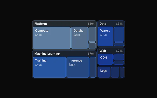
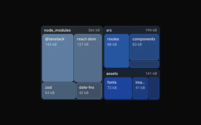
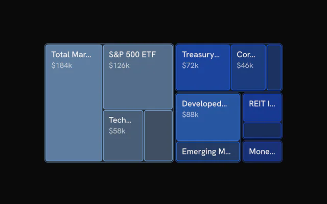
data is the root node. A leaf has a value, a branch has children, and a branch's size is what its leaves add up to.
<script lang="ts">
import {
  ChartTooltip,
  TreemapChart,
  TreemapLabels,
  type TreemapNode,
} from "@/components/ui/charts";

const data: TreemapNode = {
  name: "Storage",
  children: [
    {
      name: "Media",
      children: [
        { name: "Images", value: 412 },
        { name: "Video", value: 1280 },
      ],
    },
    {
      name: "Backups",
      children: [
        { name: "Daily", value: 860 },
        { name: "Weekly", value: 540 },
      ],
    },
    {
      name: "Logs",
      children: [
        { name: "App", value: 230 },
        { name: "Audit", value: 95 },
      ],
    },
  ],
};

const formatGigabytes = (value: number) => `${value} GB`;
</script>

<TreemapChart
  ariaLabel="Storage by bucket"
  {data}
  formatValue={formatGigabytes}
  valueLabel="Stored"
>
  <TreemapLabels />
  <ChartTooltip />
</TreemapChart>
Anatomy
TreemapChart does the tiling and the drawing. Both children are optional: without TreemapLabels the cells are bare, and without ChartTooltip hovering only dims the rest.
<TreemapChart {data} formatValue={formatGigabytes} valueLabel="Stored">
  <TreemapLabels />
  <ChartTooltip />
</TreemapChart>TreemapChart: Tiles the hierarchy, colors each top-level branch and handles the drill-down.TreemapLabels: Names and values inside the cells, and a header strip naming each branch.ChartTooltip: The hovered cell's path, value and share of what's shown.
Drilling down
depth sets how many levels show at once, 2 by default. Deeper levels fold into their parent's cell until you click it or focus it and press Enter.
onDrillChange gets the path you're at, [] at the top, which the example writes into its footer. drillDown={false} turns zooming off.
Tiling and labels
tile picks the layout. "squarify" keeps cells close to square, "binary" balances them, and "slice-dice" alternates rows and columns by level. gap (3 px) and radius (6 px) set the spacing and the corners.
<TreemapLabels showHeaders={false} /> drops the branch headers for a flat look. Labels that don't fit their cell are left out, and minWidth (36 px) sets how much room one needs.
Customization
The kit is in your project, in components/ui/charts/: your framework's components over a shared core/. Change a default there and every chart picks it up.
class goes on the chart's container, so size and spacing are utility classes.
content on ChartTooltip replaces the panel. Its point has the cell's name, path, group, value, share and color, and whether it's a branch you can zoom into.
Each top-level branch gets one color, from colors or --chart-1 to --chart-5 in order, and its cells are tints of it, stronger as they get larger. Set color on a node to change it for that node and everything under it.
<ChartTooltip>
  {#snippet content({ point })}
    <TooltipBox>
      <div class="grid gap-1 px-3 py-2 text-sm">
        <span class="font-medium">{String(point.name)}</span>
        <span class="text-muted-foreground">
          {Math.round(Number(point.share) * 100)}% of storage
        </span>
      </div>
    </TooltipBox>
  {/snippet}
</ChartTooltip>
Where a part renders content of its own, you pass it in. In Svelte:
ChartTooltip:{#snippet content({ point, index })}
Loading state
With status="loading" the chart draws shimmering muted tiles, one group per branch in data when it has one, and ignores the pointer. On "ready" the cells pop in, and going back to "loading" fades the chart out first.
With nothing to pass yet, render <TreemapChartLoading /> in the chart's place.
Animation
Cells pop in on a spring, in a diagonal sweep from the top-left corner. Zooming in or out moves the cells you keep to their new rectangles rather than redrawing them.
animate={false} skips the entrance. With reduced motion there's no entrance either, and a zoom jumps straight to its layout.
Theming
Every color in the kit is one of your theme's tokens or a mix of them, except --chart-positive, a fixed green. A preset or the .dark class restyles the chart, and overriding a token in your CSS changes it everywhere.
The breadcrumb's strip uses --chart-segment-background, and the labels inside the cells use the tooltip's text color so they read on both themes.
| Token | Default | Paints |
|---|---|---|
--chart-1 | your theme's | the first series |
--chart-2 | your theme's | the second series |
--chart-3 | your theme's | the third series |
--chart-4 | your theme's | the fourth series |
--chart-5 | your theme's | the fifth series |
--chart-segment-background | --muted-foreground at 8% | a selected range |
--chart-tooltip-foreground | --popover-foreground | the tooltip's values |
:root {
  --chart-label: var(--foreground);
}
Accessibility
The chart is an image named by ariaLabel, "Treemap of" and the root's name unless you pass one. With a ChartTooltip, each cell the keyboard reaches shows its panel, path and share included.
The arrow keys visit the branches, then the cells inside them, starting with the breadcrumb once you've zoomed in. Enter on a branch zooms into it, and Enter on the breadcrumb zooms back out.
- Tab
- Moves focus to the chart.
- Arrow Right
- Moves to the next cell. ArrowDown does the same.
- Arrow Left
- Moves to the previous cell. ArrowUp does the same.
- Home
- Jumps to the first cell.
- End
- Jumps to the last cell.
- Enter
- Zooms into the focused branch, or out from the breadcrumb. Space does the same.
API reference
Svelte takes the same props as React, with class for className. Render props are snippets, listed below by their names. Keep data in $state.raw so the chart sees each new array.
TreemapChart
dataTreemapNode
The hierarchy's root; its children are the top-level branches.
aspectRatio?string | number
Width over height: a number or a string such as "16 / 9".
- Type
string | number- Default
"16 / 9"
height?number
A fixed height in px instead of an aspect ratio.
depth?number
How many levels below the shown root are drawn; deeper ones fold into their ancestor's cell (drill in to see them).
- Default
2
gap?number
Gap between cells, in px.
- Default
3
radius?number
Corner radius of the cells, in px.
- Default
6
tile?"squarify" | "binary" | "slice-dice"
The tiling: "squarify" keeps cells near square, "binary" balances them, "slice-dice" alternates rows and columns by depth.
- Type
"squarify" | "binary" | "slice-dice"- Default
"squarify"
colors?readonly string[]
Colours of the top-level branches, in order (cycled). Defaults to --chart-1 … --chart-5.
drillDown?boolean
Click (or Enter on) a branch to zoom into it; the breadcrumb at the top zooms back out.
- Default
true
formatValue?(value: number) => string
Formats a value in labels and the tooltip.
- Type
(value: number) => string
valueLabel?string
The value's name in the tooltip.
- Default
"Value"
animate?boolean
Play the entrance.
- Default
true
status?ChartStatus
"loading" draws a shimmering skeleton (muted tiles) in place of the chart and ignores the pointer; switching to "ready" plays the entrance. Switching back to "loading" fades the chart out first.
- Default
"ready"
loadingLabel?string
Text shown centered over the plot, with a shimmer, while status is "loading". Nothing is shown when it is unset or empty.
onDrillChange?(path: readonly string[]) => void
Called with the shown root's path when a drill-down changes it ([] at the top).
- Type
(path: readonly string[]) => void
ariaLabel?stringariaDescription?stringclass?string
Extra class name for the chart's root element.
style?CSSProperties
Inline style for the chart's root element.
children?ReactNode
Carriers: ChartTooltip and the family's own.
TreemapLabels
showValues?boolean
Show each cell's value under its name.
- Default
true
showHeaders?boolean
Name each branch in a header strip above its cells.
- Default
true
minWidth?number
Hide a label narrower than this many px of room.
- Default
36
ChartTooltip
showDatePill?boolean
Show the date pill that rides along the bottom of the plot.
- Default
true
showCrosshair?boolean
Show the vertical crosshair line. Bar charts leave it off unless this is true (the dots and the category pill mark the bar).
- Default
true
showDots?boolean
Show a dot on every series at the hovered position.
- Default
true
dotVariant?"dot" | "ring"
Dot style: a filled "dot" or a transparent "ring" square. Read by BarChart only.
- Type
"dot" | "ring"- Default
"dot"
dotSize?number
Dot radius in px.
- Default
5
dotRadiusFraction?number
Corner radius of the "ring" variant as a fraction of its side (0 is square, 0.5 is a circle). Read by BarChart only.
- Default
0.25
dotScale?number
Multiplier applied to the dot or ring size. Read by BarChart and LiveLineChart.
- Default
1
dotStrokeWidth?number
Stroke width of the dots in px.
- Default
2
indicatorColor?string | ((point: Record<string, unknown>) => string)
Color of the crosshair. Only a string is applied; the function form that bklit-ui accepts is ignored and the default is used.
- Type
string | ((point: Record<string, unknown>) => string)- Default
"var(--chart-crosshair)"
content?Snippet<[{ point, index }]>
Replaces the default tooltip panel body. Receives the hovered data row and its index; with pinnable, also whether the panel is pinned and a dismiss that unpins it (for a close button in a pinned panel's detail).
- Type
Snippet<[{ point, index }]>
pinnable?boolean
A click (or Enter, or Space) on the chart pins the tooltip where it is: the panel takes the pointer, so its content can grow into detail and hold controls, until another click, Escape or dismiss lets it go.
- Default
false
rows?(point: Record<string, unknown>) => { readonly color: string; readonly label: string; readonly value: string | number }[]
Replaces the default rows (one per series) with your own list of { color, label, value }.
- Type
(point: Record<string, unknown>) => { readonly color: string; readonly label: string; readonly value: string | number }[]
dotColor?string | ((point: Record<string, unknown>, line: ChartLineConfig) => string)
Fill of the tooltip dots. A function receives the hovered row and the series config, and is called again each time the hovered row changes. Defaults to each series' color; a ProfitLossLine's dot takes the color of the hovered value's sign.
- Type
string | ((point: Record<string, unknown>, line: ChartLineConfig) => string)
children?Snippet
Extra content rendered below the rows in the default panel, for example marker details. Without it, a chart with ChartMarkers lists the markers on the hovered date there.
class?string
Extra class name for the tooltip panel.
springConfig?SpringConfig
Spring for the floating panel when matchCrosshair is on. Defaults to the chart's tooltip spring.
matchCrosshair?boolean
Make the floating panel follow the pointer with the same spring as the crosshair instead of damping.
- Default
false
damping?number
Spring damping for the floating panel when matchCrosshair is off, on bklit's 0 to 100 scale: lower is bouncier, higher slower, 0 moves the panel instantly. The default, 20, is the snappy hover spring (stiffness 3600, damping 120); every other value is bklit's spring for it played six times faster.
- Default
20
indicatorDasharray?string
Dash pattern of the crosshair. Omit for a solid line.
indicatorFadeEdges?IndicatorFadeEdges
Vertical fade of the crosshair: both ends, the top, the bottom, or none (solid).
- Default
"both"
indicatorFadeLength?number
Size of the crosshair's fade, as a percentage of its height (2 to 40).
- Default
10
indicatorEndColor?string
Bottom colour of the crosshair: it ramps from indicatorColor at the top to this at the bottom (composes with the fade).
indicatorEnd?"plot" | "point"
How far down the crosshair reaches: the whole plot, or down to the hovered point of the first series.
- Type
"plot" | "point"- Default
"plot"
dotHaloBlur?number
Blur in px on the dots' halo, for a soft glow.
- Default
0
topOffset?number
Extra gap in px between the top of the plot and the tooltip panel.
- Default
0
dateLabels?readonly string[]
The date pill's text for each data row, in row order (pair it with XAxis labels).
boxSpringConfig?SpringConfig
Spring for the floating panel. Takes priority over matchCrosshair and damping.
indicatorWidth?IndicatorWidth
Thickness of the crosshair: a width in px, or "line" (1px), "thin" (2px), "medium" (4px) or "thick" (8px).
- Default
"line"
TreemapChartLoading
aspectRatio?string | number
Width over height: a number or a string such as "2 / 1". Defaults to the chart's own.
- Type
string | number
height?number
A fixed height in px instead of an aspect ratio.
label?string
Text shown centered over the skeleton, with a shimmer. Nothing is shown when it is unset or empty.
class?string
Extra CSS class name for the placeholder's root element.
- Default
""
Examples
4 examples on Svelte, each live with its code and its own install command.