BMW Design System
Corporate Blue #1c69d4 on every CTA, BMW Type Next Latin at 700 and 300, 0px corners and 26 components. BMW's look for React and AI tools.
- Primary color
- #1c69d4
- Typeface
- BMW Type Next Latin
- Shape
- Sharp
- Base radius
- 8px
- Colors
- 25
- Type tokens
- 13
- Components
- 26
- Spacing values
- 8
About BMW DESIGN.md
Curated by Dov Azencot, updated May 12, 2026. Source bmw.com (opens in a new tab).
BMW's corporate design system reads like the brand itself: measured, engineered, and quietly confident. One brand action color (Corporate Blue, #1c69d4). One licensed typeface (BMW Type Next Latin). One radius for everything interactive (0px — rectangular). The atmosphere is light cream-tinted white, broken only by deep navy #1a2129 hero bands that frame model photography. Where Apple softens and Airbnb rounds, BMW squares off — the corporate dialect distinct from BMW M's motorsport-bombastic cousin.
This page packages the spec into a single DESIGN.md file. Inside: 25 colors, 14 typography styles, 7 corner radii, 8 spacing tokens, and 26 components — every primitive needed to build a configurator, an inventory grid, or a marketing band that reads BMW corporate rather than generic luxury automotive. The 700/300 weight contrast is the editorial signature; weight 500 is deliberately absent from the scale.
Feed the file to Claude, Cursor, or GitHub Copilot and the AI writes React components and Tailwind classes that match BMW's restraint — rectangular buttons, photography-driven depth, 80px section rhythm, the M tricolor stripe scoped strictly to motorsport contexts. Or treat it as a reference sheet for your own dealer flow, model showcase, or reservation funnel.
What makes it distinct
5 highlights
- Single brand voltageBMW Corporate Blue (#1c69d4) carries every primary CTA; press shifts to #0653b6, never paired with a second accent
- Two-weight typographic signatureBMW Type Next Latin at 700 display vs 300 Light body, with weight 500 deliberately absent from the scale
- Rectangular dialectEvery button, card, input, and configurator chip uses {rounded.none} 0px corners; only icon buttons go circular
- Photography-driven depthNo drop shadows anywhere; hierarchy comes from light canvas alternating with dark navy (#1a2129) hero bands at 80px section rhythm
- M tricolor stripe scoped tight#0066b1 → #1c69d4 → #e22718 appears only on M-model pages and motorsport dividers, never as a CTA fill
Live at bmw.com
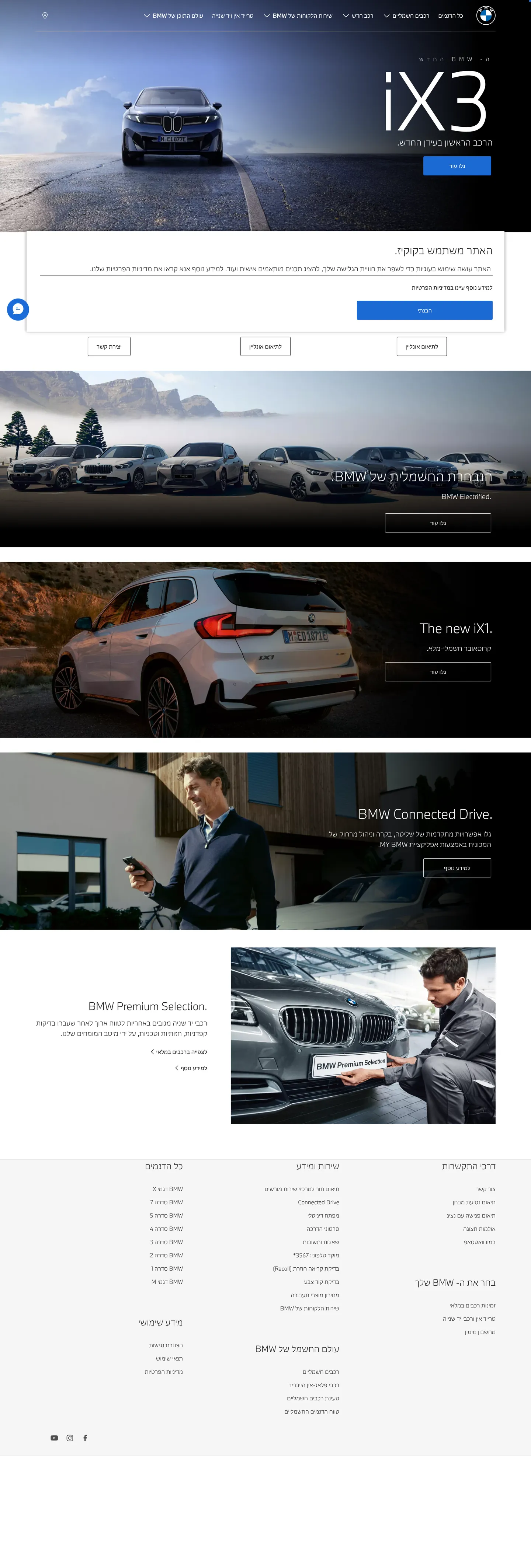
BMW in production, as captured. Scroll the window to see the whole page.
25 colors
BMW's system runs on #1c69d4 as its primary voltage, used in 1 of 26 components. Type is set in BMW Type Next Latin across 13 tokens from 12px to 64px, weights 300–700. Shape language is sharp — components average 0px corner radius, favoring crisp rectangles.
Brand & Accent
Sparing, CTA-only voltage · 3
Surface
Page and card backgrounds · 6
Text
Headlines, body, captions · 8
Borders & Hairlines
Dividers, outlines, rules · 2
Semantic
Status, errors, success, links · 3
Other
Specialty colors · 3
13 type tokens
Set in BMW Type Next Latin across 13 tokens, from 12px to 64px, weights 300–700. Shown in its own stack: where the font isn't installed, the fallback the file names stands in.
- display-xl64px · weight 700 · lh 1.05The quick brown fox jumps over the lazy dog
- display-lg48px · weight 700 · lh 1.1The quick brown fox jumps over the lazy dog
- display-md32px · weight 700 · lh 1.15The quick brown fox jumps over the lazy dog
- display-sm24px · weight 700 · lh 1.25The quick brown fox jumps over the lazy dog
- title-lg20px · weight 700 · lh 1.3The quick brown fox jumps over the lazy dog
- title-md18px · weight 700 · lh 1.4The quick brown fox jumps over the lazy dog
- title-sm16px · weight 700 · lh 1.4The quick brown fox jumps over the lazy dog
- body-md16px · weight 300 · lh 1.55The quick brown fox jumps over the lazy dog
- body-sm14px · weight 300 · lh 1.55The quick brown fox jumps over the lazy dog
- caption12px · weight 400 · lh 1.4 · tracking 0.5pxThe quick brown fox jumps over the lazy dog
- label-uppercase13px · weight 700 · lh 1.3 · tracking 1.5pxThe quick brown fox jumps over the lazy dog
- button14px · weight 700 · lh 1 · tracking 0.5pxThe quick brown fox jumps over the lazy dog
- nav-link14px · weight 400 · lh 1.4 · tracking 0.3pxThe quick brown fox jumps over the lazy dog
Radii and spacing
7 corner radii and 8 spacing values. Shape language: sharp, on a 8px base radius.
Radii7
- none0px
- xs2px
- sm4px
- md8px
- lg12px
- pill9999px
- full9999px
Spacing8
- xxs4px
- xs8px
- sm12px
- md16px
- lg24px
- xl32px
- xxl48px
- section80px
26 components
Each rendered from its tokens (color, type, radius, padding) on BMW's own canvas.
- Top NavTop Navtop-nav
- Button PrimaryButton Primarybutton-primary
- Button Primary ActiveButton Primary Activebutton-primary-active
- Button Primary DisabledButton Primary Disabledbutton-primary-disabled
- Button SecondaryButton Secondarybutton-secondary
- Button Secondary On DarkButton Secondary On Darkbutton-secondary-on-dark
- Button Text LinkButton Text Linkbutton-text-link
- Text LinkText Linktext-link
- Hero Band DarkHero Band Darkhero-band-dark
- Hero Photo BandHero Photo Bandhero-photo-band
- Model CardModel Cardmodel-card
- Model Card PhotoModel Card Photomodel-card-photo
- Feature Photo CardFeature Photo Cardfeature-photo-card
- Spec CellSpec Cellspec-cell
- Inventory CardInventory Cardinventory-card
- Filter ChipFilter Chipfilter-chip
- Filter Chip ActiveFilter Chip Activefilter-chip-active
- Configurator Option TileConfigurator Option Tileconfigurator-option-tile
- Configurator Option Tile SelectedConfigurator Option Tile Selectedconfigurator-option-tile-selected
- Type here…Text Inputtext-input
- Cookie Consent CardCookie Consent Cardcookie-consent-card
- Category TabCategory Tabcategory-tab
- Category Tab ActiveCategory Tab Activecategory-tab-active
- M Stripe DividerM Stripe Dividerm-stripe-divider
- Cta Band PhotoCta Band Photocta-band-photo
- FooterFooterfooter
The system, in use
BMW's tokens on the kind of product it builds.
Engineered for every road ahead
The performance, comfort and technology that make every drive feel new.
BMW design system FAQ
BMW's tokens, its components and how to use this DESIGN.md in your project.
Related reading
Specs, directories and component libraries that pair with this design system.
Use BMW in your project
One machine-readable file. Drop it into Claude Code, Cursor, VS Code or any AI tool that reads DESIGN.md.
Download the DESIGN.md
One machine-readable file: every color, type, radius, spacing, and component token of BMW.
Feed it to your AI tool
Drop it into Claude, Cursor, or GitHub Copilot. The agent writes React components and Tailwind classes that match BMW's visual language.
Reference the tokens directly
Or paste the values into your Tailwind config, CSS variables, or component library: every color, size and radius is a quoted, ready-to-copy value.
Read the full DESIGN.md overview, rationale, do’s and don’ts
Overview
BMW's corporate site carries a far more measured, corporate-automotive interface than its motorsport-bombastic cousin BMW M. The atmosphere is light: {colors.canvas} (#ffffff) is the base surface, {colors.surface-card} (#fafafa) carries the soft-grey card plates, and dark navy {colors.surface-dark} (#1a2129) appears only inside hero bands — one per page, framing the lead model render.
Type runs BMW's licensed BMW Type Next Latin at two weights: heavy 700 (display + button + nav) and Light 300 (body + secondary copy). That contrast — heavy display next to thin paragraph — is the editorial signature, channeling the brand's "European-engineered" voice. Weight 500 is deliberately absent; weight 400 only appears on caption and nav-link in neutral utility contexts.
The brand action color, BMW corporate blue ({colors.primary} — #1c69d4), works alone across every primary CTA — buttons are rectangular, 0px corner, with white type. The site rotates a blue-button + dark-navy-hero combination across page rhythm. The M tricolor stripe ({colors.m-blue-light} → {colors.m-blue-dark} → {colors.m-red}) only appears in motorsport contexts and as M-model badges/dividers — never in the corporate site's main language.
The configuration and reservation flows add a dealer-side inventory UI on top of the same system — filter chips, model cards, price tables — but typography and color stay identical; only density goes up.
Key Characteristics:
- Light
{colors.canvas}is the base surface; dark navy{colors.surface-dark}appears only inside hero bands — page rhythm relies on contrast. - BMW corporate blue (
{colors.primary}— #1c69d4) acts as the single primary action color. - BMW Type Next Latin: weight 700 display against weight 300 body is the signature.
- Buttons are rectangular, 0px radius — corporate dialect, distinct from M's sportier radii.
- Model cards run as 4-up or 5-up grids with no hairline border or only minimal border — just white plate + photo + title.
- Photography (model renders) sits in environment, no shadow — depth comes entirely from color-block contrast.
- M tricolor stripe appears only in M-model contexts — not part of the corporate language.
- Section rhythm holds at
{spacing.section}(80px) for every major band.
Colors
Brand & Accent
- BMW Blue (Primary) (
{colors.primary}— #1c69d4): The single brand action color. All primary CTAs, "Learn More" link prefixes (blue text), nav-link active state. Press shifts to{colors.primary-active}(#0653b6). - M Blue Light (
{colors.m-blue-light}— #0066b1) + M Blue Dark ({colors.m-blue-dark}— #1c69d4) + M Red ({colors.m-red}— #e22718): The M tricolor stripe — appears on the corporate site only on M-model pages and the "M" badge. Never as CTA colors.
Surface
- Canvas (
{colors.canvas}— #ffffff): The default page surface. - Surface Soft (
{colors.surface-soft}— #f7f7f7): Soft grey for the footer and sub-navigation bands. - Surface Card (
{colors.surface-card}— #fafafa): The light plate behind a model card's photo block. - Surface Strong (
{colors.surface-strong}— #ebebeb): A slightly heavier grey used as a section divider. - Surface Dark (
{colors.surface-dark}— #1a2129): Dark navy for hero bands and large dark CTAs. Not pure black — carries a warm undertone. - Surface Dark Elevated (
{colors.surface-dark-elevated}— #262e38): One step lighter, used for nested cards on top of the dark hero.
Hairlines
- Hairline (
{colors.hairline}— #e6e6e6): The 1px divider — input outline, configurator card outline, table separator. - Hairline Strong (
{colors.hairline-strong}— #cccccc): A more visible 1px outline — disabled secondary buttons, emphasized table border.
Text
- Ink (
{colors.ink}— #262626): All display and primary text. Not pure black — soft against photography. - Body (
{colors.body}— #3c3c3c): Default running text. - Body Strong (
{colors.body-strong}— #1a1a1a): Emphasized paragraphs and lead text. - Muted (
{colors.muted}— #6b6b6b): Footer links, breadcrumbs, captions. - Muted Soft (
{colors.muted-soft}— #9a9a9a): Disabled text, fine-print legal. - On Primary (
{colors.on-primary}— #ffffff): White text on a blue button. - On Dark (
{colors.on-dark}— #ffffff): White text on a dark hero band. - On Dark Soft (
{colors.on-dark-soft}— #bbbbbb): A slightly muted white for secondary text on dark bands.
Semantic
- Success (
{colors.success}— #22c55e): Confirmation messages and "available" indicators. - Warning (
{colors.warning}— #f59e0b): Warning callouts. - Error (
{colors.error}— #dc2626): Validation errors.
Typography
Font Family
The system runs BMW Type Next Latin in two cuts: regular (display + UI labels) and BMW Type Next Latin Light (body + secondary copy). Fallback stack: system-ui, -apple-system, BlinkMacSystemFont, "Segoe UI", Roboto, sans-serif.
The display/body split is functional:
- BMW Type Next Latin (700) → display headlines, button labels, nav links
- BMW Type Next Latin Light (300) → paragraphs, descriptive copy
- BMW Type Next Latin (400) → caption, neutral nav-link contexts
This three-way split mirrors BMW M's — corporate and the M sub-brand share the same typographic DNA; only the weight/size ratios differ.
Hierarchy
| Token | Size | Weight | Line Height | Letter Spacing | Use |
|---|---|---|---|---|---|
{typography.display-xl} | 64px | 700 | 1.05 | 0 | Hero h1 ("iX3", model name) |
{typography.display-lg} | 48px | 700 | 1.1 | 0 | Section heads |
{typography.display-md} | 32px | 700 | 1.15 | 0 | Sub-section heads |
{typography.display-sm} | 24px | 700 | 1.25 | 0 | CTA-band headlines |
{typography.title-lg} | 20px | 700 | 1.3 | 0 | Card group titles |
{typography.title-md} | 18px | 700 | 1.4 | 0 | Model card title, intro paragraphs |
{typography.title-sm} | 16px | 700 | 1.4 | 0 | Inventory card title, list label |
{typography.body-md} | 16px | 300 (Light) | 1.55 | 0 | Default body — BMW Type Next Latin Light |
{typography.body-sm} | 14px | 300 (Light) | 1.55 | 0 | Footer body, fine-print |
{typography.caption} | 12px | 400 | 1.4 | 0.5px | Photo captions, meta |
{typography.label-uppercase} | 13px | 700 | 1.3 | 1.5px | "LEARN MORE" inline links, category tabs |
{typography.button} | 14px | 700 | 1.0 | 0.5px | Standard CTA button label |
{typography.nav-link} | 14px | 400 | 1.4 | 0.3px | Top-nav menu items |
Principles
- The 700/300 contrast is the editorial signature. Weight 500 is absent from the system.
- No negative letter-spacing — BMW Type Next Latin works on a wide body, so tracking stays at default. Apple/Cal.com-style tightening reads off-brand here.
- UPPERCASE inline links — "LEARN MORE"-style CTAs run uppercase with 1.5px tracking. The "machined precision" voice.
- Weight 400 lives in a narrow lane — only caption and nav-link, both neutral utility roles.
Note on Font Substitutes
BMW Type Next Latin is a licensed BMW typeface. Open-source alternatives:
- Inter (variable) — close match at weight 700/300. Leave letter-spacing at 0.0em.
- Saira Condensed — for a slightly more compressed BMW Type feel.
Layout
Spacing System
- Base unit: 8px.
- Tokens:
{spacing.xxs}4px ·{spacing.xs}8px ·{spacing.sm}12px ·{spacing.md}16px ·{spacing.lg}24px ·{spacing.xl}32px ·{spacing.xxl}48px ·{spacing.section}80px. - Section padding:
{spacing.section}(80px) for every major editorial band. - Card internal padding:
{spacing.lg}(24px) for model and feature cards.
Grid & Container
- Max content width: ~1440px center-aligned.
- Editorial body: A single 12-column grid.
- Model card grids: 4-up or 5-up at desktop, 2-up at tablet, 1-up on mobile.
- Configurator inventory grids: 3-up filter row + 4-up vehicle cards, dense layout.
Whitespace Philosophy
BMW's whitespace strategy is tighter than BMW M's motorsport-aerated grenadier — the corporate side is more utility-driven. Section rhythm is 80px (not M's 96px). Card padding is 24px (not M's 32px). The page is denser, more dealership-functional.
Elevation & Depth
| Level | Treatment | Use |
|---|---|---|
| Flat | No shadow, no border | Body, top nav, footer, hero bands |
| Soft hairline | 1px {colors.hairline} border | Configurator option tile, table divider |
| Card surface | {colors.surface-card} background — no shadow | Model card photo plate |
| Photographic | Edge-to-edge photography | Hero band, model renders |
The system never uses a drop shadow. Depth comes entirely from (a) color-block contrast (light canvas vs dark hero) and (b) photographic subject + lighting.
Decorative Depth
m-stripe-divider— a 4px-tall horizontal tricolor stripe ({colors.m-blue-light}→{colors.m-blue-dark}→{colors.m-red}). Only in M-model contexts, motorsport badges, or as an M-related section divider. Not part of the main corporate flow.- Photographic depth — full-bleed vehicle photography (lighting + subject) does the work chrome would otherwise do.
Shapes
Border Radius Scale
| Token | Value | Use |
|---|---|---|
{rounded.none} | 0px | Every button, card, input, configurator chip — the dominant radius |
{rounded.xs} | 2px | Very small badges, very rare |
{rounded.sm} | 4px | Small inline button (rare) |
{rounded.md} | 8px | Mobile-only collapse cards (rare) |
{rounded.lg} | 12px | Very rare — modal/dialog corners |
{rounded.pill} | 9999px | Filter chips in some contexts (rare) |
{rounded.full} | 9999px / 50% | Avatar, circular icon button |
The radius hierarchy is binary: rectangular for everything, circular only for icon buttons. A clear departure from the soft-cornered SaaS dialect of Apple or Cal.com — closer to BMW corporate-automotive's "engineered precision" voice.
Photography Geometry
- Hero photography is full-bleed at 16:9 or 21:9 cinematic ratio.
- Model card photos sit at 16:10, edge-to-edge with
{rounded.none}corners. - Configurator vehicle renders sit on a white studio background, full silhouette visible.
Components
Top Navigation
top-nav — A white sticky nav bar pinned to the top of the page. 64px tall, {colors.canvas} background. Left: BMW circular badge logo; center: primary horizontal menu (Models, Next Generation, Pre-Owned, Dealers, Test Drive); right: cart icon, language picker, profile. Menu items render in {typography.nav-link} (14px / 400 / 0.3px tracking).
Buttons
button-primary — The signature primary CTA. Background {colors.primary} (BMW Blue #1c69d4), text {colors.on-primary}, type {typography.button} (BMW Type Next Latin 14px / 700 / 0.5px tracking), padding 14px × 32px, height 48px, rounded {rounded.none} (0px — rectangular). Press state: button-primary-active shifts to {colors.primary-active}.
button-secondary — A white button with a hairline outline. Background {colors.canvas}, text {colors.ink}, 1px {colors.hairline-strong} border, same padding + height + radius.
button-secondary-on-dark — Used over a dark hero band. Background transparent, text {colors.on-dark}, 1px {colors.on-dark} border, same rectangular shape.
button-text-link — An inline UPPERCASE letter-spaced link. No background, text {colors.ink}, type {typography.label-uppercase} (13px / 700 / 1.5px tracking). Reads as "LEARN MORE", terminated by a › chevron.
text-link — An inline link inside body copy. {colors.ink} text, no underline by default; underlines per context.
Cards & Containers
hero-band-dark — Full-width dark navy hero. Background {colors.surface-dark}, text {colors.on-dark}, vertical padding {spacing.section} (80px). Centered: model name in {typography.display-xl} (64px / 700) + sub-headline + vehicle render (right-aligned or below). A single {component.button-primary} (blue) or {component.button-secondary-on-dark}.
hero-photo-band — A light-canvas model showcase band. Background {colors.canvas}, text {colors.ink}. The vehicle render takes the wide area; right or below, a headline + two link CTAs + sub-tagline.
model-card — Used in 4-up or 5-up model card grids on the homepage ("BMW iX3", "BMW iX", "BMW 5 Series"). Background {colors.canvas}, rounded {rounded.none}, padding {spacing.lg} (24px). Contents: model render at the top ({component.model-card-photo} on {colors.surface-card}), model name in {typography.title-md} (18px / 700) below, a one-line tagline in {typography.body-sm} (14px / 300), and a {component.button-text-link} ("LEARN MORE ›").
model-card-photo — The card's photo plate. Background {colors.surface-card} (#fafafa — soft grey), rounded {rounded.none}, vehicle render in full silhouette. Zero padding — the photo runs edge-to-edge.
feature-photo-card — A feature/lifestyle card. Background {colors.canvas}, padding {spacing.lg}. 16:9 photo at the top, {typography.title-md} headline + body excerpt below.
spec-cell — A technical spec cell (model detail page). Transparent background, separated by hairline dividers. Value on top ({typography.display-sm} 24px / 700), label below ({typography.label-uppercase}).
Inventory & Configurator
inventory-card — One card per vehicle on the dealer inventory page. Background {colors.canvas}, padding {spacing.md} (16px), rounded {rounded.none}. Vehicle photo on top, model + variant name + price + "View" link below.
filter-chip + filter-chip-active — Inventory filter chips (model, year, price range). Inactive: background {colors.canvas}, 1px {colors.hairline-strong} border, text {colors.ink}, type {typography.caption}. Active: background {colors.ink}, text {colors.on-dark}. Padding 8px × 14px, radius {rounded.none}.
configurator-option-tile + configurator-option-tile-selected — Configurator selection cell (color, wheels, upholstery). Inactive: background {colors.canvas}, 1px hairline. Selected: 2px {colors.primary} border. Padding 16px × 24px, radius {rounded.none}.
Inputs & Forms
text-input — Standard text input. Background {colors.canvas}, text {colors.ink}, type {typography.body-md}, rounded {rounded.none} (0px), padding 14px × 16px, height 48px, 1px hairline border. On focus, the border thickens to ink.
cookie-consent-card — Cookie banner. Background {colors.canvas}, 1px hairline, padding {spacing.lg} (24px), {typography.body-sm} (14px / 300 — Light even in legal copy).
Tabs / Tags
category-tab + category-tab-active — Category sub-nav. Inactive: transparent + {colors.muted} UPPERCASE label. Active: transparent + {colors.ink} UPPERCASE label + 2px ink underline. 12px vertical padding, no horizontal radius.
Brand Signature
m-stripe-divider — A 4px-tall horizontal tricolor stripe ({colors.m-blue-light} → {colors.m-blue-dark} → {colors.m-red}). Only in M-model contexts, motorsport badges, or as an M-related section divider. Absent from the corporate main flow; on M-model detail pages and the M Performance badge it plays an inline divider role.
CTA / Footer
cta-band-photo — A pre-footer "Discover the New iX3"-style band. Background {colors.surface-dark} with a full-bleed vehicle photo. Centered headline in {typography.display-md} (32px / 700) + a single {component.button-secondary-on-dark}. 80px padding.
footer — The closing soft-grey footer. Background {colors.surface-soft} (#f7f7f7 — not pure white — soft grey), text {colors.body}. A 4-column link list: Models / Services / Dealers / About. Vertical padding 64px. Below, a copyright line in {typography.body-sm} with {colors.muted}.
Do's and Don'ts
Do
- Sit every page on
{colors.canvas}(pure white); reserve{colors.surface-dark}for hero bands only. - Pair primary CTAs with
{colors.primary}(BMW Blue) +{colors.on-primary}white text +{rounded.none}0px corners — the corporate signature. - Set display headlines in BMW Type Next Latin 700 and body in Light 300. The contrast is non-negotiable.
- Use UPPERCASE letter-spaced links like "LEARN MORE" as inline CTAs.
- Place the model card photo on
{colors.surface-card}with the title beneath — the standard BMW corporate pattern. - Hold section rhythm at
{spacing.section}(80px) — tighter than BMW M's 96px. - Reserve the M tricolor stripe for M-model contexts and motorsport dividers.
Don't
- Don't add a brand color other than blue — BMW Blue is the only primary action color.
- Don't use pill or rounded buttons —
{rounded.none}(0px) rectangular IS the brand button. - Don't drop display weight to 500 — the system uses 700 / 400 / 300; 500 is absent.
- Don't bold body type — Light 300 is the BMW corporate editorial voice.
- Don't add drop shadows to cards — depth comes from photo + color-block contrast.
- Don't repeat the same surface mode across two consecutive bands — light → dark hero → light → light feature → dark CTA → light footer rotation is required.
- Don't use the M tricolor stripe as a CTA fill — divider/accent role only.
- Don't mix languages in a single page — UI language must stay consistent.
Responsive Behavior
Breakpoints
| Name | Width | Key Changes |
|---|---|---|
| Mobile | < 768px | Hamburger nav; hero h1 64→40px; model card grid 1-up; configurator filter chips 2-up; footer 4 col → 1 col |
| Tablet | 768–1024px | Top nav narrows, secondary menu hides under "More"; model card 2-up; inventory 2-up |
| Desktop | 1024–1440px | Full top-nav; 4-up or 5-up model card grid; inventory 3-up; full configurator UI |
| Wide | > 1440px | Same as desktop, content fixed at 1440px; gutters absorb the rest |
Touch Targets
{component.button-primary}minimum 48 × 48px — above WCAG AAA (44 × 44).{component.text-input}height 48px.- Category tabs run with 12px vertical padding, giving an effective tap area > 44px.
Collapsing Strategy
- The top nav collapses to a hamburger below 768px; the menu opens as a full-screen sheet.
- The hero band's internal layout drops to a single column.
- Model card grid 4-up/5-up → 2-up → 1-up.
- The configurator filter chip row scrolls horizontally on mobile.
- The M tricolor stripe stays at 4px height across every breakpoint.
Image Behavior
- Model renders scale at every breakpoint while preserving native aspect ratios.
- Hero photography may shift to a more vertical crop on mobile (art direction).
- Inventory vehicle photos may move from 16:9 to 4:3 on mobile.
Iteration Guide
- Focus on a single component. Reference its YAML key directly (
{component.model-card},{component.button-primary}). - New components default to
{rounded.none}(0px). Use{rounded.full}only for circular icon buttons. - Variants (
-active,-disabled,-selected) live as separate entries inside thecomponents:block. {token.refs}everywhere — never inline hex.- Hover state is never documented. Only Default and Active/Pressed states.
- Display headlines stay BMW Type Next Latin 700; body stays Light 300; the trio is fixed.
- Keep UI strings in a single language — match the locale of the page.
Known Gaps
- BMW Type Next Latin is licensed to BMW and not published as a public web font; Inter at weights 700/300 is documented as the substitute.
- Animation and transition timings (configurator color swap, model card hover-reveal) are out of scope here.
- Form validation states beyond
{component.text-input}focus were not extracted — error/success states would need a dedicated form page. - The dealer inventory sub-domain shares typography and color with the main corporate site; only UI density rises (filters, tables, prices).
- A cookie consent overlay can occlude part of the hero — the lead hero band content may not be fully captured.
- The M tricolor stripe appears infrequently on this corporate site; full motorsport context lives on the BMW M site.
More systems like this
Acura, Alfa Romeo, Bugatti and 40 more in Automotive: each brand's colors, type and components in one file your AI agent builds from.
Build it with Pro
The DESIGN.md files are free. Pro adds 6,000+ blocks, premium templates and the MCP server, so your AI editor builds in your system for you.
4.9/5 out of 5 · 150+ reviewsfrom 150+ founders and developers.
Billing
Billed once a year in USD. Cancel anytime.
- How many people can use the license.
- Client work, SaaS products and anything you charge for.
- Page sections in 56 categories, from heroes and pricing tables to dashboards and settings, on every framework and UI library, in your theme.
- Complete Next.js sites for startups, SaaS, agencies and portfolios, every page designed, ready to ship.
- Your AI agent searches, previews and installs any component, block, icon or DESIGN.md from a prompt: 22 tools in Claude Code, Cursor, VS Code and 35 more clients.
- Buttons with motion and states of their own, from an arrow that slides in to a burst of confetti.
- Typewriters, scrambles, counters and more, for headlines, labels and numbers.
- Animated backgrounds for heroes, sections and cards, from a soft aurora to a flock that flees the cursor. Most are pure CSS.
- WebGPU shaders, from a slow aurora to a black hole, each drawing only while it's on screen.
- One design and one theme on all four: the components, blocks and effects are built for each framework.
- React on Base UI, Radix UI, React Aria or Ark UI: install the version for the library your project already uses. Vue, Svelte and Solid run on Ark UI.
- From a button to a date picker, a color picker or a guided tour: accessible, typed in TypeScript, each with live demos.
- Real-world patterns built from the components, in 53 galleries: forms, tables, menus, dialogs and more.
- Area, bar, line, pie, radar and radial charts on TanStack Charts, on every framework. React also gets the Recharts originals.
- Debounce, local storage, media queries and more: each hook is one typed file you own.
- From 222 libraries, Lucide, Heroicons, Tabler and Material Symbols among them, as SVG or a React component in one command.
- Stripe, Linear, Apple and 497 more: a brand's colors, typography and components in one file your AI agent builds from.
- Restyle every component and block at once: 8 styles, 8 grays, 18 colors and 5 radii, shared as a shadcn preset code.
- Priority requests are answered first.
Individual
For personal projects & open source
$32instead of $49/mo
$389 billed yearly
- Seats: 1 seat
- Commercial use: Personal & open source only
- Blocks: All 6,181 blocks
- Templates: All 14 templates
- MCP server: 38 AI clients
- Animated buttons: All 35 buttons
- Text effects: All 97 effects
- Backgrounds: All 100 backgrounds
- Shaders: All 100 shaders
- Frameworks: React, Vue, Svelte, Solid
- UI libraries: Base UI, Radix, Aria, Ark
- Components: All 174 components
- Examples: All 1,103 examples
- Charts: All 70 charts
- React hooks: All 35 hooks
- Icons: 294k+ icons
- DESIGN.md files: All 500 brands
- Theme builder: 8 styles × 18 colors
- Support: Standard
Team
Most popularFor freelancers, agencies & startups
$66instead of $99/mo
$789 billed yearly · ≈ $13/dev/mo
- Seats: Up to 5 seats
- Commercial use: Included
- Blocks: All 6,181 blocks
- Templates: All 14 templates
- MCP server: 38 AI clients
- Animated buttons: All 35 buttons
- Text effects: All 97 effects
- Backgrounds: All 100 backgrounds
- Shaders: All 100 shaders
- Frameworks: React, Vue, Svelte, Solid
- UI libraries: Base UI, Radix, Aria, Ark
- Components: All 174 components
- Examples: All 1,103 examples
- Charts: All 70 charts
- React hooks: All 35 hooks
- Icons: 294k+ icons
- DESIGN.md files: All 500 brands
- Theme builder: 8 styles × 18 colors
- Support: Priority
Organization
For companies with larger teams
$132instead of $199/mo
$1,589 billed yearly
- Seats: Unlimited seats
- Commercial use: Included
- Blocks: All 6,181 blocks
- Templates: All 14 templates
- MCP server: 38 AI clients
- Animated buttons: All 35 buttons
- Text effects: All 97 effects
- Backgrounds: All 100 backgrounds
- Shaders: All 100 shaders
- Frameworks: React, Vue, Svelte, Solid
- UI libraries: Base UI, Radix, Aria, Ark
- Components: All 174 components
- Examples: All 1,103 examples
- Charts: All 70 charts
- React hooks: All 35 hooks
- Icons: 294k+ icons
- DESIGN.md files: All 500 brands
- Theme builder: 8 styles × 18 colors
- Support: Priority
Billed once a year in USD. Cancel anytime.
Individual
For personal projects & open source
$32instead of $49/mo
$389 billed yearly
- How many people can use the license.Seats: 1 seat
- Client work, SaaS products and anything you charge for.Commercial use: Personal & open source only
- Page sections in 56 categories, from heroes and pricing tables to dashboards and settings, on every framework and UI library, in your theme.Blocks: All 6,181 blocks
- Complete Next.js sites for startups, SaaS, agencies and portfolios, every page designed, ready to ship.Templates: All 14 templates
- Your AI agent searches, previews and installs any component, block, icon or DESIGN.md from a prompt: 22 tools in Claude Code, Cursor, VS Code and 35 more clients.MCP server: 38 AI clients
- Buttons with motion and states of their own, from an arrow that slides in to a burst of confetti.Animated buttons: All 35 buttons
- Typewriters, scrambles, counters and more, for headlines, labels and numbers.Text effects: All 97 effects
- Animated backgrounds for heroes, sections and cards, from a soft aurora to a flock that flees the cursor. Most are pure CSS.Backgrounds: All 100 backgrounds
- WebGPU shaders, from a slow aurora to a black hole, each drawing only while it's on screen.Shaders: All 100 shaders
- One design and one theme on all four: the components, blocks and effects are built for each framework.Frameworks: React, Vue, Svelte, Solid
- React on Base UI, Radix UI, React Aria or Ark UI: install the version for the library your project already uses. Vue, Svelte and Solid run on Ark UI.UI libraries: Base UI, Radix, Aria, Ark
- From a button to a date picker, a color picker or a guided tour: accessible, typed in TypeScript, each with live demos.Components: All 174 components
- Real-world patterns built from the components, in 53 galleries: forms, tables, menus, dialogs and more.Examples: All 1,103 examples
- Area, bar, line, pie, radar and radial charts on TanStack Charts, on every framework. React also gets the Recharts originals.Charts: All 70 charts
- Debounce, local storage, media queries and more: each hook is one typed file you own.React hooks: All 35 hooks
- From 222 libraries, Lucide, Heroicons, Tabler and Material Symbols among them, as SVG or a React component in one command.Icons: 294k+ icons
- Stripe, Linear, Apple and 497 more: a brand's colors, typography and components in one file your AI agent builds from.DESIGN.md files: All 500 brands
- Restyle every component and block at once: 8 styles, 8 grays, 18 colors and 5 radii, shared as a shadcn preset code.Theme builder: 8 styles × 18 colors
- Priority requests are answered first.Support: Standard
Team
Most popularFor freelancers, agencies & startups
$66instead of $99/mo
$789 billed yearly · ≈ $13/dev/mo
Everything in Individual, plus
- How many people can use the license.Seats: Up to 5 seats
- Client work, SaaS products and anything you charge for.Commercial use: Included
- Priority requests are answered first.Support: Priority
Organization
For companies with larger teams
$132instead of $199/mo
$1,589 billed yearly
Everything in Team, plus
- How many people can use the license.Seats: Unlimited seats
- Secure checkout via Stripe
- Code lives in your repo
- Keep what you've shipped if you cancel
- License terms
4.9 out of 5 from 150+ developers


Your system, built for you
Every block, template and icon, installed by your AI agent in your design system. The DESIGN.md files stay free.
- Cancel anytime
- Keep what you've shipped