character.ai Design System
character.ai's design tokens as a DESIGN.md file.
About character.ai DESIGN.md
Curated by Dov AzencotUpdated Source character.ai
- AI & LLM Platforms
- Social & Community
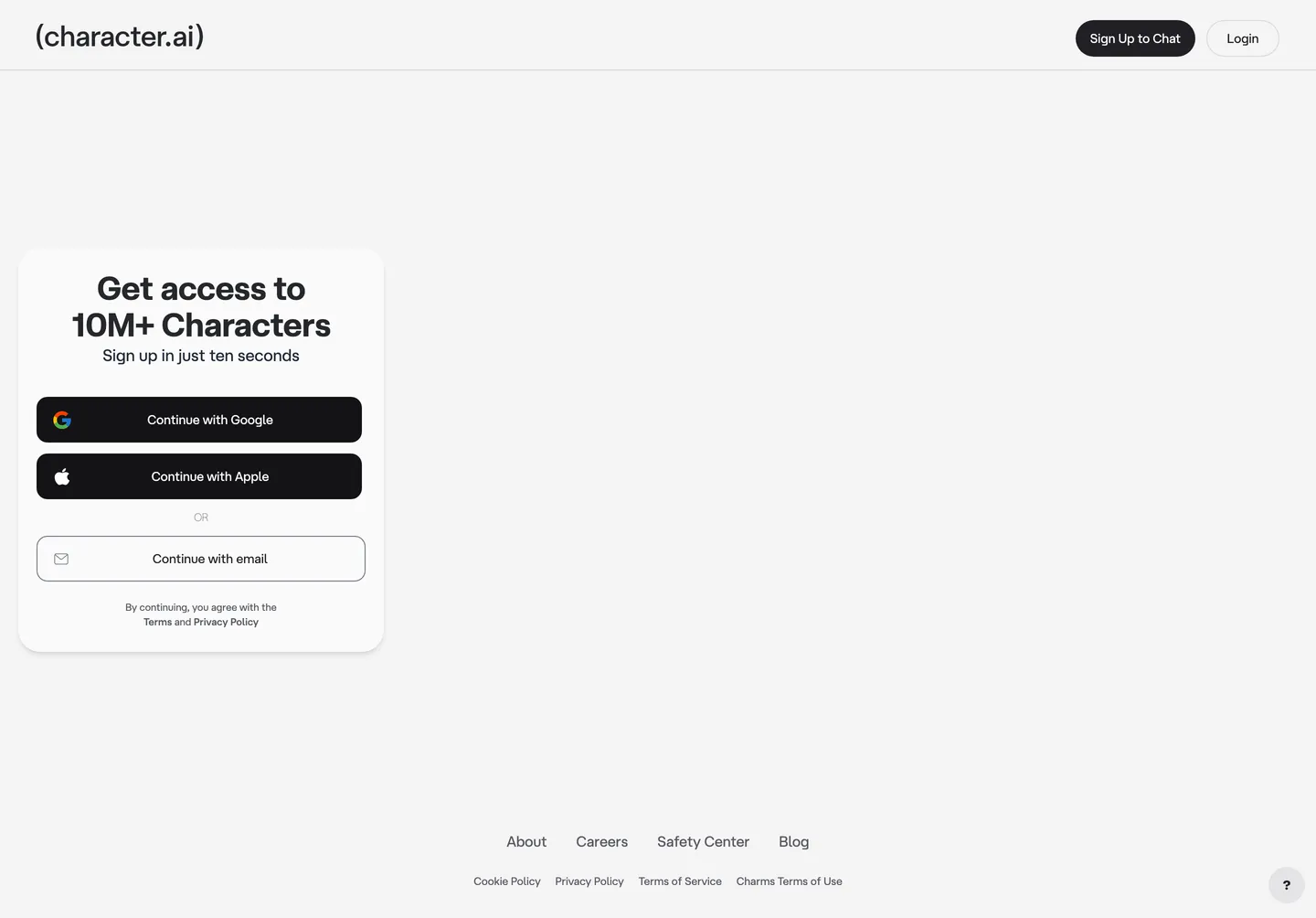
character.ai's landing surface is a sign-up gate, not a marketing brochure. The page is one card on a near-white canvas (#f4f4f5), holding a 36px atHauss h1 ("Get access to 10M+ Characters"), three auth buttons stacked vertically, and a footer link row. The wordmark sits top-left wrapped in literal parentheses — (character.ai) — a typographic move that treats the URL itself as the logo. There is no hero illustration, no testimonial band, no comparison table. The page exists to convert a click to an account.
This DESIGN.md packages the underlying token graph into one file. Inside: 22 color tokens, 9 type styles built on atHauss with Inter as the declared --font-inter fallback, 6 corner radii anchored to a 30px pill, 9 spacing values on a 4px scale, and 18 components — every piece visible on the auth surface plus the latent product chrome the 379 :root variables expose. The colors include the brand-layer #1a5eff (declared as --primary-blue), the auth-CTA near-black #202024 (--button-background), and the cream canvas #f4f4f5 (--background) that distinguishes the site from a pure white default.
Download the file and feed it to Claude, Cursor, or GitHub Copilot. The agent reproduces character.ai's auth-card voice — pill buttons, near-black primaries, atHauss tightening at -0.72px, parentheses-wrapped wordmark — rather than a generic SaaS theme. Where most AI-chat consumer apps front-load a feature grid, this one front-loads a Google/Apple/email triplet on a single card. Studying the token graph reveals a NextUI-derived scale operating beneath a custom Tailwind layer.
What makes it distinct
- Pill CTA geometry30px radius on buttons paired with a 2rem (#1a5eff) root radius, the strongest formal signal in the chrome
- Wordmark-in-parenthesesliteral ( ) brackets wrap the (character.ai) lockup in atHauss, treating the URL itself as the logotype
- Near-black primary, blue in reservevisible CTAs run #202024 on white while #1a5eff lives in focus rings, link-text, and the primary-refresh token
- Two-typeface stackatHauss for product chrome, Inter declared as --font-inter for fallbacks, no third family across 7 weight tiers
- NextUI-derived token graph379 CSS variables on :root expose the underlying nextui scale (primary 212/100/47), surfaced through a Tailwind layer rather than hand-rolled
Live at character.ai
A snapshot of the brand in production. Hover the frame to scroll the page; click to visit.
 character.ai
Explore character.ai
Pick what you want to see — mockups, colors, typography, layout, or the full component list.
Brand & Accent
Sparing, CTA-only voltage.
Surface
Page and card backgrounds.
Text
Headlines, body, captions, muted.
Borders & Hairlines
Dividers, outlines, structural rules.
Semantic
Status, errors, success, inline links.
Other
Specialty colors.
character.ai design system FAQ
Common questions about character.ai's tokens, components, and how to use this DESIGN.md in your project.
Related reading
Specs, directories, and component libraries that pair with this design system.
Browse all design systems
The full directory of DESIGN.md files on shadcn.io, with live mockups for each.
character.ai — official site
The chat-with-millions-of-AI-characters consumer app, gated behind the sign-up card this spec extracts.
The DESIGN.md specification
Google Labs' open spec for machine-readable design system files — the format this page is built on.