Clay Design System
Clay.com's design system as a DESIGN.md file.
About Clay DESIGN.md
Curated by Dov AzencotUpdated Source clay.com
- AI & LLM Platforms
- Marketing & CRM
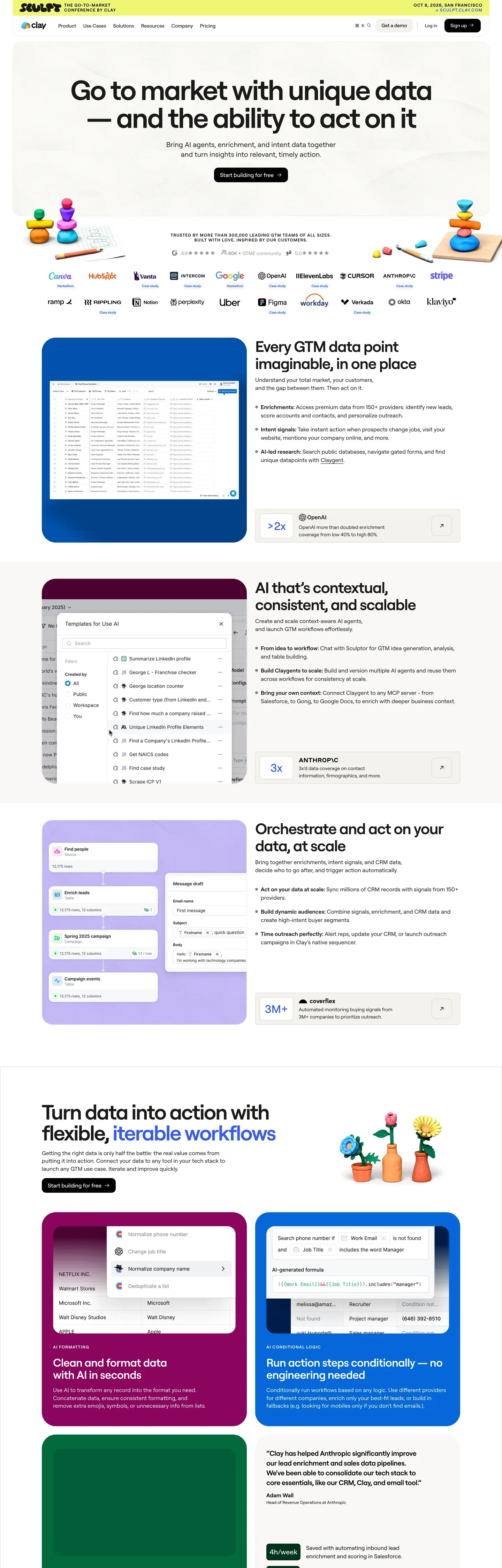
Clay.com is the most playful B2B SaaS interface in the GTM-data category. The base atmosphere is a cream-tinted white canvas at #fffaf0, holding dark-navy ink type and 3D-rendered claymation illustrations as the dominant brand voltage. Where competing data-platform brands play it cool with grids and gradients, Clay leans hard into hand-crafted-looking 3D illustrations and saturated single-color feature cards.
This page packages the full system into a single DESIGN.md file. Inside: 16 color tokens, 14 type styles, 6 corner radii, 8 spacing values, and 27 components — every piece you need to reproduce Clay's voice. The typography runs Plain Black for headlines at weight 500 with negative letter-spacing, and Inter for body, navigation, and UI. The shape language is generous: 12px buttons, 16px content cards, and 24px feature cards.
Download the file and feed it to Claude, Cursor, or GitHub Copilot. The AI writes React components and Tailwind classes that match Clay's playful warmth — cream canvas, saturated feature cards, modest display weight — rather than a generic dashboard theme. Or use it as a direct reference for your own Tailwind config and component library.
What makes it distinct
- Cream-tinted canvas #fffaf0the warm tint differentiates Clay from every cool-gray competitor in the GTM data category
- Six saturated feature cardshot pink #ff4d8b, deep teal #1a3a3a, lavender #b8a4ed, peach #ffb084, ochre #e8b94a, cream surface
- Plain Black display at weight 500rounded custom face runs 72px hero with -2.5px letter-spacing, never bolder than 500
- 3D claymation illustrations carry hero voltagehand-crafted mountains and mascot characters replace the genre's standard abstract gradients
- Cream footer #faf5e8 instead of dark navyClay deliberately closes pages warm-light to extend the playful pacing throughout
Live at clay.com
A snapshot of the brand in production. Hover the frame to scroll the page; click to visit.
 clay.com
Explore Clay
Pick what you want to see — mockups, colors, typography, layout, or the full component list.
Brand & Accent
Sparing, CTA-only voltage.
Surface
Page and card backgrounds.
Text
Headlines, body, captions, muted.
Borders & Hairlines
Dividers, outlines, structural rules.
Semantic
Status, errors, success, inline links.
Clay design system FAQ
Common questions about Clay's tokens, components, and how to use this DESIGN.md in your project.
Related reading
Specs, directories, and component libraries that pair with this design system.
The DESIGN.md specification
Google Labs' open spec for machine-readable design system files — the format this page is built on.
Browse all design systems
The full directory of DESIGN.md files on shadcn.io, with live mockups for each.
React blocks for shadcn/ui
Production-ready hero, pricing, CTA, and dashboard sections built with the same Tailwind + shadcn primitives.
Use Clay in your project
One machine-readable file. Drop it into Claude, Cursor, or any AI tool that reads DESIGN.md.