ClickHouse Design System
ClickHouse's design system as a DESIGN.md file.
About ClickHouse DESIGN.md
Curated by Dov AzencotUpdated Source clickhouse.com
- Backend, Database & DevOps
- Developer Tools & IDEs
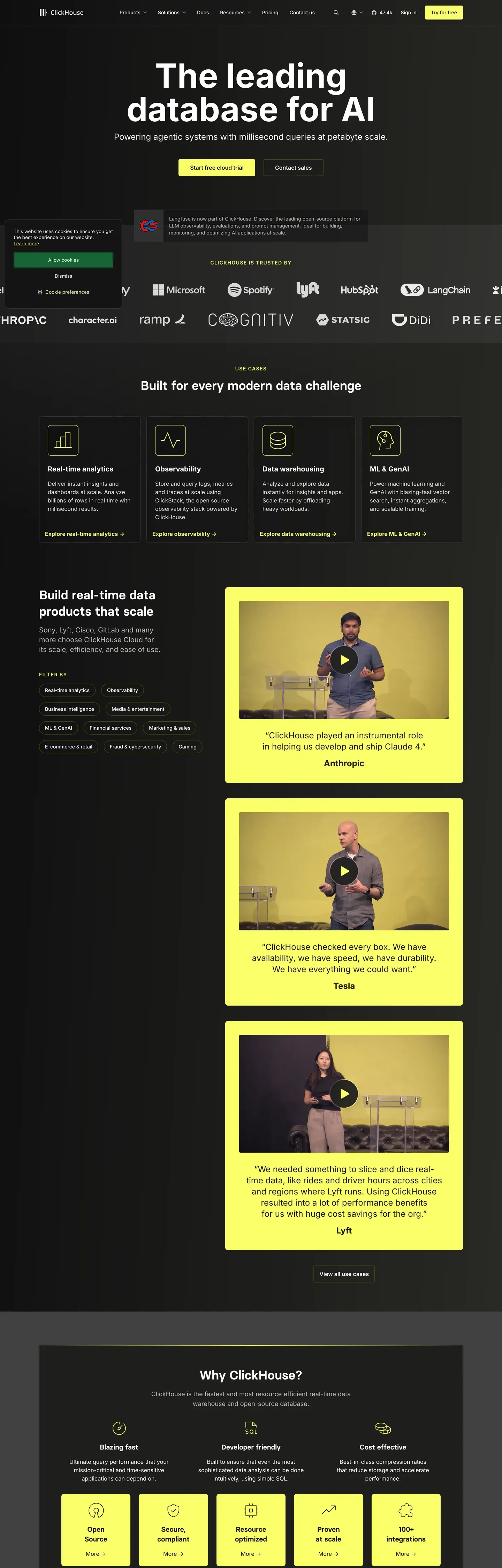
ClickHouse's design system runs on one electric idea: yellow plus black. Near-pure black canvas (#0a0a0a) underneath, electric yellow (#faff69) on top — used scarcely on individual buttons and stat numbers, then poured generously into full-bleed CTA bands. No second brand color. No gradient softening. The voltage IS the identity.
This page packages the full spec into a single DESIGN.md file. Inside: 22 colors, 16 type styles built on Inter and JetBrains Mono, 6 corner radii, 8 spacing tokens, and 25 components — buttons, stat callouts, code-window cards, pricing tiers (with a yellow-fill featured variant), and the signature yellow CTA band that closes every page.
Feed the file to Claude, Cursor, or GitHub Copilot and the React components come back in ClickHouse's voice — Inter 700 headlines at -2.5px tracking, SQL code blocks rendered in JetBrains Mono on dark surface cards, yellow reserved for the moments that matter. Or read it as a reference for how a developer-tooling brand earns recognition with one color instead of ten.
What makes it distinct
- Single brand voltageelectric yellow #faff69 carries every primary CTA, stat number, and full-bleed CTA band, never as secondary
- Near-pure black canvas#0a0a0a is the page floor; the system has no light-mode marketing surface anywhere
- Inter at weight 700 with -2.5px trackingdisplay headlines run 72px tight; no serif counter-voice in the entire scale
- JetBrains Mono code windows on #1a1a1aSQL syntax embedded directly in marketing pages, not painted illustrations
- Yellow stat-callouts at 56px / 700'779+', '47k+', '2.8k+' are the system's signature credibility moments
Live at clickhouse.com
A snapshot of the brand in production. Hover the frame to scroll the page; click to visit.
 clickhouse.com
Explore ClickHouse
Pick what you want to see — mockups, colors, typography, layout, or the full component list.
Brand & Accent
Sparing, CTA-only voltage.
Surface
Page and card backgrounds.
Text
Headlines, body, captions, muted.
Borders & Hairlines
Dividers, outlines, structural rules.
Semantic
Status, errors, success, inline links.
ClickHouse design system FAQ
Common questions about ClickHouse's tokens, components, and how to use this DESIGN.md in your project.
Related reading
Specs, directories, and component libraries that pair with this design system.
The DESIGN.md specification
Google Labs' open spec for machine-readable design system files — the format this page is built on.
Browse all design systems
The full directory of DESIGN.md files on shadcn.io, with live mockups for each.
React blocks for shadcn/ui
Production-ready hero, pricing, CTA, and dashboard sections built with the same Tailwind + shadcn primitives.
Use ClickHouse in your project
One machine-readable file. Drop it into Claude, Cursor, or any AI tool that reads DESIGN.md.