CrewAI Design System
CrewAI's marketing system: coral-orange crew branding on a pure-black canvas, Gellix display at weight 400, Interdisplay body, 100px pill cards, 17 color tokens, 18 components.
About CrewAI DESIGN.md
Curated by Dov AzencotUpdated Source crewai.com
- AI & LLM Platforms
- Developer Tools & IDEs
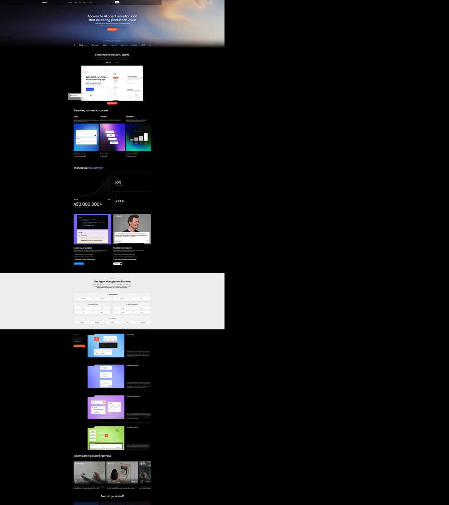
CrewAI's marketing page opens with something most AI-platform brands avoid: a real photograph. The hero background is a full-bleed cinematic image of storm clouds and light rays, saturated enough to read as atmosphere but dark enough to hold white headline text cleanly. "Accelerate AI agent adoption and start delivering production value" runs at 60px in Gellix at weight 400 — the font family holds the heading role while Interdisplay handles every body, label, and UI string below. The single chromatic brand signal is the coral-orange CTA button, which matches the declared --colors-global--crew-branding CSS variable exactly.
The DESIGN.md file packages the system as machine-readable tokens for React and AI tools. Inside: 17 color tokens anchored on pure black canvas, coral orange voltage, and a two-gray muted tier; 13 typography tokens spanning Gellix at 44–80px display and Interdisplay at 14–20px body; 6 radius values dominated by 100px pill rounding for product screenshot cards; and 18 component definitions covering the photographic hero, the coral CTA, the 100px pill cards in the feature grid, the light-gray inversion band, and the two-column stat blocks. The system also documents a standalone white-canvas section mid-page used for the Agent Management Platform product walkthrough.
Feed this file to Claude or Cursor and it reproduces CrewAI's specific moves: pure-black canvas broken by a single photographic hero, coral-orange voltage at borders and CTAs only, Gellix at modest weight 400 for display, and the 100px pill that makes product screenshots look like enterprise-grade marketing art. The system's most transferable idea is the border-only voltage discipline — coral orange never fills a surface larger than a button, which keeps the black-canvas severity intact while the brand color still reads as present and deliberate.
What makes it distinct
- Photographic hero, not a gradientthe above-fold hero is a full-bleed storm-cloud photograph with white headline type over it, not a dark gradient or canvas fill
- Crew branding at borderscoral orange (#f75a36) appears 23 times on the captured page; 20 of those occurrences are as border or CTA fill, never as a background canvas
- Two-voice type systemGellix for every heading level, Interdisplay for body and UI labels; the split signals technical platform with enterprise finish
- 100px pill radiusthe dominant card radius is 100px, rendering product screenshots as large rounded-rectangle tiles rather than sharp or softly-rounded surfaces
- Gray band inversiona mid-page section flips to light gray (#f2f2f2) while the rest of the page holds pure black, creating a two-tone page rhythm without a third hue
Live at crewai.com
A snapshot of the brand in production. Hover the frame to scroll the page; click to visit.
 crewai.com
Explore CrewAI
Pick what you want to see — mockups, colors, typography, layout, or the full component list.
Brand & Accent
Sparing, CTA-only voltage.
Surface
Page and card backgrounds.
Text
Headlines, body, captions, muted.
Borders & Hairlines
Dividers, outlines, structural rules.
Other
Specialty colors.
CrewAI design system FAQ
Common questions about CrewAI's tokens, components, and how to use this DESIGN.md in your project.
Related reading
Specs, directories, and component libraries that pair with this design system.
Browse all design systems
The full directory of DESIGN.md files on shadcn.io, with live mockups for each.
CrewAI — official site
CrewAI's public marketing site — the source of truth for the live tokens captured in this file.
The DESIGN.md specification
Google Labs' open spec for machine-readable design system files — the format this page is built on.