Lovable Design System
Lovable's design system as a DESIGN.md file.
About Lovable DESIGN.md
Curated by Dov AzencotUpdated Source lovable.dev
- AI & LLM Platforms
- Developer Tools & IDEs
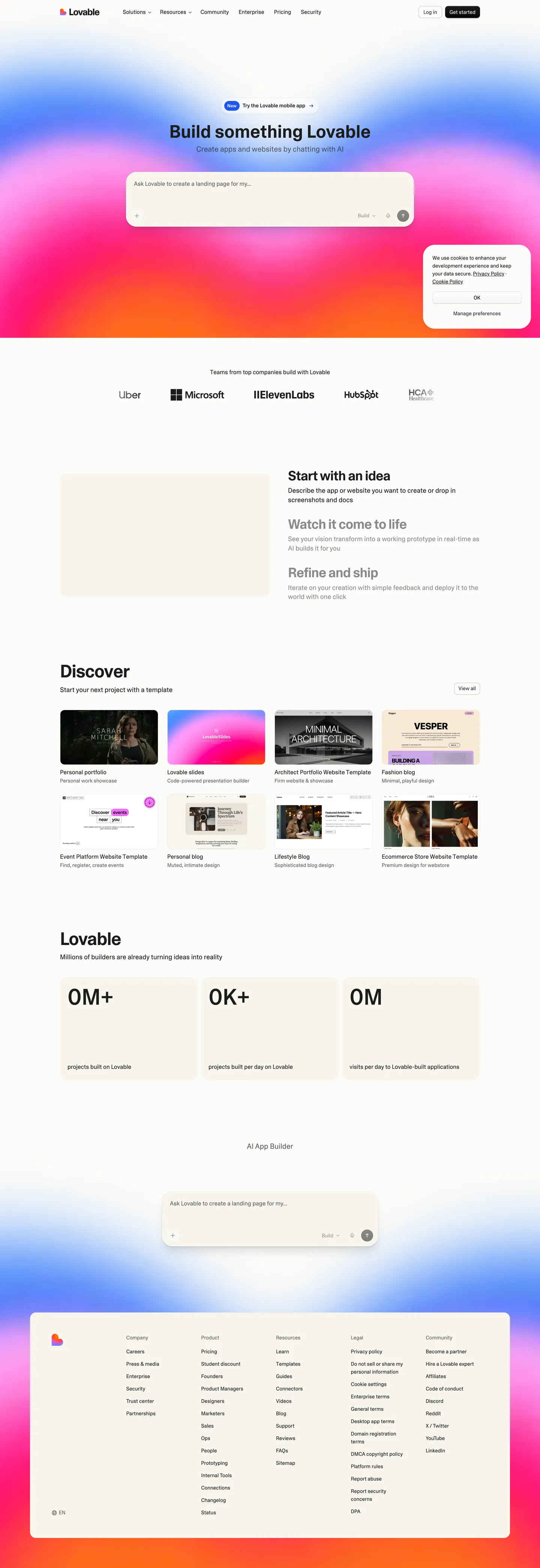
Lovable's design system is built on warmth through restraint. The page floor is a parchment cream (#f7f4ed) — not white, not beige, a deliberate hand-selected tone that immediately separates the site from the cold-white conventions of developer tools. Text is near-black charcoal (#1c1c1c) rather than pure black. The custom Camera Plain Variable typeface carries humanist warmth: slightly rounded terminals and organic curves that contrast with the geometric sans-serifs most AI builders default to. At display sizes (48–60px), the font compresses headlines with aggressive negative letter-spacing (-0.9px to -1.5px) for editorial confidence. The depth system is intentionally shallow — borders define boundaries, not shadows.
This page packages the full system into a single DESIGN.md file. Inside: a cream-and-charcoal palette where every gray is the same hex (#1c1c1c) at different opacity stops, a 13-step type scale running on Camera Plain Variable at three weights (400, 480, 600), a 6-tier radius scale from 4px micro to 9999px full pill, and a component inventory covering buttons, cards, inputs, navigation, AI chat input, template gallery, and stats bars. The format is the Google Labs DESIGN.md spec — machine-readable tokens alongside human prose.
Feed the file to Claude, Cursor, GitHub Copilot, or any AI tool that reads structured design tokens. The agent will reproduce Lovable's parchment warmth (cream canvas, opacity-based grays, inset-shadowed buttons) instead of a generic shadcn theme. Reference the tokens directly to paste into Tailwind config or CSS variables. The system is worth studying for one discipline alone: deriving an entire neutral palette from a single hue at varied transparency rather than inventing arbitrary gray hexes.
What makes it distinct
- Parchment cream canvas (#f7f4ed)deliberate warm cream, not white, not beige; the foundation of every surface
- Opacity-driven graysevery tonal shade derives from #1c1c1c at 3%, 4%, 40%, 82%, or 83% transparency
- Camera Plain Variable at weight 480a variable font lets headlines hit intermediate weights between regular and semibold
- Signature inset shadow on dark buttonsa 0.5px white top-edge highlight over a 0.5px dark ring reads as pressed, not floating
- Borders, not shadows, for containment#eceae4 hairlines define cards; the system caps at one diffused focus glow
Live at lovable.dev
A snapshot of the brand in production. Hover the frame to scroll the page; click to visit.
 lovable.dev
Explore Lovable
Pick what you want to see — mockups, colors, typography, layout, or the full component list.
Text
Headlines, body, captions, muted.
Other
Specialty colors.
Lovable design system FAQ
Common questions about Lovable's tokens, components, and how to use this DESIGN.md in your project.
Related reading
Specs, directories, and component libraries that pair with this design system.
Browse all design systems
The full directory of DESIGN.md files on shadcn.io, with live mockups for each.
Lovable's product site
The AI app builder whose visual system this DESIGN.md captures.
The DESIGN.md specification
Google Labs' open spec for machine-readable design system files — the format this page is built on.
Use Lovable in your project
One machine-readable file. Drop it into Claude, Cursor, or any AI tool that reads DESIGN.md.