MiniMax Design System
MiniMax's AI product site as a DESIGN.md: black #0a0a0a pill buttons, DM Sans, four product brand colors and a big component set for React and AI tools.
- Primary color
- #0a0a0a
- Typeface
- DM Sans
- Shape
- Soft
- Base radius
- 8px
- Colors
- 28
- Type tokens
- 15
- Components
- 44
- Spacing values
- 12
About MiniMax DESIGN.md
Curated by Dov Azencot, updated May 12, 2026. Source minimaxi.com (opens in a new tab).
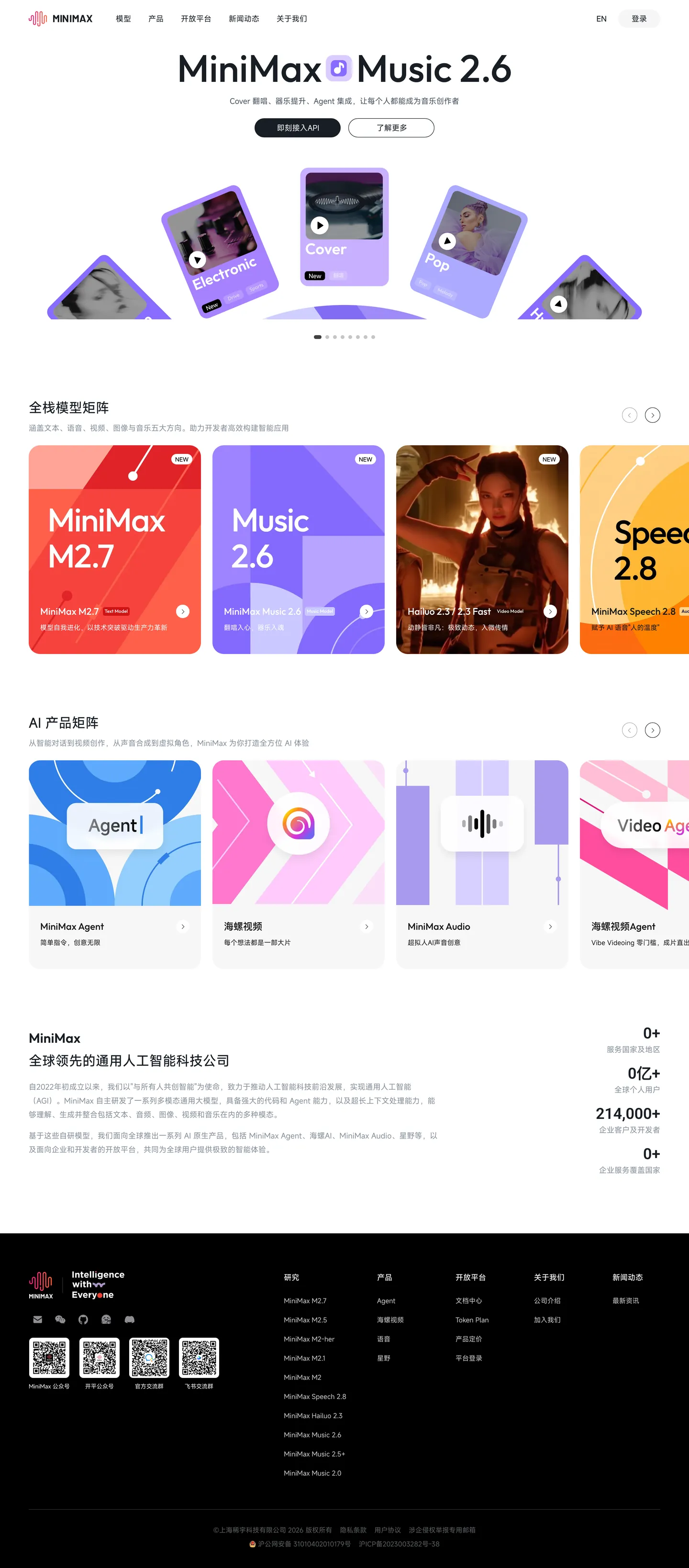
MiniMax is a Chinese AI infrastructure brand that runs on a deliberate duality. Marketing surfaces sit on stark white canvas (#ffffff) with near-black ink (#0a0a0a) and confident, editorial type — but each model release gets its own saturated identity card: M2.7 in volcanic coral (#ff5530), Music 2.6 in magenta-pink (#ea5ec1), Hailuo in deep blue (#1456f0), Speech 2.8 in royal purple (#a855f7). The product matrix on the homepage reads like a row of album covers, each tile declaring its own personality at 32px corner radius against quieter 16px white documentation cards in the same viewport. The radius contrast is the visual signature.
This page packages the brand into a single Google Labs DESIGN.md file. Inside: 28 colors tokens (split across brand accent, surface, hairline, text, and semantic groups), 16 type styles drawn entirely from DM Sans at weights 400/500/600/700, 9 corner radii (from 4px chips to 32px hero cards to 9999px pills), a 12-step spacing scale anchored on 4px, and roughly 44 components — buttons, vibrant product cards, search pills, segmented tabs, badges, data tables, sidebar nav, the 80px hero band, and the dense black footer.
Feed the file to Claude, Cursor, GitHub Copilot, or any AI tool that reads structured tokens. The agent reproduces MiniMax's discipline — black-pill primaries, product-color identity cards reserved for model moments, DM Sans at -2px letter-spacing on the hero — instead of a generic SaaS theme. The system is worth studying for one move in particular: how a brand can run 90% monochrome and still feel saturated by reserving color for product identity only.
What makes it distinct
5 highlights
- Product-color encodingCoral #ff5530 (M2.7), magenta #ea5ec1 (Music 2.6), blue #1456f0 (Hailuo), purple #a855f7 (Speech 2.8)
- Pill-shaped everythingEvery button, tab, and badge runs rounded-full; rectangular forms only inside data tables
- Magazine-grade hero80px DM Sans display at -2px letter-spacing and 1.10 leading, scaling down to 12px micro labels
- Radius contrast as signature32px gradient product cards beside 16px white documentation cards in the same viewport
- Single typeface, no italicsDM Sans handles every role at four weights (400/500/600/700); emphasis comes from weight, not slope
Live at minimaxi.com
MiniMax in production, as captured. Scroll the window to see the whole page.
28 colors
MiniMax's system runs on #0a0a0a as its primary voltage, used in 4 of 44 components. Type is set in DM Sans across 15 tokens from 12px to 80px, weights 400–700. Shape language is soft — components average 20px corner radius, with no sharp interactive edges.
Brand & Accent
Sparing, CTA-only voltage · 11
Surface
Page and card backgrounds · 3
Text
Headlines, body, captions · 6
Borders & Hairlines
Dividers, outlines, rules · 2
Semantic
Status, errors, success, links · 1
Other
Specialty colors · 5
15 type tokens
Set in DM Sans across 15 tokens, from 12px to 80px, weights 400–700. Shown in its own stack: where the font isn't installed, the fallback the file names stands in.
- hero-display80px · weight 600 · lh 1.1 · tracking -2pxThe quick brown fox jumps over the lazy dog
- display-lg56px · weight 600 · lh 1.1 · tracking -1.5pxThe quick brown fox jumps over the lazy dog
- heading-lg40px · weight 600 · lh 1.2 · tracking -1pxThe quick brown fox jumps over the lazy dog
- heading-md32px · weight 600 · lh 1.25 · tracking -0.5pxThe quick brown fox jumps over the lazy dog
- heading-sm24px · weight 600 · lh 1.3The quick brown fox jumps over the lazy dog
- card-title20px · weight 600 · lh 1.4The quick brown fox jumps over the lazy dog
- subtitle18px · weight 500 · lh 1.5The quick brown fox jumps over the lazy dog
- body-md16px · weight 400 · lh 1.5The quick brown fox jumps over the lazy dog
- body-md-bold16px · weight 700 · lh 1.5The quick brown fox jumps over the lazy dog
- body-sm14px · weight 400 · lh 1.5The quick brown fox jumps over the lazy dog
- body-sm-medium14px · weight 500 · lh 1.5The quick brown fox jumps over the lazy dog
- caption13px · weight 400 · lh 1.7The quick brown fox jumps over the lazy dog
- caption-bold13px · weight 600 · lh 1.5The quick brown fox jumps over the lazy dog
- micro12px · weight 400 · lh 1.5The quick brown fox jumps over the lazy dog
- button-md14px · weight 600 · lh 1.4The quick brown fox jumps over the lazy dog
Radii and spacing
9 corner radii and 12 spacing values. Shape language: soft, on a 8px base radius.
Radii9
- xs4px
- sm6px
- md8px
- lg12px
- xl16px
- xxl20px
- xxxl24px
- hero32px
- full9999px
Spacing12
- xxs4px
- xs8px
- sm12px
- md16px
- lg20px
- xl24px
- xxl32px
- xxxl40px
- section-sm48px
- section64px
- section-lg80px
- hero96px
44 components
Each rendered from its tokens (color, type, radius, padding) on MiniMax's own canvas.
- Button PrimaryButton Primarybutton-primary
- Button Primary PressedButton Primary Pressedbutton-primary-pressed
- Button Primary DisabledButton Primary Disabledbutton-primary-disabled
- Button SecondaryButton Secondarybutton-secondary
- Button TertiaryButton Tertiarybutton-tertiary
- Button LinkButton Linkbutton-link
- Button Icon Circularbutton-icon-circular
- Product Card CoralProduct Card Coralproduct-card-coral
- Product Card MagentaProduct Card Magentaproduct-card-magenta
- Product Card BlueProduct Card Blueproduct-card-blue
- Product Card PurpleProduct Card Purpleproduct-card-purple
- Product Card PhotoProduct Card Photoproduct-card-photo
- Card BaseCard Basecard-base
- Card FeatureCard Featurecard-feature
- Card RecommendationCard Recommendationcard-recommendation
- Promo Cta CardPromo Cta Cardpromo-cta-card
- Type here…Text Inputtext-input
- Type here…Text Input Focusedtext-input-focused
- Type here…Text Input Errortext-input-error
- Search PillSearch Pillsearch-pill
- Segmented TabSegmented Tabsegmented-tab
- Segmented Tab ActiveSegmented Tab Activesegmented-tab-active
- Pill TabPill Tabpill-tab
- Pill Tab ActivePill Tab Activepill-tab-active
- Badge SuccessBadge Successbadge-success
- Badge NewBadge Newbadge-new
- Badge BetaBadge Betabadge-beta
- Badge CodeBadge Codebadge-code
- Promo BannerPromo Bannerpromo-banner
- Data TableData Tabledata-table
- Data Table HeaderData Table Headerdata-table-header
- Data Table RowData Table Rowdata-table-row
- Sidebar Nav ItemSidebar Nav Itemsidebar-nav-item
- Sidebar Nav Item ActiveSidebar Nav Item Activesidebar-nav-item-active
- Doc Toc ItemDoc Toc Itemdoc-toc-item
- Ai Product TileAi Product Tileai-product-tile
- Footer RegionFooter Regionfooter-region
- Footer LinkFooter Linkfooter-link
- Hero Band MarketingHero Band Marketinghero-band-marketing
- Product Matrix GridProduct Matrix Gridproduct-matrix-grid
- Ai Product MatrixAi Product Matrixai-product-matrix
- Docs Prose BlockDocs Prose Blockdocs-prose-block
- Models Comparison TableModels Comparison Tablemodels-comparison-table
- Testimonial Stat RowTestimonial Stat Rowtestimonial-stat-row
The system, in use
MiniMax's tokens on the kind of product it builds.
Think bigger with an AI at your side
Ask anything, write and analyze, and build with an assistant that understands your work.
MiniMax design system FAQ
MiniMax's tokens, its components and how to use this DESIGN.md in your project.
Related reading
Specs, directories and component libraries that pair with this design system.
- Browse all design systemsThe full directory of DESIGN.md files on shadcn.io, with live mockups for each.shadcn.io
- MiniMax homepageThe source site for this spec — homepage, model showcases, platform docs, and pricing surfaces.minimax.io (opens in a new tab)
- The DESIGN.md specificationGoogle Labs' open spec for machine-readable design system files — the format this page is built on.github.com (opens in a new tab)
Use MiniMax in your project
One machine-readable file. Drop it into Claude Code, Cursor, VS Code or any AI tool that reads DESIGN.md.
Download the DESIGN.md
One machine-readable file: every color, type, radius, spacing, and component token of MiniMax.
Feed it to your AI tool
Drop it into Claude, Cursor, or GitHub Copilot. The agent writes React components and Tailwind classes that match MiniMax's visual language.
Reference the tokens directly
Or paste the values into your Tailwind config, CSS variables, or component library: every color, size and radius is a quoted, ready-to-copy value.
Read the full DESIGN.md overview, rationale, do’s and don’ts
Overview
MiniMax stages itself as a Chinese AI infrastructure brand with a sophisticated dual identity. Marketing surfaces and platform pages anchor in stark white canvas with deep-black typographic emphasis — the brand voice is confident, technical, almost editorial. But each model release gets its own vibrant gradient identity card: M2.7 in volcanic coral-red, Music 2.6 in magenta-pink, Hailuo in deep blue, Speech 2.8 in saturated orange-purple. Together these vibrant tiles read like album covers laid out on the homepage — each one declaring its own product personality.
DM Sans anchors every surface from oversized 80px hero displays down to 12px micro labels. The geometric, slightly humanist character of the face suits both the dense documentation surfaces (where 14px body type carries 1.5 line-height for long-form prose) and the high-impact marketing displays (where -2px letter-spacing tightens 80px headlines). Buttons are universally pill-shaped (rounded-full) with a sharp two-tier system: black-pill primary (the dominant CTA) and outline-pill secondary. Cards split into two distinct families: vibrant gradient product showcases (32px corner softening) and quiet white documentation cards (16px corner softening).
Key Characteristics:
- Stark monochrome palette — black ({colors.primary}) and white ({colors.canvas}) — broken open by saturated brand-color gradient cards
- Distinct product-color encoding: each model line has its own vibrant brand color (coral M2.7, magenta Music 2.6, blue Hailuo, orange Speech 2.8)
- DM Sans across the entire system; Inter as fallback
- Pill-shaped buttons ({rounded.full}) and pill-shaped tabs everywhere; rectangular forms only inside data tables and dense docs
- Hero typography uses tight 1.10 line-height with -2px letter-spacing for impact
- Documentation surfaces use a 3-column layout: left sidebar nav, center prose body, right table-of-contents
- Black promo banners ({colors.primary}) above the nav for time-bound brand moments
Known Gaps
- Specific dark-mode token values (canvas, surface, ink, hairline) are not surfaced on these pages; the brand has not yet shipped a published dark-mode palette.
- Animation/transition timings are not extracted; recommend 150–200ms ease for hover/focus state transitions.
- Form validation success state is not explicitly captured beyond defaults — implement following standard green-border + success badge patterns.
- Code syntax highlighting palette inside docs is not formalized; documentation samples appear with system-default monospace and minimal coloring.
More systems like this
Algolia, Anthropic, Arc and 61 more in AI & LLM Platforms: each brand's colors, type and components in one file your AI agent builds from.
Build it with Pro
The DESIGN.md files are free. Pro adds 6,000+ blocks, premium templates and the MCP server, so your AI editor builds in your system for you.
4.9/5 out of 5 · 150+ reviewsfrom 150+ founders and developers.
Billing
Billed once a year in USD. Cancel anytime.
- How many people can use the license.
- Client work, SaaS products and anything you charge for.
- Page sections in 56 categories, from heroes and pricing tables to dashboards and settings, on every framework and UI library, in your theme.
- Complete Next.js sites for startups, SaaS, agencies and portfolios, every page designed, ready to ship.
- Your AI agent searches, previews and installs any component, block, icon or DESIGN.md from a prompt: 22 tools in Claude Code, Cursor, VS Code and 35 more clients.
- Buttons with motion and states of their own, from an arrow that slides in to a burst of confetti.
- Typewriters, scrambles, counters and more, for headlines, labels and numbers.
- Animated backgrounds for heroes, sections and cards, from a soft aurora to a flock that flees the cursor. Most are pure CSS.
- WebGPU shaders, from a slow aurora to a black hole, each drawing only while it's on screen.
- One design and one theme on all four: the components, blocks and effects are built for each framework.
- React on Base UI, Radix UI, React Aria or Ark UI: install the version for the library your project already uses. Vue, Svelte and Solid run on Ark UI.
- From a button to a date picker, a color picker or a guided tour: accessible, typed in TypeScript, each with live demos.
- Real-world patterns built from the components, in 53 galleries: forms, tables, menus, dialogs and more.
- Area, bar, line, pie, radar and radial charts on TanStack Charts, on every framework. React also gets the Recharts originals.
- Debounce, local storage, media queries and more: each hook is one typed file you own.
- From 222 libraries, Lucide, Heroicons, Tabler and Material Symbols among them, as SVG or a React component in one command.
- Stripe, Linear, Apple and 497 more: a brand's colors, typography and components in one file your AI agent builds from.
- Restyle every component and block at once: 8 styles, 8 grays, 18 colors and 5 radii, shared as a shadcn preset code.
- Priority requests are answered first.
Individual
For personal projects & open source
$32instead of $49/mo
$389 billed yearly
- Seats: 1 seat
- Commercial use: Personal & open source only
- Blocks: All 6,181 blocks
- Templates: All 14 templates
- MCP server: 38 AI clients
- Animated buttons: All 35 buttons
- Text effects: All 97 effects
- Backgrounds: All 100 backgrounds
- Shaders: All 100 shaders
- Frameworks: React, Vue, Svelte, Solid
- UI libraries: Base UI, Radix, Aria, Ark
- Components: All 174 components
- Examples: All 1,103 examples
- Charts: All 70 charts
- React hooks: All 35 hooks
- Icons: 294k+ icons
- DESIGN.md files: All 500 brands
- Theme builder: 8 styles × 18 colors
- Support: Standard
Team
Most popularFor freelancers, agencies & startups
$66instead of $99/mo
$789 billed yearly · ≈ $13/dev/mo
- Seats: Up to 5 seats
- Commercial use: Included
- Blocks: All 6,181 blocks
- Templates: All 14 templates
- MCP server: 38 AI clients
- Animated buttons: All 35 buttons
- Text effects: All 97 effects
- Backgrounds: All 100 backgrounds
- Shaders: All 100 shaders
- Frameworks: React, Vue, Svelte, Solid
- UI libraries: Base UI, Radix, Aria, Ark
- Components: All 174 components
- Examples: All 1,103 examples
- Charts: All 70 charts
- React hooks: All 35 hooks
- Icons: 294k+ icons
- DESIGN.md files: All 500 brands
- Theme builder: 8 styles × 18 colors
- Support: Priority
Organization
For companies with larger teams
$132instead of $199/mo
$1,589 billed yearly
- Seats: Unlimited seats
- Commercial use: Included
- Blocks: All 6,181 blocks
- Templates: All 14 templates
- MCP server: 38 AI clients
- Animated buttons: All 35 buttons
- Text effects: All 97 effects
- Backgrounds: All 100 backgrounds
- Shaders: All 100 shaders
- Frameworks: React, Vue, Svelte, Solid
- UI libraries: Base UI, Radix, Aria, Ark
- Components: All 174 components
- Examples: All 1,103 examples
- Charts: All 70 charts
- React hooks: All 35 hooks
- Icons: 294k+ icons
- DESIGN.md files: All 500 brands
- Theme builder: 8 styles × 18 colors
- Support: Priority
Billed once a year in USD. Cancel anytime.
Individual
For personal projects & open source
$32instead of $49/mo
$389 billed yearly
- How many people can use the license.Seats: 1 seat
- Client work, SaaS products and anything you charge for.Commercial use: Personal & open source only
- Page sections in 56 categories, from heroes and pricing tables to dashboards and settings, on every framework and UI library, in your theme.Blocks: All 6,181 blocks
- Complete Next.js sites for startups, SaaS, agencies and portfolios, every page designed, ready to ship.Templates: All 14 templates
- Your AI agent searches, previews and installs any component, block, icon or DESIGN.md from a prompt: 22 tools in Claude Code, Cursor, VS Code and 35 more clients.MCP server: 38 AI clients
- Buttons with motion and states of their own, from an arrow that slides in to a burst of confetti.Animated buttons: All 35 buttons
- Typewriters, scrambles, counters and more, for headlines, labels and numbers.Text effects: All 97 effects
- Animated backgrounds for heroes, sections and cards, from a soft aurora to a flock that flees the cursor. Most are pure CSS.Backgrounds: All 100 backgrounds
- WebGPU shaders, from a slow aurora to a black hole, each drawing only while it's on screen.Shaders: All 100 shaders
- One design and one theme on all four: the components, blocks and effects are built for each framework.Frameworks: React, Vue, Svelte, Solid
- React on Base UI, Radix UI, React Aria or Ark UI: install the version for the library your project already uses. Vue, Svelte and Solid run on Ark UI.UI libraries: Base UI, Radix, Aria, Ark
- From a button to a date picker, a color picker or a guided tour: accessible, typed in TypeScript, each with live demos.Components: All 174 components
- Real-world patterns built from the components, in 53 galleries: forms, tables, menus, dialogs and more.Examples: All 1,103 examples
- Area, bar, line, pie, radar and radial charts on TanStack Charts, on every framework. React also gets the Recharts originals.Charts: All 70 charts
- Debounce, local storage, media queries and more: each hook is one typed file you own.React hooks: All 35 hooks
- From 222 libraries, Lucide, Heroicons, Tabler and Material Symbols among them, as SVG or a React component in one command.Icons: 294k+ icons
- Stripe, Linear, Apple and 497 more: a brand's colors, typography and components in one file your AI agent builds from.DESIGN.md files: All 500 brands
- Restyle every component and block at once: 8 styles, 8 grays, 18 colors and 5 radii, shared as a shadcn preset code.Theme builder: 8 styles × 18 colors
- Priority requests are answered first.Support: Standard
Team
Most popularFor freelancers, agencies & startups
$66instead of $99/mo
$789 billed yearly · ≈ $13/dev/mo
Everything in Individual, plus
- How many people can use the license.Seats: Up to 5 seats
- Client work, SaaS products and anything you charge for.Commercial use: Included
- Priority requests are answered first.Support: Priority
Organization
For companies with larger teams
$132instead of $199/mo
$1,589 billed yearly
Everything in Team, plus
- How many people can use the license.Seats: Unlimited seats
- Secure checkout via Stripe
- Code lives in your repo
- Keep what you've shipped if you cancel
- License terms
4.9 out of 5 from 150+ developers


Your system, built for you
Every block, template and icon, installed by your AI agent in your design system. The DESIGN.md files stay free.
- Cancel anytime
- Keep what you've shipped