Voltagent Inspired Design System
Voltagent's design system as a DESIGN.md file.
About Voltagent Inspired DESIGN.md
Curated by Dov AzencotUpdated Source voltagent.dev
- AI & LLM Platforms
- Developer Tools & IDEs
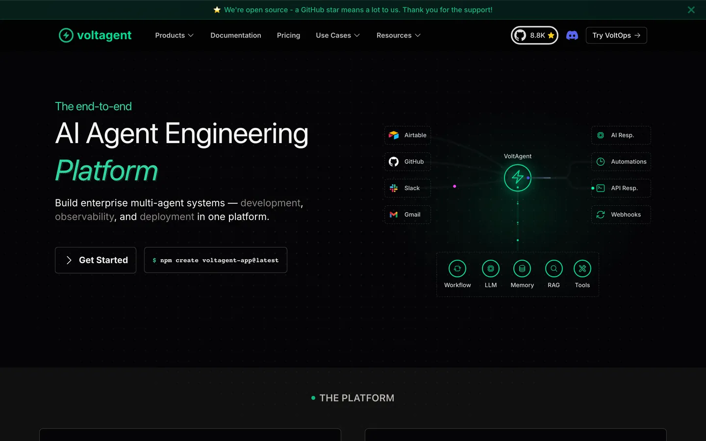
Voltagent is an AI agent engineering platform that wears its developer audience proudly. The marketing surface looks like polished documentation that decided to also sell something: a near-black #101010 canvas runs edge-to-edge with no light-mode rhythm, a single electric-green #00d992 carries every CTA and the lightning logo, and hairline-bordered feature cards replace material shadows. The hero headline sits at 60px Inter in regular weight 400 with -0.65px tracking, deliberately calm against AI marketing's tendency to shout. Code-editor mockups, copy-to-clipboard chips, and monospace metric counters anchor the brand's engineered voice.
This page packages the full system into a single DESIGN.md file built on Google Labs' open spec. Inside: 14 color tokens grouped into brand, surface, text, and semantic ranges, 17 typography styles across Inter and SF Mono, 6 corner-radius tokens, 11 spacing values from 2px to 64px, and 24 components covering buttons, cards, code mockups, hero bands, and 11 illustrative example surfaces. Every hex is quoted, every padding traces back to a spacing token, and every component references its primitives by name.
Feed the file to Claude, Cursor, or GitHub Copilot and the agent reproduces Voltagent's restraint — single accent, hairline elevation, two-face type pair — rather than a generic dark-mode SaaS theme. Or paste the tokens straight into Tailwind config and CSS variables. The system rewards study for one reason: it shows how to make a dark, developer-facing brand feel engineered rather than edgy, using typography and hairlines instead of glow and gradient.
What makes it distinct
- Single electric-green accent#00d992 carries every CTA, status pill, and the lightning glyph, never a body fill
- Dark canvas only#101010 page surface with no light-mode counterpart, broken only by hairline-bordered feature cards
- Hairline elevation system1px #3d3a39 borders replace shadows; depth comes from precise rectangles, not material lift
- Two-face type pairingInter at calm 400-weight 60px display next to SF Mono 13px for code chips and command snippets
- Tight 6px button radiusbuttons stay rectangular at rounded.sm; only inline status tags use the 9999px pill
Live at voltagent.dev
A snapshot of the brand in production. Hover the frame to scroll the page; click to visit.
 voltagent.dev
Explore Voltagent Inspired
Pick what you want to see — mockups, colors, typography, layout, or the full component list.
Brand & Accent
Sparing, CTA-only voltage.
Surface
Page and card backgrounds.
Text
Headlines, body, captions, muted.
Borders & Hairlines
Dividers, outlines, structural rules.
Other
Specialty colors.
Voltagent Inspired design system FAQ
Common questions about Voltagent Inspired's tokens, components, and how to use this DESIGN.md in your project.
Related reading
Specs, directories, and component libraries that pair with this design system.
The DESIGN.md specification
Google Labs' open spec for machine-readable design system files — the format this page is built on.
Browse all design systems
The full directory of DESIGN.md files on shadcn.io, with live mockups for each.
React blocks for shadcn/ui
Production-ready hero, pricing, CTA, and dashboard sections built with the same Tailwind + shadcn primitives.