shadcn.io is an independent project built on shadcn/ui
A border, the label, and a badge with the number. The demo shows 3. Update it from your state, and hide the badge at zero if zero is not useful.
Use it for View cart or Review comments when this is not the primary button. If the count is urgent, put it on the filled Button. In React, Ark UI does not keep the number in sync for you.
Installation
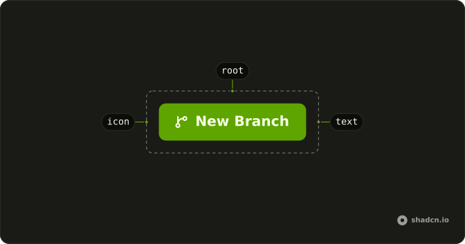
Anatomy
Usage
<Button variant="outline">
  Button
  <Badge pill variant="secondary">
    3
  </Badge>
</Button>
FAQ
Is the 3 a live count?
No. The Badge children are the characters 3. Nothing in the demo reads a selection or updates the number. Pass your count as the badge's children.
How is the badge colored on an outline button?
variant="outline" is the bordered button. The badge is variant="secondary" and pill, a muted round count on the outline.
Should I disable it when the count is 0?
When a delete with nothing selected shouldn't run, pass disabled yourself. The demo always shows 3 and stays enabled. Hide the button only when that action isn't part of the screen.
How do I show singular and plural?
The badge is only the number. Put the noun on the button, such as Delete, or write the whole phrase as the button's children. This demo doesn't pick a plural form for you.
API Reference
Button
Sets variant="outline". The rest is on the Button page.
Badge
Sets pill and variant="secondary". The rest is on the Badge page.