shadcn.io is an independent project built on shadcn/ui
A message box with a footer. Attach and a microphone sit at the start. A Claude 3.5 menu sits at the end, then a short divider and a round send button. The menu lists Sonnet, Opus, and Haiku, and the label stays Claude 3.5.
Reach for this when a prompt can be typed or spoken. A model the person should really set is a Select. In React, Ark UI does not start recording from the microphone button.
Installation
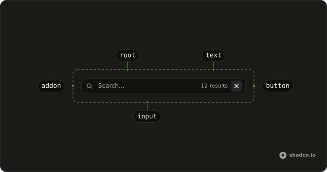
Anatomy
Usage
<div className="flex w-full max-w-2xl flex-col gap-4">
  <InputGroup className="bg-background">
    <InputGroupTextarea
      aria-label="Message"
      placeholder="Type or speak your message..."
    />
    <InputGroupAddon align="block-end">
      <InputGroupButton aria-label="Attach" size="icon-xs" variant="ghost">
        <PaperclipIcon aria-hidden="true" />
      </InputGroupButton>
      <InputGroupButton
        aria-label="Voice input"
        size="icon-xs"
        variant="ghost"
      >
        <MicIcon aria-hidden="true" />
      </InputGroupButton>
      <DropdownMenu positioning={{ placement: "top-end" }}>
        <DropdownMenuTrigger asChild>
          <InputGroupButton className="ms-auto text-xs" variant="ghost">
            Claude 3.5
          </InputGroupButton>
        </DropdownMenuTrigger>
        <DropdownMenuContent>
          <DropdownMenuGroup>
            <DropdownMenuItem value="claude-3-5-sonnet">
              Claude 3.5 Sonnet
            </DropdownMenuItem>
            <DropdownMenuItem value="claude-3-opus">
              Claude 3 Opus
            </DropdownMenuItem>
{/* The rest of the file is under Installation. */}
FAQ
What sits under the prompt in this input?
One InputGroupAddon with align="block-end", written after InputGroupTextarea: the paperclip button, the mic button, the model menu, a vertical Separator and the send button.
How is the Claude model menu built?
The trigger is an InputGroupButton labeled Claude 3.5, with ms-auto so it and everything after it sit at the end. DropdownMenuTrigger takes asChild, so the InputGroupButton itself is the trigger. The menu opens above the row, aligned to the end. positioning on DropdownMenu sets placement to top-end. The label doesn't change when you pick a model: keep the choice in state and render it in the trigger.
What is the short line before the send button?
A Separator with orientation="vertical" and h-4!, which keeps it shorter than the row.
API Reference
Input Group
Sets aria-label="Message", placeholder="Type or speak your message...", align="block-end", aria-label="Attach", size="icon-xs" and variant="ghost". The rest is on the Input Group page.
Dropdown Menu
Sets positioning, placement, top-end, asChild, value="claude-3-5-sonnet" and value="claude-3-opus". The rest is on the Dropdown Menu page.
Separator
Sets orientation="vertical". The rest is on the Separator page.