shadcn.io is an independent project built on shadcn/ui
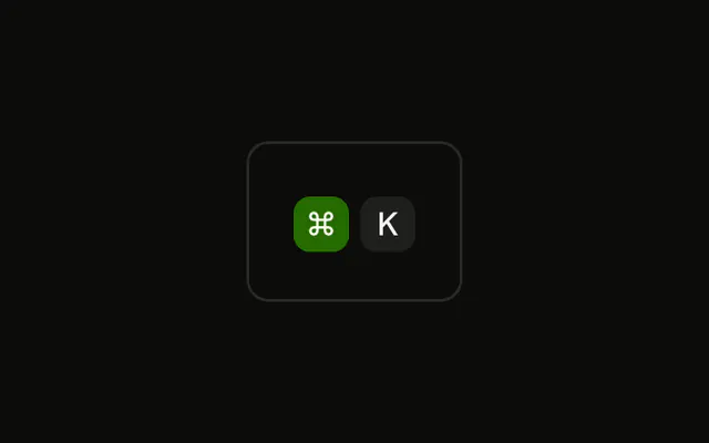
Both caps opt back into pointer events, show a pointer cursor, and fade to the accent color on hover. They still do not listen for ⌘K.
Add hover only when it explains the key. A cap cannot take focus, so put a Tooltip on a real control. In React, Ark UI does not make these caps focusable.
Installation
Anatomy
Usage
<div className="rounded-md border bg-background p-4">
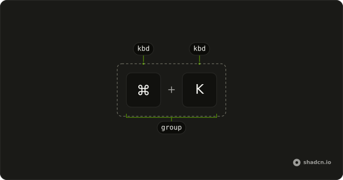
  <KbdGroup>
    <Kbd className="pointer-events-auto cursor-pointer transition-colors hover:bg-accent hover:text-accent-foreground">
      ⌘
    </Kbd>
    <Kbd className="pointer-events-auto cursor-pointer transition-colors hover:bg-accent hover:text-accent-foreground">
      K
    </Kbd>
  </KbdGroup>
</div>
FAQ
When should key caps have a hover state?
When hovering does something: a cheat sheet that shows what the key does, or a key cap inside a control. A hover effect on a cap that does nothing suggests a click that never comes.
Which classes create the hover effect?
pointer-events-auto turns pointer events back on, since Kbd turns them off, hover:bg-accent hover:text-accent-foreground changes the colors, transition-colors fades between them and cursor-pointer shows the hand. Without pointer-events-auto, the hover classes never apply.
Should each key in a shortcut be hoverable on its own?
Here each cap changes on its own, which suits an explorable keyboard. If the shortcut as a whole is the target, put the hover on the control that contains the KbdGroup instead.
How does hover work on touch screens?
It mostly doesn't: a tap may trigger the hover style briefly or not at all. Don't put anything people need behind hover; show it by default or on tap.
Should hoverable keys show a tooltip?
If the hover is meant to explain the key, yes: wrap a focusable trigger in a Tooltip that says what the shortcut does. A Kbd on its own can't receive focus, so the tooltip needs a real control to attach to.
Are hover-only interactions accessible?
No. Keyboard and screen reader users never hover, and Kbd can't be focused. Anything a hover reveals must also be available on focus or in visible text, and a click action belongs on a Button.
API Reference
Kbd
No extra props in this demo. The rest is on the Kbd page.