shadcn.io is an independent project built on shadcn/ui
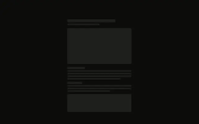
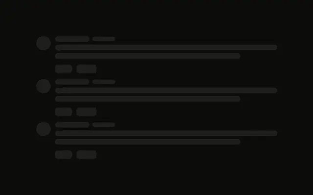
A wide article column, with a title, an image, and two paragraphs, sits beside a sidebar of two cards. The second card is a short list of links.
Use it for an article with related reading, so both columns hold their place. A known download is clearer as Progress. In React, Ark UI does not fill either column.
Installation
Sign in to get your install command
Free with an account. It carries your token, so the CLI installs everything in one go.
Use email insteadNo credit card
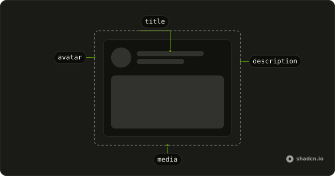
Anatomy
Usage
<div className="grid w-full max-w-5xl grid-cols-3 gap-8">
  <div className="col-span-2 flex flex-col gap-6">
    <Skeleton className="h-8 w-3/4" />
    <Skeleton className="h-64 w-full" />
    <div className="flex flex-col gap-3">
      <Skeleton className="h-4 w-full" />
      <Skeleton className="h-4 w-full" />
      <Skeleton className="h-4 w-full" />
      <Skeleton className="h-4 w-5/6" />
    </div>
    <div className="flex flex-col gap-3">
      <Skeleton className="h-4 w-full" />
      <Skeleton className="h-4 w-full" />
      <Skeleton className="h-4 w-4/6" />
    </div>
  </div>
  <div className="flex flex-col gap-6">
    <div className="flex flex-col gap-3 rounded-md border p-4">
      <Skeleton className="h-5 w-24" />
      <Skeleton className="h-4 w-full" />
      <Skeleton className="h-4 w-5/6" />
    </div>
    <div className="flex flex-col gap-3 rounded-md border p-4">
      <Skeleton className="h-5 w-32" />
      {LINKS.map((link) => (
        <div className="flex items-center gap-2" key={link}>
          <Skeleton className="size-8 rounded-md" />
          <Skeleton className="h-4 flex-1" />
        </div>
      ))}
    </div>
{/* The rest of the file is under Installation. */}
FAQ
API Reference
Skeleton
No extra props in this demo. The rest is on the Skeleton page.