shadcn.io is an independent project built on shadcn/ui
UI library: Ark UI
A wide article column, with a title, an image, and two paragraphs, sits beside a sidebar of two cards. The second card is a short list of links.
Use it for an article with related reading, so both columns hold their place. A known download is clearer as Progress. In Svelte, Ark UI does not fill either column.
Installation
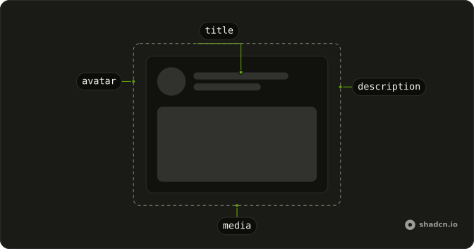
Anatomy
Usage
<div class="grid w-full max-w-5xl grid-cols-3 gap-8"><div class="col-span-2 flex flex-col gap-6"><Skeleton class="h-8 w-3/4" /><Skeleton class="h-64 w-full" /><div class="flex flex-col gap-3"><Skeleton class="h-4 w-full" /><Skeleton class="h-4 w-full" /><Skeleton class="h-4 w-full" /><Skeleton class="h-4 w-5/6" /></div><div class="flex flex-col gap-3"><Skeleton class="h-4 w-full" /><Skeleton class="h-4 w-full" /><Skeleton class="h-4 w-4/6" /></div></div><div class="flex flex-col gap-6"><div class="flex flex-col gap-3 rounded-md border p-4"><Skeleton class="h-5 w-24" /><Skeleton class="h-4 w-full" /><Skeleton class="h-4 w-5/6" /></div><div class="flex flex-col gap-3 rounded-md border p-4"><Skeleton class="h-5 w-32" />{#each LINKS as link (link)}<div class="flex items-center gap-2"><Skeleton class="size-8 rounded-md" /><Skeleton class="h-4 flex-1" /></div>{/each}</div></div></div>FAQ
API Reference
Skeleton
No extra props in this demo. The rest is on the Skeleton page.