shadcn.io is an independent project built on shadcn/ui
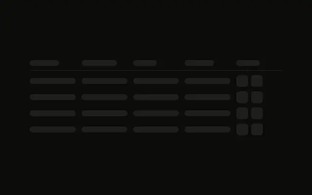
A header and two rows, each with a small square for an expand icon. A detail panel sits under the first row. Nothing in the demo opens or closes it.
Use it for orders or transactions whose rows reveal detail. If the table is already real and one cell is busy, use a Spinner. In React, Ark UI does not toggle that panel.
Installation
Anatomy
Usage
<div className="flex w-full max-w-2xl flex-col gap-3">
  <div className="grid grid-cols-4 gap-4 border-b pb-3">
    <Skeleton className="h-4 w-20" />
    <Skeleton className="h-4 w-24" />
    <Skeleton className="h-4 w-16" />
    <Skeleton className="h-4 w-20" />
  </div>
  <div className="flex flex-col gap-2">
    <div className="grid grid-cols-4 items-center gap-4">
      <div className="flex items-center gap-2">
        <Skeleton className="size-4 rounded-sm" />
        <Skeleton className="h-4 flex-1" />
      </div>
      <Skeleton className="h-4 w-full" />
      <Skeleton className="h-4 w-full" />
      <Skeleton className="h-4 w-full" />
    </div>
    <div className="rounded-md bg-muted/50 py-2 ps-10 pe-4">
      <div className="flex flex-col gap-2">
        <Skeleton className="h-3 w-full" />
        <Skeleton className="h-3 w-5/6" />
      </div>
    </div>
  </div>
  <div className="grid grid-cols-4 items-center gap-4">
    <div className="flex items-center gap-2">
      <Skeleton className="size-4 rounded-sm" />
      <Skeleton className="h-4 flex-1" />
    </div>
    <Skeleton className="h-4 w-full" />
    <Skeleton className="h-4 w-full" />
{/* The rest of the file is under Installation. */}
FAQ
How is the header row built?
grid grid-cols-4 gap-4 border-b pb-3 with four h-4 bars: w-20, w-24, w-16 and w-20. The whole block is max-w-2xl with gap-3.
What is the small square in the first cell?
size-4 rounded-sm, beside an h-4 flex-1 bar, in flex items-center gap-2. It holds the place of the expand icon. The other three cells are h-4 w-full.
Is the detail panel opened by state?
No. The panel is always in the markup, under the first row only. It is rounded-md bg-muted/50 py-2 ps-10 pe-4, with two h-3 lines at w-full and w-5/6.
What does the second row show?
The same grid-cols-4 as the first row, including the size-4 rounded-sm icon, and no panel under it.
API Reference
Skeleton
No extra props in this demo. The rest is on the Skeleton page.