shadcn.io is an independent project built on shadcn/ui
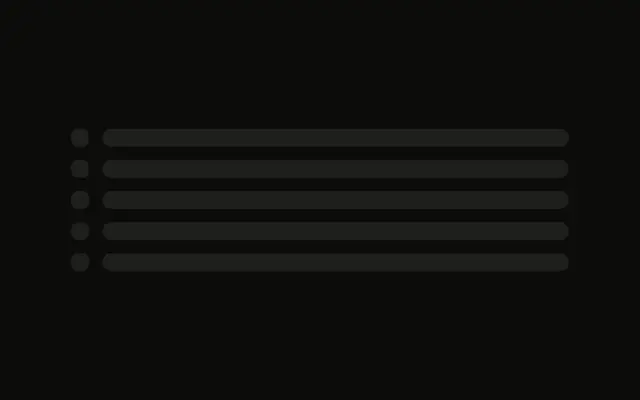
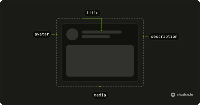
Five bordered rows each hold a square for an icon, two lines of text, and a second square at the end for an action.
Use it for a settings list or a file list with an icon in front and an action behind. A row that is already real can show a Spinner on that action. In React, Ark UI does not run it.
Installation
Anatomy
Usage
<div className="flex w-full max-w-md flex-col gap-3">
  {ROWS.map((row) => (
    <div className="flex items-center gap-3 rounded-md border p-3" key={row}>
      <Skeleton className="size-8 shrink-0 rounded-md" />
      <div className="flex flex-1 flex-col gap-2">
        <Skeleton className="h-4 w-2/3" />
        <Skeleton className="h-3 w-1/2" />
      </div>
      <Skeleton className="size-8 shrink-0 rounded-md" />
    </div>
  ))}
</div>
FAQ
How many rows does this list show?
Five. ROWS maps them into a max-w-md column with gap-3. Each row is flex items-center gap-3 rounded-md border p-3.
What are the squares at each end?
Both are size-8 shrink-0 rounded-md. One leads the row, one trails it. shrink-0 keeps them square while the text is flex-1.
What text does a row reserve?
Two lines in a gap-2 column: h-4 w-2/3 and h-3 w-1/2. The second bar is a smaller height and a shorter width.
Where does the row border come from?
rounded-md border p-3 is on the row div. The bars inside use Skeleton's own rounded-md and bg-muted.
API Reference
Skeleton
No extra props in this demo. The rest is on the Skeleton page.