shadcn.io is an independent project built on shadcn/ui
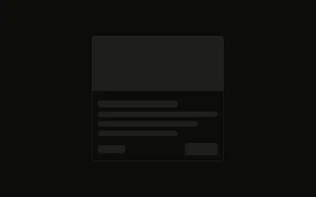
The smallest card shape: a tall image block and two lines under it, the second one shorter. No border wraps the stack.
Use it for a media grid or product tiles while images and titles load. When you cannot predict that shape, use a Spinner. In React, Ark UI does not hold the image.
Installation
Anatomy
Usage
<div className="flex w-full max-w-sm flex-col gap-3">
  <Skeleton className="h-48 w-full" />
  <Skeleton className="h-4 w-3/4" />
  <Skeleton className="h-4 w-1/2" />
</div>
FAQ
What wraps the image and the lines?
flex w-full max-w-sm flex-col gap-3. There is no border on the wrapper. The image and the two lines stack with gap-3.
How big is the image bar?
h-48 w-full. It uses the default radius and bg-muted from Skeleton. Match h-48 to the image you render.
Why are the two text lines different widths?
h-4 w-3/4 then h-4 w-1/2. The second bar is shorter, so the pair reads as a title and a short line under it.
Where does the pulse come from?
animate-pulse on Skeleton, with data-slot="skeleton". Edit the skeleton file under components/ui to change the pulse or the bg-muted fill for every bar.
API Reference
Skeleton
No extra props in this demo. The rest is on the Skeleton page.