shadcn.io is an independent project built on shadcn/ui
A round avatar with no photo shows a user icon on the muted background. There are no initials and no image.
Use it for a guest or an account with no name and no picture. Initials are better once you know the name. A role can sit in a Badge beside it. In React, Base UI does not choose the icon.
Installation
Anatomy
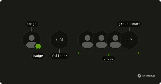
Usage
<Avatar>
  <AvatarFallback>
    <UserIcon aria-hidden="true" className="size-4" />
  </AvatarFallback>
</Avatar>
FAQ
Why is there no photo?
This file has no AvatarImage. AvatarFallback is the whole face, and it holds a UserIcon at size-4.
What color is the placeholder?
AvatarFallback uses the muted background and muted foreground from the avatar styles. The icon inherits that foreground. This file doesn't set a color.
How do I make the placeholder larger?
Set size on Avatar to sm, default, or lg. The icon stays size-4 until you change that class. The fallback fills the avatar.
API Reference
Avatar
No extra props in this demo. The rest is on the Avatar page.


