shadcn.io is an independent project built on shadcn/ui
The badge shows the word Badge in the destructive color, on a light tint of that color. There is no icon.
Use it for Failed, an error count, or something overdue. A full sentence belongs in an Alert. In React, Base UI keeps the label on one line.
Installation
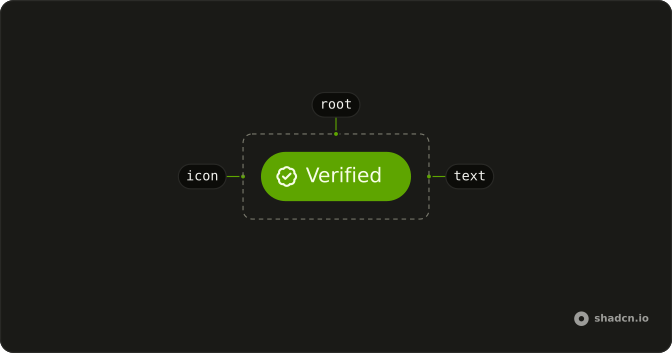
Anatomy
Usage
<Badge variant="destructive">Badge</Badge>FAQ
What color does variant destructive use?
variant="destructive" sets text-destructive on bg-destructive/10, and dark:bg-destructive/20 in dark mode. The word still has to name the problem, such as Error or Failed.
Which variant is for a success or a warning?
success and warning, plus info. secondary and outline stay neutral. default, ghost and link are the other values.
When should this be an alert instead?
Use the badge for a short status beside other content. Use an Alert when you need a sentence about what failed and what to do next.
How do I change the size or round it fully?
size takes sm, md or lg. pill rounds the badge fully. This demo sets neither, so you get the normal label.
API Reference
Badge
Sets variant="destructive". The rest is on the Badge page.