shadcn.io is an independent project built on shadcn/ui
Insert Block lists nine types under Basic Blocks, Lists, and Media. Those headings are not choices.
Use it in a block editor when the insert list is too long for the canvas. A longer catalog is faster to filter with Command. In React, Base UI does not insert the block.
Installation
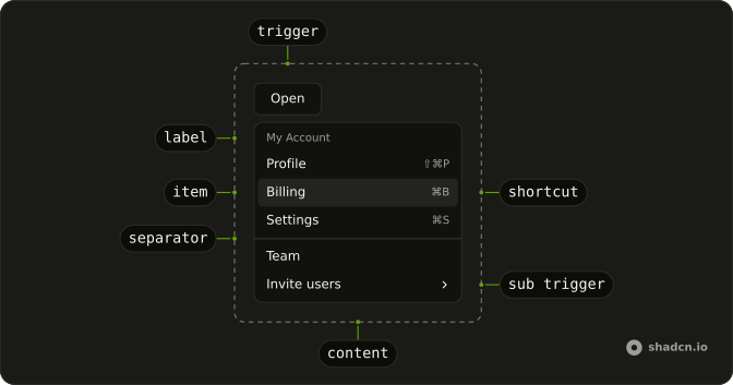
Anatomy
Usage
<DropdownMenu>
  <DropdownMenuTrigger render={<Button variant="outline" />}>
    <PlusIcon aria-hidden="true" data-icon="inline-start" />
    Insert Block
  </DropdownMenuTrigger>
  <DropdownMenuContent className="w-56">
    <DropdownMenuGroup>
      <DropdownMenuLabel>Basic Blocks</DropdownMenuLabel>
      <DropdownMenuItem>
        <TypeIcon aria-hidden="true" />
        Text
      </DropdownMenuItem>
      <DropdownMenuItem>
        <QuoteIcon aria-hidden="true" />
        Quote
      </DropdownMenuItem>
      <DropdownMenuItem>
        <MinusIcon aria-hidden="true" />
        Divider
      </DropdownMenuItem>
    </DropdownMenuGroup>
    <DropdownMenuSeparator />
    <DropdownMenuGroup>
      <DropdownMenuLabel>Lists</DropdownMenuLabel>
      <DropdownMenuItem>
        <ListIcon aria-hidden="true" />
        Bulleted List
      </DropdownMenuItem>
      <DropdownMenuItem>
        <ListOrderedIcon aria-hidden="true" />
        Numbered List
{/* The rest of the file is under Installation. */}
FAQ
How are the block types grouped?
Three DropdownMenuGroups, each starting with a DropdownMenuLabel: Basic Blocks, Lists and Media, with a DropdownMenuSeparator between groups. The label inside the group names it for screen readers too.
Which icon leads each row?
Type, quote, minus, list, ordered list, checked square, image, link and code icons, one per row and aria-hidden, before the label. The menu is w-56.
Is Basic Blocks a choice?
No. A DropdownMenuLabel is a heading: it can't be focused or picked, and the arrow keys skip it.
API Reference
Dropdown Menu
No extra props in this demo. The rest is on the Dropdown Menu page.
Button
Sets variant="outline". The rest is on the Button page.