shadcn.io is an independent project built on shadcn/ui
Support opens Documentation and Knowledge Base under Get Help, both with an external icon, then Contact Us. The rows do not open a page by themselves.
Use it in a header when help should be one click away. If Documentation should stay visible, use a Navigation Menu. In React, Base UI does not leave the page.
Installation
Anatomy
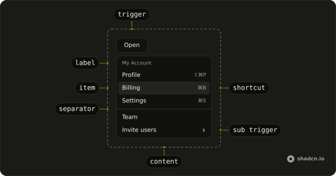
Usage
<DropdownMenu>
  <DropdownMenuTrigger render={<Button variant="outline" />}>
    <CircleHelpIcon aria-hidden="true" data-icon="inline-start" />
    Support
  </DropdownMenuTrigger>
  <DropdownMenuContent className="w-56">
    <DropdownMenuGroup>
      <DropdownMenuLabel>Get Help</DropdownMenuLabel>
      <DropdownMenuSeparator />
      <DropdownMenuItem>
        <BookIcon aria-hidden="true" />
        Documentation
        <ExternalLinkIcon aria-hidden="true" className="ms-auto size-3" />
      </DropdownMenuItem>
      <DropdownMenuItem>
        <MessagesSquareIcon aria-hidden="true" />
        Knowledge Base
        <ExternalLinkIcon aria-hidden="true" className="ms-auto size-3" />
      </DropdownMenuItem>
    </DropdownMenuGroup>
    <DropdownMenuSeparator />
    <DropdownMenuItem>
      <MailIcon aria-hidden="true" />
      Contact Us
    </DropdownMenuItem>
  </DropdownMenuContent>
</DropdownMenu>
FAQ
What is in the support menu?
A DropdownMenuGroup with the Get Help label, a separator, Documentation and Knowledge Base; then a separator and Contact Us. The menu is w-56.
Which rows show an external icon?
Documentation and Knowledge Base, with an external link icon at size-3 pushed to the end with ms-auto. Contact Us has none, since it stays in the app.
Does Documentation open a page by itself?
No. It's a plain item. Open the page from its handler, or make the row a link.
Use render on DropdownMenuItem with an a.
Is Get Help a choice?
No. It's the DropdownMenuLabel that names the group, and it can't be focused or picked.
API Reference
Dropdown Menu
No extra props in this demo. The rest is on the Dropdown Menu page.
Button
Sets variant="outline". The rest is on the Button page.