shadcn.io is an independent project built on shadcn/ui
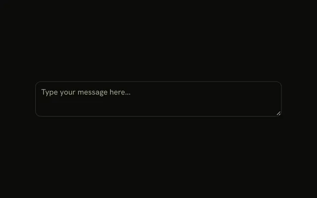
A footer under the textarea, with a line above the row. Format opens Plain Text, Markdown, and HTML. Send sits at the end. Picking Markdown does not change the Format label or the text.
Use it when one box can send more than one format. Keep the choice in state if the label should update. A box with no format menu is a Textarea. In React, Base UI does not remember the format.
Installation
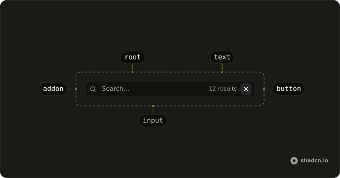
Anatomy
Usage
<InputGroup className="w-full max-w-sm bg-background">
  <InputGroupTextarea
    aria-label="Message"
    className="min-h-[100px]"
    placeholder="Write your message..."
  />
  <InputGroupAddon align="block-end" className="border-t">
    <DropdownMenu>
      <DropdownMenuTrigger
        render={<InputGroupButton size="sm" variant="ghost" />}
      >
        Format
        <ChevronDownIcon aria-hidden="true" className="size-3" />
      </DropdownMenuTrigger>
      <DropdownMenuContent align="start">
        <DropdownMenuGroup>
          <DropdownMenuItem>Plain Text</DropdownMenuItem>
          <DropdownMenuItem>Markdown</DropdownMenuItem>
          <DropdownMenuItem>HTML</DropdownMenuItem>
        </DropdownMenuGroup>
      </DropdownMenuContent>
    </DropdownMenu>
    <InputGroupButton className="ms-auto" size="sm" variant="default">
      Send
    </InputGroupButton>
  </InputGroupAddon>
</InputGroup>
FAQ
How is the bottom row built?
One InputGroupAddon with align="block-end" and border-t, after the textarea. It holds the Format menu and the Send button, which ms-auto pushes to the end.
How is the Format button wired to the menu?
An InputGroupButton with size="sm" and a small chevron. DropdownMenuTrigger renders the InputGroupButton through render.
Where does the menu open?
Below the button, aligned to its start. align="start" on DropdownMenuContent place it.
Does picking Markdown change anything?
No. Store the format in state, show it in the trigger and use it when you render the message.
API Reference
Input Group
Sets aria-label="Message", placeholder="Write your message...", align="block-end", size="sm", variant="ghost" and variant="default". The rest is on the Input Group page.
Dropdown Menu
Sets align="start". The rest is on the Dropdown Menu page.