shadcn.io is an independent project built on shadcn/ui
Border Radius is on the left and 50px is on the right. A muted box under the track uses that radius.
Use it in an editor where seeing the corner beats reading the number. A Number Input fits if the radius is typed. In React, Base UI does not draw the box.
Installation
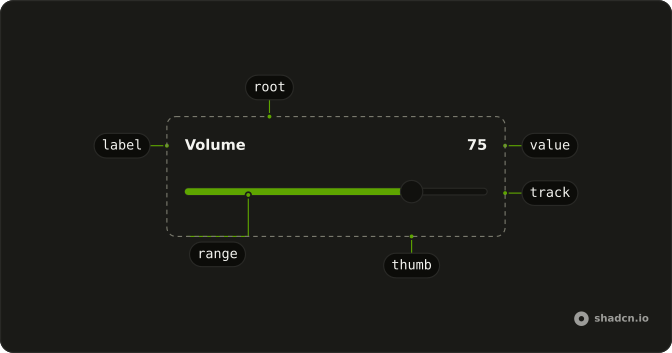
Anatomy
Usage
<div className="flex w-full max-w-md flex-col gap-4">
  <div className="flex items-center justify-between">
    <Label>Border Radius</Label>
    <span className="text-muted-foreground text-sm tabular-nums">
      {value[0]}px
    </span>
  </div>
  <Slider
    aria-label="Border Radius"
    max={50}
    min={0}
    onValueChange={handleValueChange}
    value={value}
  />
  <div
    className="h-24 bg-muted-foreground transition-all"
    style={{ borderRadius: `${value[0]}px` }}
  />
</div>
FAQ
How does the box change?
Its inline style sets borderRadius to the value in pixels. transition-all smooths the change.
How does the readout follow the thumb?
The value lives in state, starting at 50, and goes back to the slider as value. The text beside the label prints it with px.
onValueChange receives the new value, and the handler stores it as an array.
What is the preview box?
A div with h-24 and bg-muted-foreground, under the slider in the same column.
API Reference
Label
No extra props in this demo. The rest is on the Label page.
Slider
Sets aria-label="Border Radius", max={50}, min={0}, onValueChange={handleValueChange} and value={value}. The rest is on the Slider page.