shadcn.io is an independent project built on shadcn/ui
Each format is a radio with a title and a description. JSON is the default. The buttons are Cancel and Export. No file is built.
Use radios when exactly one format is allowed. A long list fits a Select better. In Solid, Ark UI does not export the data.
Installation
Anatomy
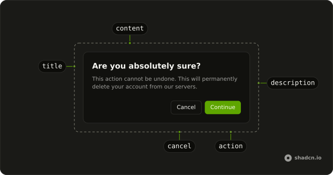
Usage
<AlertDialog>
    <AlertDialogTrigger asChild={props => <Button {...props()} variant="outline">Export Data</Button>} />
    <AlertDialogContent>
      <AlertDialogHeader>
        <AlertDialogTitle>Export Format</AlertDialogTitle>
        <AlertDialogDescription>
          Choose the format you want to export your data in.
        </AlertDialogDescription>
      </AlertDialogHeader>
      <RadioGroup aria-label="Export format" defaultValue="json">
        {formats.map(format => <FieldLabel>
            <Field orientation="horizontal">
              <RadioGroupItem value={format.value} />
              <FieldContent>
                <FieldTitle>{format.label}</FieldTitle>
                <FieldDescription>{format.description}</FieldDescription>
              </FieldContent>
            </Field>
          </FieldLabel>)}
      </RadioGroup>
      <AlertDialogFooter>
        <AlertDialogCancel>Cancel</AlertDialogCancel>
        <AlertDialogClose asChild={props => <AlertDialogAction {...props()}>Export</AlertDialogAction>} />
      </AlertDialogFooter>
    </AlertDialogContent>
  </AlertDialog>
FAQ
Radio group or select?
A radio group for three to five options people should compare, especially with descriptions. A select for longer lists or when space is tight.
Should an option be selected by default?
Usually. defaultValue="json" preselects the most common choice. Leave it empty only when you need people to choose deliberately.
How are the cards built?
Each option is a FieldLabel wrapping a horizontal Field with FieldTitle, FieldDescription and the RadioGroupItem. The label makes the whole card clickable and gives it its border and selected style.
Can I use it with the keyboard?
Yes. Tab moves into the group, arrow keys move between options and select them. The group is named Export format through aria-label.
API Reference
Alert Dialog
Sets asChild and props. The rest is on the Alert Dialog page.
Button
Sets props and variant="outline". The rest is on the Button page.
Radio Group
Sets aria-label="Export format", defaultValue="json" and value={format.value}. The rest is on the Radio Group page.
Field
Sets orientation="horizontal". The rest is on the Field page.