shadcn.io is an independent project built on shadcn/ui
The lightbulb is centered above Pro Tip. The description says to press Cmd+K to open the command palette. That cap does not listen for keys. Got it does not open a palette.
Center the icon for a tip that should pause the page. Put keys people will use on the real control. The palette is a Command. In Solid, Ark UI does not bind that shortcut.
Installation
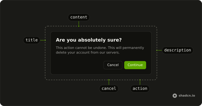
Anatomy
Usage
<AlertDialog>
    <AlertDialogTrigger asChild={props => <Button {...props()} variant="outline">Show Tip</Button>} />
    <AlertDialogContent>
      <AlertDialogHeader class="sm:place-items-center sm:text-center">
        <div class="mb-2 flex size-12 items-center justify-center rounded-full bg-warning/10">
          <LightbulbIcon aria-hidden="true" class="size-6 text-warning" />
        </div>
        <AlertDialogTitle>Pro Tip</AlertDialogTitle>
        <AlertDialogDescription>
          Use keyboard shortcuts to navigate faster. Press <Kbd>Cmd+K</Kbd> to
          open the command palette.
        </AlertDialogDescription>
      </AlertDialogHeader>
      <AlertDialogFooter>
        <AlertDialogClose asChild={props => <AlertDialogAction {...props()}>Got it</AlertDialogAction>} />
      </AlertDialogFooter>
    </AlertDialogContent>
  </AlertDialog>
FAQ
When should the icon be centered?
For messages worth pausing on: tips, milestones, announcements. Routine information reads faster with the icon beside the title.
Which colors suit a tip?
bg-warning/10 behind a text-warning icon, the theme's amber. Use info for general notes and success for completions; the tokens adapt to dark mode.
What size should the circle be?
size-12 with a size-6 icon inside, so the icon is half the circle's width.
How is the shortcut shown?
With the Kbd component inside AlertDialogDescription, which styles Cmd+K as a key and renders a kbd element.
API Reference
Alert Dialog
Sets asChild and props. The rest is on the Alert Dialog page.
Button
Sets props and variant="outline". The rest is on the Button page.
Kbd
No extra props in this demo. The rest is on the Kbd page.