shadcn.io is an independent project built on shadcn/ui
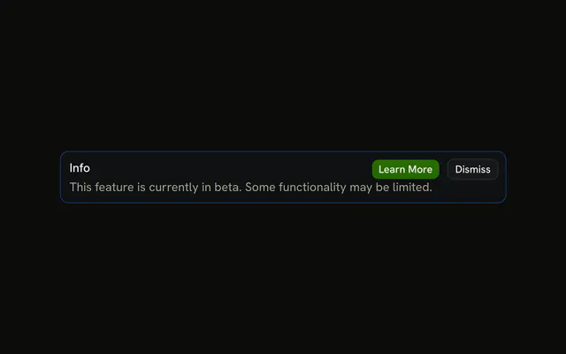
The title Info and a sentence that the feature is in beta and some parts may be limited. No icon and no buttons.
Use it for a limitation that should stay on the page. A one-time tip can go away as a Toast. In Solid, Ark UI does not hide this alert.
Installation
Anatomy
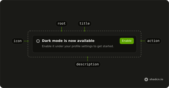
Usage
<Alert class="max-w-lg" variant="info">
    <AlertTitle>Info</AlertTitle>
    <AlertDescription>
      This feature is currently in beta. Some functionality may be limited.
    </AlertDescription>
  </Alert>
FAQ
What does this info alert contain?
AlertTitle with the text Info, and AlertDescription with "This feature is currently in beta. Some functionality may be limited." The root is variant="info" and className="max-w-lg".
Is there an icon or a button?
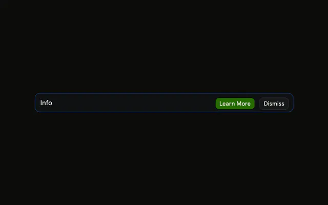
No. The demo is only the title and the description. Put an svg first if you want the icon column, or an AlertAction if you want buttons.
Why isn't the description blue?
The info variant tints the alert's background and border and colors the icon, but leaves the text in the theme's foreground and muted colors. Blue body text would be harder to read, and the tint already marks the alert as information.
How are the two lines laid out?
Alert is a grid with a small gap. AlertTitle is font-medium, and AlertDescription follows it in the muted color. The description wraps inside max-w-lg.
API Reference
Alert
Sets variant="info". The rest is on the Alert page.