shadcn.io is an independent project built on shadcn/ui
An alert is a bordered box in the flow of the page that holds one message: an icon, a title, a line or two of description and an optional next step. It stays until your code removes it, so it suits news the reader may look back at, such as a failed payment above the form they have to fix.
For a message that should show briefly and go away by itself, use a Toast. When the reader has to answer before going on, use an Alert Dialog.
Installation
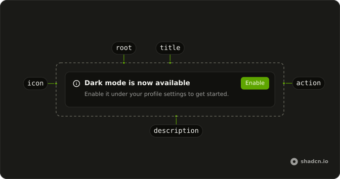
Anatomy
Usage
import { CheckCircle2Icon } from "lucide-solid";
import {
  Alert, AlertDescription, AlertTitle,
} from "@/components/ui/alert";
Put the icon first, as a direct child of Alert. The alert gives it a column of its own and lines the title and description up beside it.
<Alert class="max-w-md">
  <CheckCircle2Icon aria-hidden="true" />
  <AlertTitle>Payment successful</AlertTitle>
  <AlertDescription>
    Your payment of $29.99 has been processed. A receipt has been sent to
    your email address.
  </AlertDescription>
</Alert>
Accessibility
Alert renders a div with role="alert", which makes it an assertive live region: when one is added to the page or its text changes, a screen reader announces it straight away, ahead of whatever it was reading. Keep that for news that can't wait, such as a failed payment. A confirmation that can wait its turn belongs in a role="status" region instead, as the answer on screen readers explains. The rest is up to you. The icon means nothing to a screen reader, so mark it aria-hidden as the demos do and let the title say what happened. AlertTitle is a div, not a heading, so the alert doesn't appear in the page's outline.
Demos
Basic
A confirmation that the account was updated, with a check icon, a title and one sentence saying the profile was saved. This is the default variant, on the card background with nothing tinted. Use it after a save, when the reader may glance back to check that it worked. The icon is hidden from screen readers, so the title alone has to say what happened.
Destructive
Payment failed, with variant set to destructive, which turns the title, the description and the icon the theme's destructive red while the background stays the card's. Pick it when something the reader did has failed and they have to act on it, and let the description say what to do next, as this one points to the payment method. A plan about to expire is a warning, not an error.
Action
A notice that dark mode is available, with an Enable button in AlertAction, which pins it to the alert's top right corner. There is no icon, so the title starts at the alert's edge. Use an action when the notice has one obvious next step the reader can take on the spot. A button wider than this one needs more room, as the answer on buttons explains.
Colors
A notice that the subscription expires in three days, colored amber by classes on Alert for the border, the background and the text, each with a dark: version. The title and icon follow the amber, while AlertDescription keeps its own muted color. The built-in warning variant would suit this message, so keep classes like these for a color no variant has, such as your brand's.
RTL
The payment confirmation and the dark mode notice in Arabic, inside a wrapper with dir set to rtl. The icons move to the right, where Arabic starts, and each title and description line up to their left, because the alert's grid and padding follow the reading direction. Use this to check how a translated alert lays out, including a description that wraps onto a second line.
FAQ
When should I use an Alert instead of a toast?
Use an Alert when the message belongs to a place on the page and should stay there until your code removes it, such as a failed save above the form that needs fixing. A toast floats over the page and closes itself after a few seconds, which suits a confirmation nobody needs to keep, like a copied link. Sonner and Toast cover that case.
When the reader has to answer before going on, such as confirming that a project should be deleted, use an Alert Dialog instead.
What color variants does the Alert have?
Five, chosen with variant. The default alert sits on the card background in the card's text color, and destructive turns its text and icon the theme's destructive red, for something that failed. The other three, info, success and warning, give the background a faint tint and color the border and the icon.
Those three read their color from the --info, --success and --warning variables that installing the alert adds to your theme. Change one there and every alert of that kind follows, along with the hover tint of a ghost button inside AlertAction.
How do I give an Alert a color of my own?
For one alert, put the classes on it, as the Colors demo does: a border, a background and a text color, each with a dark: version. Give AlertDescription a text color too, because it keeps its own muted one otherwise.
For a color you'll use again, add a key to alertVariants in components/ui/alert, which is your code once installed. Model it on info, with a tinted background, a border color and an icon color, then pass the new name as variant. The prop's type comes from that object, so TypeScript accepts the new name without further changes.
Does the Alert announce itself to screen readers?
Yes, when it appears or its text changes. Alert sets role="alert", so a screen reader reads its title and description at once, ahead of whatever it was saying, which suits an error the reader has to deal with now.
For a message that can wait, such as a saved profile, render the alert inside an element with role="status" that is already on the page, and pass role="none" to the alert itself. The status region reads it once the screen reader finishes what it is saying, which a status added along with its text doesn't do reliably. A notice that is part of the page from the start needs no announcement: role="note" takes it out of the live regions, and it is read in order with the rest of the page.
How do I make an Alert dismissible in Solid?
Keep whether it is shown in your own state and render the alert only while that is true. Put a close button with an X icon in AlertAction and have it set that state to hidden. A button with only an icon needs a name, so give it an aria-label such as Dismiss.
Alert has no close button and no open state of its own, so nothing else needs wiring. To keep it closed after a reload, save the dismissal, in localStorage for one browser or on the server for the account.
Can I use an Alert without an icon?
Yes. Without an icon the alert is a single column and the text starts at its edge, as in the Action demo. With one, the alert adds a narrow column for it and lines the title and description up beside it.
That layout only happens when the svg is a direct child of Alert, so put the icon itself there, not inside a span or a wrapper. The alert gives the icon a fixed size unless it has a size- class of its own, and colors it to match the variant.
How should I show form errors with an Alert?
Put one destructive Alert above the form for what went wrong as a whole, such as a declined card or a server that didn't answer. Let the title say what happened and the description how to fix it, and render it when the submit fails, so its role="alert" has a screen reader read it out.
Errors that belong to one field go next to that field, as Field shows them, not in an alert per field. When several fields fail at once, the alert can list them, each with a link that moves focus to its field.
API Reference
Alert
<div> data-slot="alert"
variant?"default" | "destructive" | "info" | "success" | "warning"
The visual style.
- Type
"default" | "destructive" | "info" | "success" | "warning"- Default
"default"
asChild?(props: ParentProps) => JSX.Element
Render your own element: a function that gets the part's props to spread on it.
- Type
(props: ParentProps) => JSX.Element
class?string
Merged with the part's classes.
data-variant?stringAlertTitle
<div> data-slot="alert-title"
asChild?(props: ParentProps) => JSX.Element
Render your own element: a function that gets the part's props to spread on it.
- Type
(props: ParentProps) => JSX.Element
class?string
Merged with the part's classes.
AlertDescription
<div> data-slot="alert-description"
asChild?(props: ParentProps) => JSX.Element
Render your own element: a function that gets the part's props to spread on it.
- Type
(props: ParentProps) => JSX.Element
class?string
Merged with the part's classes.
AlertAction
<div> data-slot="alert-action"
asChild?(props: ParentProps) => JSX.Element
Render your own element: a function that gets the part's props to spread on it.
- Type
(props: ParentProps) => JSX.Element
class?string
Merged with the part's classes.