shadcn.io is an independent project built on shadcn/ui
The question Can I use this in my project? fills the row, with an up-down chevron at the end. The answer is one short line.
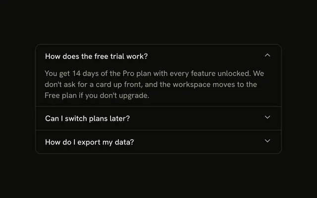
Use it for a short FAQ or a terms line. A longer answer reads better in an Accordion. In Solid, Ark UI toggles this row on its own.
Installation
Anatomy
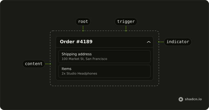
Usage
<Collapsible class="flex w-full max-w-lg flex-col gap-2">
    <CollapsibleTrigger class="flex w-full items-center justify-between gap-4 text-start font-medium text-sm">
      Can I use this in my project?
      <ChevronsUpDownIcon aria-hidden="true" class="size-4 shrink-0" />
    </CollapsibleTrigger>
    <CollapsibleContent class="text-muted-foreground text-sm">
      Yes. Free to use for personal and commercial projects. No attribution
      required.
    </CollapsibleContent>
  </Collapsible>
FAQ
How does the question line up with the icon?
The trigger is flex w-full items-center justify-between gap-4: the question at the start, the icon at the end. shrink-0 keeps the icon its size when the question wraps.
Does ChevronsUpDown rotate?
No. It already points both ways, so it reads right open or closed. It is aria-hidden; the question names the button.
What separates the question and the answer?
Collapsible is a flex flex-col gap-2 column, so the answer sits a step below the question. The answer is text-muted-foreground text-sm.
How do I toggle it from the keyboard?
Tab reaches the trigger, a button named by the question, and Space or Enter toggles the answer.
How do I add another question in this layout?
Repeat the Collapsible with new text, in a column with a gap. Each Collapsible opens on its own. When several sit in one list and only one should be open at a time, with arrow keys between the headers, use an Accordion.
API Reference
Collapsible
No extra props in this demo. The rest is on the Collapsible page.