shadcn.io is an independent project built on shadcn/ui
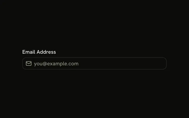
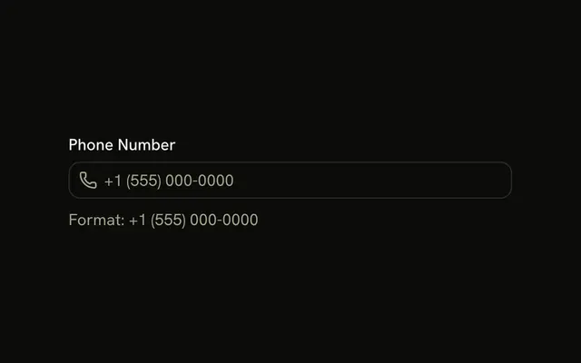
Two contact fields. A mail icon sits before the email input, and a phone icon sits before the phone input. Email gets the email keyboard. Phone gets the phone keyboard. The icons are decorative.
Use it on a contact form where the icon should say what to type. If you also need a visible caption, add a Label. In Solid, Ark UI does not read the icon as the field's name.
Installation
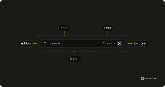
Anatomy
Usage
<div class="flex w-full max-w-sm flex-col gap-4">
    <InputGroup class="bg-background">
      <InputGroupInput aria-label="Email address" placeholder="Email address" type="email" />
      <InputGroupAddon>
        <MailIcon aria-hidden="true" />
      </InputGroupAddon>
    </InputGroup>
    <InputGroup class="bg-background">
      <InputGroupInput aria-label="Phone number" placeholder="Phone number" type="tel" />
      <InputGroupAddon>
        <PhoneIcon aria-hidden="true" />
      </InputGroupAddon>
    </InputGroup>
  </div>
FAQ
How does the icon sit before the input?
The InputGroupAddon uses the default align, inline-start, which places it before the input, while the code keeps the input first.
Why type=email and type=tel?
They bring up the email and phone keyboards on mobile and let the browser autofill and check the email format.
API Reference
Input Group
Sets aria-label="Email address", placeholder="Email address", type="email", aria-label="Phone number", placeholder="Phone number" and type="tel". The rest is on the Input Group page.