shadcn.io is an independent project built on shadcn/ui
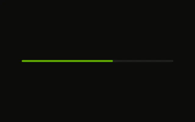
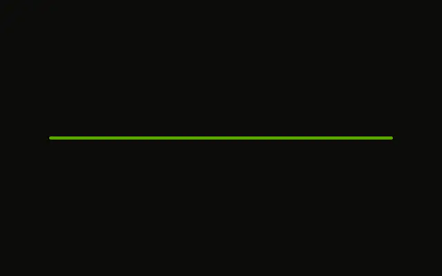
A bar at 60 percent on a 4 pixel track. It is a thin line, with no label and no change to the default color.
Use the thin track in a dense row where a tall bar would crowd the text. A Spinner is smaller still when you have no percentage. In Solid, Ark UI shows only the value you pass.
Installation
Anatomy
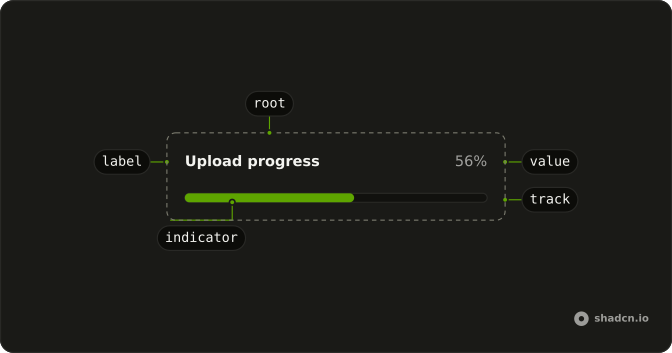
Usage
<Progress aria-label="Upload progress" class="w-full max-w-md *:data-[slot=progress-track]:h-1" value={60} />FAQ
How is the track's height set?
With a class on Progress, since it has no size prop.
*:data-[slot=progress-track]:h-1 makes the track 4px tall.
The fill is h-full, so it follows.
How tall is it without the class?
This demo sets no height. Each theme style sets its own, from h-0.5 to h-3.
Does the height change the colors?
The fill is bg-primary and the track bg-muted, from the theme's progress styles. This demo adds no color class.
API Reference
Progress
Sets aria-label="Upload progress" and value={60}. The rest is on the Progress page.