shadcn.io is an independent project built on shadcn/ui
A progress bar shows how far a task with a known end has gotten: an upload, an import, the third of five setup steps. It fills from the value you pass and redraws when that number changes. It never watches the request itself.
When there's no number to report, a Spinner is the honest choice. For a ring that fits a tight corner, use Circular Progress, and when people should set the number themselves, a Slider.
Installation
Anatomy
Usage
import { useEffect, createSignal } from "react";
import { Progress } from "@/components/ui/progress";
const ProgressDemo = () => {
const [progress, setProgress] = createSignal(13);
useEffect(() => {
const timer = setTimeout(() => setProgress(66), 500);
return () => clearTimeout(timer);
}, []);
return <Progress aria-label="Loading" class="w-[60%]" value={progress} />;
};The timer stands in for real work: half a second after mount it moves value from 13 to 66, and the fill slides to match. In your app the number comes from the upload or the job that reports it. With no visible label, aria-label gives the bar its name.
Accessibility
The element with the progressbar role is the track that Progress renders inside itself, with aria-valuenow, aria-valuemin and aria-valuemax. A ProgressLabel names it through aria-labelledby, and an aria-label or aria-labelledby passed to Progress goes to the track too. With none of them, Ark UI names the bar by its value text, such as "56%" or, while it's indeterminate, "loading...". ProgressValue is a polite live region, which a screen reader reads again each time the number changes.
Demos
Label
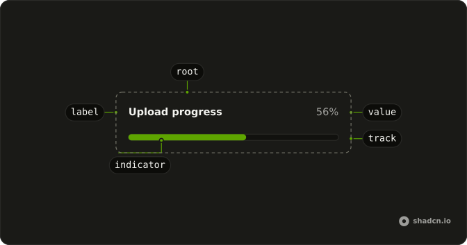
An upload bar at 56%, with ProgressLabel reading "Upload progress" on one side and ProgressValue printing the percent on the other, both inside Progress. Use it when the page runs more than one task, or the bar sits far from the thing it measures. The label also becomes the bar's name for screen readers.
Controlled
A bar at 50% with a Slider under it that writes into the same state, so dragging the thumb moves the fill. The slider stands in for the real source. In an app, value comes from an upload's progress events or from the step a setup flow is on. Reach for this pattern whenever the work can report how far it has gotten.
RTL
The upload bar with an Arabic label and dir set to rtl on Progress. On Ark UI that attribute reaches only the root, so the label and percent swap sides while the track keeps the locale's left-to-right direction and fills from the left. Wrap the bar in a Direction provider set to right to left, and the fill grows from the right edge.
FAQ
How do I update a Progress bar from a file upload in Solid?
Keep the percent in state and pass it as value: the bar redraws on every change and never reads the request itself. For an upload, XMLHttpRequest reports bytes sent through upload.onprogress, and loaded / total * 100 is the number to store. fetch has no upload progress event, so a bar driven by it can only jump from start to finish.
Pass a number from the first render. With no value, Ark UI starts the bar halfway between min and max.
How do I show an indeterminate Progress bar when I don't know how long it will take?
Pass null as value. The bar drops aria-valuenow, its value text becomes "loading..." (the name it falls back on without a label), and the root and indicator get data-state set to indeterminate.
The indicator then fills the whole track and pulses, so the bar reads as busy rather than empty or finished. The pulse is a fade, not movement, so it keeps running under reduced motion. For another look, change the indicator's classes for that state in components/ui/progress, or show a Spinner, which says "working" without a number.
How do I count steps instead of percent with the Ark UI Progress?
Set max on Progress to the number of steps and pass the current step as value: 3 with a max of 5 fills 60% of the track. Add min when the count doesn't start at 0. ProgressValue still prints a percent unless you give it content of its own, such as "3 of 5", which replaces the number.
How do I change what screen readers hear for the Ark UI Progress?
Pass translations with a value function, which receives the value, min, max and percent and returns the value text, "56%" by default. Ark UI sets that text as the bar's aria-label, which screen readers hear only when no ProgressLabel, aria-label or aria-labelledby names the bar, so return the task along with the number, such as "Upload, 56%".
With a ProgressLabel, the bar is read by its label and aria-valuenow. To put the number in words there, pass Progress an aria-label that carries both, such as "Upload, 3 of 5 files", which names the bar in the label's place. The visible ProgressValue ignores both, so change it through its own content.
How do I show a label and the percentage next to the Progress bar?
Put ProgressLabel and ProgressValue inside Progress, ahead of the track it renders for you, as the Label demo does. The root is a flex row that wraps, so the two share the first line with the value pushed to the far end, and the track takes the full width beneath them.
ProgressLabel also becomes the bar's accessible name, so it needs no aria-label.
How do I change the color or height of a Progress bar?
Progress renders its track and indicator for you, so reach them from the classes you pass to Progress, matching their data-slot. *:data-[slot=progress-track]:h-3 makes the track taller, and **:data-[slot=progress-indicator]:bg-emerald-500 recolors the fill. The first selector matches direct children only, and the indicator sits one level deeper, inside the track.
For a look every bar in the app should share, edit ProgressTrack and ProgressIndicator in components/ui/progress, which is your code once installed.
What happens when a Progress value goes past max?
Progress clamps it between min and max before Ark UI sees it, since Ark UI throws an error for a first value outside them and passes a later one through as it is. A value above max fills the whole track and reports max to screen readers, and one below min leaves it empty. Nothing breaks, but a bar sitting at 100% while work goes on points at max and value counting different things, such as kilobytes against bytes.
When should I use a Slider or a Circular Progress instead of a Progress bar?
Progress reports a number your code sets, and nobody can move it. When people should choose the value, such as a volume or a price ceiling, use a Slider, which takes focus and answers to the arrow keys.
Circular Progress shows the same kind of value as a ring, for a card corner or a button where a full-width bar won't fit. A Spinner covers work with no amount to measure, like waiting on a server response.
API Reference
Progress
<div> data-slot="progress"
value?number | null
The controlled value of the progress bar.
- Type
number | null
defaultValue?number | null
The initial value of the progress bar when rendered. Use when you don't need to control the value of the progress bar.
- Type
number | null- Default
50
onValueChange?(details: ValueChangeDetails) → void
Callback fired when the value changes.
- Type
(details: ValueChangeDetails) → void- Parameters
details– { value: number | null }- Returns
void
dir?"ltr" | "rtl"
The document's text/writing direction.
- Type
"ltr" | "rtl"- Default
"ltr"
formatOptions?Intl.NumberFormatOptions
The options to use for formatting the value.
- Default
{ style: "percent" }
id?string
The unique identifier of the machine.
ids?object
The ids of the elements in the progress bar. Useful for composition.
- Type
{ root?: string; track?: string; label?: string; circle?: string }
locale?string
The locale to use for formatting the value.
- Default
"en-US"
max?number
The maximum allowed value of the progress bar.
- Default
100
min?number
The minimum allowed value of the progress bar.
- Default
0
orientation?"horizontal" | "vertical"
The orientation of the element.
- Type
"horizontal" | "vertical"- Default
"horizontal"
translations?object
The localized messages to use.
- Type
{ value?: (details: ValueTranslationDetails) → string }
asChild?(props: ParentProps) => JSX.Element
Render your own element: a function that gets the part's props to spread on it.
- Type
(props: ParentProps) => JSX.Element
class?string
Merged with the part's classes.
data-max?stringdata-orientation?string
The orientation of the progress.
data-state"indeterminate" | "loading" | "complete"
"indeterminate", "loading" or "complete".
- Type
"indeterminate" | "loading" | "complete"
data-value?string
The value of the item.
--circumferencestring
The circumference value for the root.
--offsetstring
The offset position of the element.
--percentstring
The percent value for the root.
--radiusstring
The border radius value.
ProgressLabel
<span> data-slot="progress-label"
asChild?(props: ParentProps) => JSX.Element
Render your own element: a function that gets the part's props to spread on it.
- Type
(props: ParentProps) => JSX.Element
class?string
Merged with the part's classes.
data-orientation?string
The orientation of the label.
ProgressTrack
<div> data-slot="progress-track"
asChild?(props: ParentProps) => JSX.Element
Render your own element: a function that gets the part's props to spread on it.
- Type
(props: ParentProps) => JSX.Element
class?string
Merged with the part's classes.
data-max?stringdata-orientation?string
The orientation of the track.
data-state"indeterminate" | "loading" | "complete"
"indeterminate", "loading" or "complete".
- Type
"indeterminate" | "loading" | "complete"
ProgressIndicator
<div> data-slot="progress-indicator"
asChild?(props: ParentProps) => JSX.Element
Render your own element: a function that gets the part's props to spread on it.
- Type
(props: ParentProps) => JSX.Element
class?string
Merged with the part's classes.
data-orientation?string
The orientation of the range.
data-state"indeterminate" | "loading" | "complete"
"indeterminate", "loading" or "complete".
- Type
"indeterminate" | "loading" | "complete"
ProgressValue
<span> data-slot="progress-value"
asChild?(props: ParentProps) => JSX.Element
Render your own element: a function that gets the part's props to spread on it.
- Type
(props: ParentProps) => JSX.Element
class?string
Merged with the part's classes.
ProgressRange
asChild?(props: ParentProps) => JSX.Element
Render your own element: a function that gets the part's props to spread on it.
- Type
(props: ParentProps) => JSX.Element
useProgress
value?number | null
The controlled value of the progress bar.
- Type
number | null
defaultValue?number | null
The initial value of the progress bar when rendered. Use when you don't need to control the value of the progress bar.
- Type
number | null- Default
50
onValueChange?(details: ValueChangeDetails) → void
Callback fired when the value changes.
- Type
(details: ValueChangeDetails) → void- Parameters
details– { value: number | null }- Returns
void
formatOptions?Intl.NumberFormatOptions
The options to use for formatting the value.
- Default
{ style: "percent" }
id?string
The unique identifier of the machine.
ids?object
The ids of the elements in the progress bar. Useful for composition.
- Type
{ root?: string; track?: string; label?: string; circle?: string }
locale?string
The locale to use for formatting the value.
- Default
"en-US"
max?number
The maximum allowed value of the progress bar.
- Default
100
min?number
The minimum allowed value of the progress bar.
- Default
0
orientation?"horizontal" | "vertical"
The orientation of the element.
- Type
"horizontal" | "vertical"- Default
"horizontal"
translations?object
The localized messages to use.
- Type
{ value?: (details: ValueTranslationDetails) → string }