shadcn.io is an independent project built on shadcn/ui
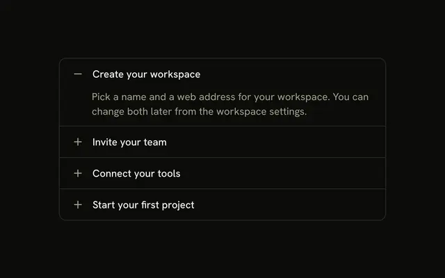
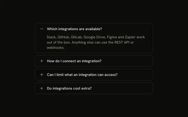
Four billing questions in a bordered stack. A plus on the right turns into a minus while the answer is open. Which payment methods do you accept? starts open.
Use it when a chevron is too easy to miss. One question on its own can be a Collapsible. In Solid, Ark UI does not draw this plus for you.
Installation
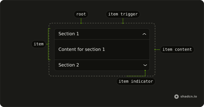
Anatomy
Usage
<Accordion class="w-full max-w-md -space-y-px" defaultValue={["payment"]}>
    {items.map(item => <AccordionItem class="overflow-hidden border bg-background px-4 first:rounded-t-lg last:rounded-b-lg" value={item.value}>
        <AccordionTrigger class="hover:no-underline **:data-[slot=accordion-trigger-icon]:hidden">
          <span class="flex w-full items-center justify-between gap-3">
            <span class="text-start">{item.title}</span>
            <span class="relative size-4 shrink-0">
              <PlusIcon aria-hidden="true" class="absolute inset-0 size-4 text-muted-foreground transition-opacity duration-200 group-aria-expanded/accordion-trigger:opacity-0" />
              <MinusIcon aria-hidden="true" class="absolute inset-0 size-4 text-muted-foreground opacity-0 transition-opacity duration-200 group-aria-expanded/accordion-trigger:opacity-100" />
            </span>
          </span>
        </AccordionTrigger>
        <AccordionContent>
          <p class="text-muted-foreground">{item.content}</p>
        </AccordionContent>
      </AccordionItem>)}
  </Accordion>
FAQ
How does the plus turn into a minus?
**:data-[slot=accordion-trigger-icon]:hidden on AccordionTrigger hides the built-in chevron. PlusIcon and MinusIcon share one relative size-4 box, and group-aria-expanded/accordion-trigger fades the plus out and the minus in over duration-200. Both icons are aria-hidden and text-muted-foreground.
Why does the payment question start open?
defaultValue={["payment"]} opens the payment question on first render. The string matches that item's value.
How do I let several items stay open at once?
One open item is the default. Add multiple to Accordion to let several stay open, and list every item that should start open in the defaultValue array.
How do the row borders meet?
-space-y-px on Accordion pulls the rows together so neighboring borders share one line. Each AccordionItem has border, px-4, first:rounded-t-lg and last:rounded-b-lg.
API Reference
Accordion
Sets defaultValue={["payment"]} and value={item.value}. The rest is on the Accordion page.