shadcn.io is an independent project built on shadcn/ui
Secondary color and the pill prop. The shape is the only difference from a normal secondary button.
Use it next to a round primary button so the pair matches. If only one button is round, it looks accidental. Leave pill off the Button unless the screen is already built that way. In Solid, Ark UI treats pill as on or off, with no radius in between.
Installation
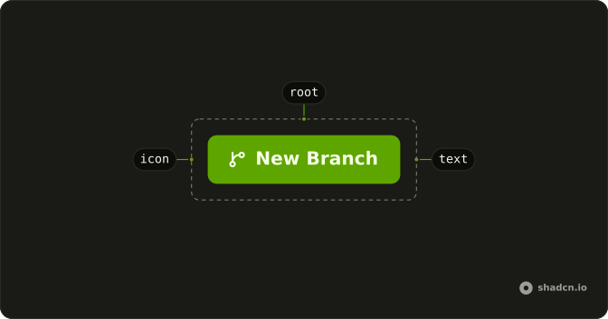
Anatomy
Usage
<Button pill variant="secondary">
    Button
  </Button>
FAQ
How do I get the fully rounded ends?
Pass pill. The component rounds the ends fully and marks the button with data-pill. Use the prop rather than a rounding class, so the shape stays the component's.
Does pill change the colors?
No. variant="secondary" is the quieter fill, and pill rounds it to match a primary pill beside it. pill only changes the radius. The label, the type, and the click are the same as a square button of that variant.
When is a pill the wrong shape?
When the buttons around it have the normal radius. One pill in a square group looks accidental. Use it when the screen is already built from round controls.
Should both buttons in a pair be pills?
If one is. A round primary next to a square secondary looks unfinished. Pass pill on both, or on neither.
API Reference
Button
Sets pill and variant="secondary". The rest is on the Button page.