shadcn.io is an independent project built on shadcn/ui
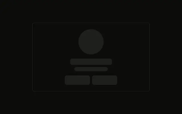
Everything is centered: a round avatar, a name, a role, two lines of bio, and three small circles for social links.
Use it in a grid of team or contributor cards while the people load. A seat that is actually vacant is clearer as Empty. In Solid, Ark UI does not load the person.
Installation
Anatomy
Usage
<div class="flex w-full max-w-xs flex-col items-center gap-4 rounded-md border p-6 text-center">
    <Skeleton class="size-20 rounded-full" />
    <div class="flex w-full flex-col items-center gap-2">
      <Skeleton class="h-5 w-32" />
      <Skeleton class="h-4 w-24" />
    </div>
    <Skeleton class="h-4 w-full" />
    <Skeleton class="h-4 w-5/6" />
    <div class="flex gap-2 pt-2">
      <Skeleton class="size-8 rounded-full" />
      <Skeleton class="size-8 rounded-full" />
      <Skeleton class="size-8 rounded-full" />
    </div>
  </div>
FAQ
How is the card centered?
flex w-full max-w-xs flex-col items-center gap-4 rounded-md border p-6 text-center. The circle, the name group, the bio and the icons all center in that column.
How big is the avatar circle?
size-20 rounded-full. rounded-full replaces the radius Skeleton gets from your style.
What sits under the circle?
A w-full column with items-center gap-2: h-5 w-32 for the name and h-4 w-24 for the role. The bio is h-4 w-full and h-4 w-5/6.
API Reference
Skeleton
No extra props in this demo. The rest is on the Skeleton page.