shadcn.io is an independent project built on shadcn/ui
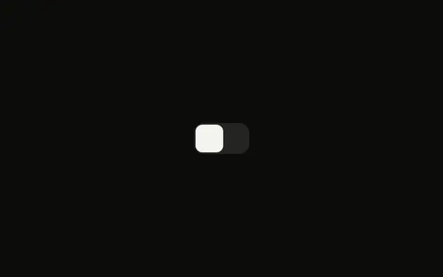
A wide switch starts on, with square corners and the word On visible on the track. Off takes that place when the switch is off. Its accessible name is Labeled switch, not On.
Use the words when on and off must be unmistakable, such as power or a live mode. Rename the accessible name to the real setting. A form field can be a Checkbox instead. In Solid, Ark UI reports the new value, and this demo stores it.
Installation
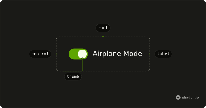
Anatomy
Usage
<div class="relative inline-grid h-9 grid-cols-[1fr_1fr] items-center font-medium text-sm">
      <Switch aria-label="Labeled switch" checked={checked()} class="peer absolute inset-0 h-[inherit] w-auto rounded-md data-unchecked:bg-input/50 **:data-[slot=switch-thumb]:data-checked:translate-x-full **:data-[slot=switch-thumb]:z-10 **:data-[slot=switch-thumb]:h-full **:data-[slot=switch-thumb]:w-1/2 **:data-[slot=switch-thumb]:rounded-sm **:data-[slot=switch-thumb]:duration-300 **:data-[slot=switch-thumb]:ease-[cubic-bezier(0.16,1,0.3,1)] **:data-[slot=switch-thumb]:data-checked:rtl:-translate-x-full" onCheckedChange={handleCheckedChange} />
      <span class="pointer-events-none relative ms-0.5 flex translate-x-full items-center justify-center px-2 text-center transition-transform duration-300 ease-[cubic-bezier(0.16,1,0.3,1)] peer-data-checked:invisible peer-data-checked:translate-x-0 rtl:-translate-x-full">
        <span class="font-medium text-[10px] uppercase">Off</span>
      </span>
      <span class="pointer-events-none invisible relative me-0.5 flex items-center justify-center px-2 text-center transition-transform duration-300 ease-[cubic-bezier(0.16,1,0.3,1)] peer-data-checked:visible peer-data-checked:-translate-x-full peer-data-checked:text-primary-foreground peer-data-checked:rtl:translate-x-full">
        <span class="font-medium text-[10px] uppercase">On</span>
      </span>
    </div>
FAQ
How is the On and Off switch laid out?
A two-column grid with h-9 and grid-cols-[1fr_1fr] holds the Off and On words. The Switch is peer absolute inset-0 with h-[inherit] w-auto rounded-md, so it covers both columns, and its thumb is h-full w-1/2.
What moves the thumb and the words?
When the switch is on, the thumb moves with translate-x-full, over 300ms with a custom easing. The words are siblings after the switch, so peer- classes show On and hide Off when it is on, and rtl: classes slide the other way.
The state classes use data-checked and data-unchecked.
Is there a text name for this switch?
The visible On and Off words describe the state, not the setting, so the demo passes aria-label (Labeled switch). Change it to the setting the switch controls.
How do I control this switch in Solid?
This file keeps the state itself, starting on, and passes it back to the Switch.
Pass checked; onCheckedChange receives details.checked.
API Reference
Switch
Sets aria-label="Labeled switch", checked={checked()} and onCheckedChange={handleCheckedChange}. The rest is on the Switch page.