shadcn.io is an independent project built on shadcn/ui
A one-line field and a textarea both say Send a message... and both are disabled. The field has a spinner at its end. The textarea's bottom row has a spinner, the word Validating..., and a send button.
Use it while a message is checked or sent, and keep the fields disabled so they are not edited mid-check. This file never sends. A percent belongs on Progress. In React, Base UI does not validate the text.
Installation
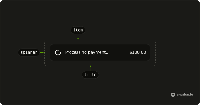
Anatomy
Usage
<div className="flex w-full max-w-md flex-col gap-4">
  <InputGroup className="bg-background">
    <InputGroupInput
      aria-label="Message"
      disabled
      placeholder="Send a message..."
      type="text"
    />
    <InputGroupAddon align="inline-end">
      <Spinner />
    </InputGroupAddon>
  </InputGroup>
  <InputGroup className="bg-background">
    <InputGroupTextarea
      aria-label="Message"
      disabled
      placeholder="Send a message..."
    />
    <InputGroupAddon align="block-end">
      <Spinner /> Validating...
      <InputGroupButton
        aria-label="Send"
        className="ms-auto"
        size="icon-xs"
        variant="default"
      >
        <ArrowUpIcon aria-hidden="true" />
      </InputGroupButton>
    </InputGroupAddon>
  </InputGroup>
</div>
FAQ
Why are the field and the textarea disabled?
Both set disabled, and both have aria-label Message. The one-line field is an InputGroupInput with type text. The other is an InputGroupTextarea. The placeholder on each is "Send a message...".
Where is the spinner on the one-line field?
In an InputGroupAddon with align set to inline-end, after the input. The addon's only child is a Spinner at the default size.
What is in the textarea's addon?
An InputGroupAddon with align set to block-end. Inside it: a Spinner, the text "Validating...", and an InputGroupButton. className ms-auto on that button pushes it to the end of the row.
What is the send button?
An InputGroupButton with aria-label Send, size icon-xs, and variant default. The icon is ArrowUpIcon with aria-hidden. The button has no click handler in this file.
API Reference
Input Group
Sets aria-label="Message", disabled, placeholder="Send a message...", type="text", align="inline-end" and align="block-end". The rest is on the Input Group page.
Spinner
No extra props in this demo. The rest is on the Spinner page.