shadcn.io is an independent project built on shadcn/ui
The trail reads Home, then a select, then Breadcrumb as the current page. The select lists Documentation, Components, and Themes, and it starts on Components. Choosing one does not change the page.
Use it for sibling sections at the same depth, such as a workspace or a version. Navigate yourself when the value should change the URL. Links that are not a single value fit a Dropdown Menu. In Svelte, Ark UI does not route from the select.
Installation
Anatomy
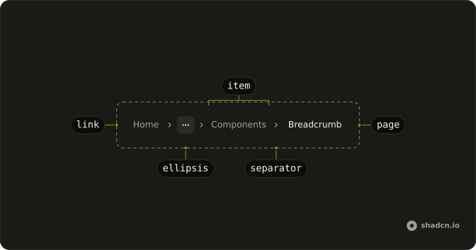
Usage
<Breadcrumb><BreadcrumbList><BreadcrumbItem><BreadcrumbLink>{#snippet asChild(props)}<a {...props({ href: "/" })}>Home</a>{/snippet}</BreadcrumbLink></BreadcrumbItem><BreadcrumbSeparator /><BreadcrumbItem><Select collection={collection} defaultValue={["components"]}><SelectTrigger aria-label="Section" class="w-auto" size="sm"><SelectValue /></SelectTrigger><SelectContent><SelectGroup>{#each collection.items as item (item.value)}<SelectItem item={item}>{item.label}</SelectItem>{/each}</SelectGroup></SelectContent></Select></BreadcrumbItem><BreadcrumbSeparator /><BreadcrumbItem><BreadcrumbPage>Breadcrumb</BreadcrumbPage></BreadcrumbItem></BreadcrumbList></Breadcrumb>FAQ
How does the select start on Components?
The options come from createListCollection, passed as collection, and defaultValue is ["components"]: the value is an array.
How does the select fit in the line?
SelectTrigger takes size="sm", and the trigger is only as wide as its value, so it sits in the trail like a crumb.
How is the select named?
It has no visible label, so it carries aria-label="Section" and is announced as the Section select with its value.
Does picking an option change the page?
Not in the demo: the select is uncontrolled and nothing listens.
Read details.value in onValueChange and navigate there.
API Reference
Breadcrumb
No extra props in this demo. The rest is on the Breadcrumb page.
Select
Sets collection={collection}, defaultValue={["components"]}, aria-label="Section", size="sm" and item={item}. The rest is on the Select page.