shadcn.io is an independent project built on shadcn/ui
Same border as a plain outline button, with a mail icon in front of the text. The icon is decorative.
Use it for a secondary action people repeat, next to a stronger button. If this is the only action in the row, the filled Button carries more weight. In Svelte, Ark UI keeps a hidden icon from being announced.
Installation
Anatomy
Usage
<Button variant="outline"><MailIcon aria-hidden="true" data-icon="inline-start" />Button</Button>FAQ
Why is the icon before the label?
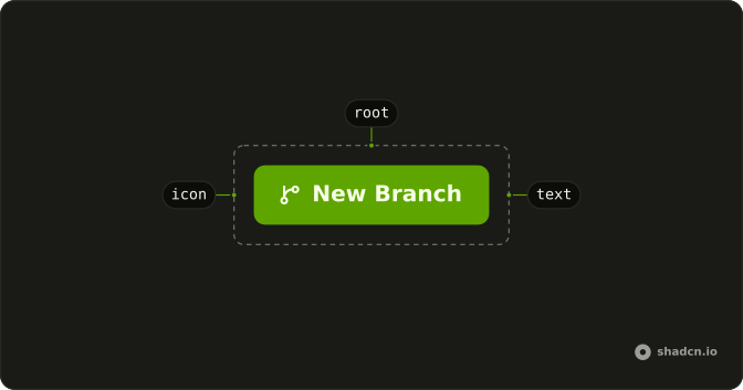
This outline button leads with MailIcon and data-icon="inline-start". The attribute sets the icon padding, and the icon moves to the other side in a right-to-left layout. variant="outline" keeps the border. The icon uses the label's color.
How do I use a different icon?
Swap the component. MailIcon is a placeholder from lucide-react. Keep data-icon="inline-start" and aria-hidden="true" when the label already says what the button does.
Will a screen reader announce the icon?
No. aria-hidden="true" takes it out, and the label is the accessible name. Drop the label only if you add an aria-label on the button. An icon with no name is an unlabeled control.
How big is the icon?
You don't pass a numeric size. The button styles an svg that has no size-* class, and these demos leave that alone. Add className="size-4" on the icon only when you need to override it.
API Reference
Button
Sets variant="outline". The rest is on the Button page.