shadcn.io is an independent project built on shadcn/ui
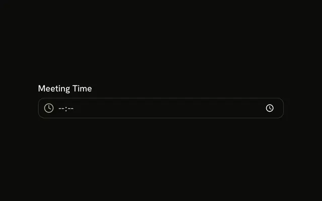
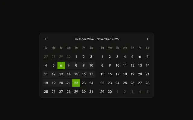
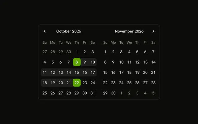
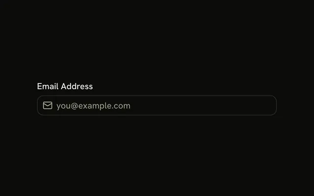
A Date of Birth label and a calendar icon inside a date field. The browser supplies the picker. No date is selected.
Use it for one date, such as a birthday, when the native control is enough. Ranges and disabled days belong on a Date Picker. In Svelte, Ark UI does not draw that calendar.
Installation
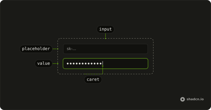
Anatomy
Usage
<Field class="w-full max-w-sm"><FieldLabel>Date of Birth</FieldLabel><InputGroup class="bg-background"><InputGroupInput type="date" /><InputGroupAddon><CalendarIcon aria-hidden="true" /></InputGroupAddon></InputGroup></Field>FAQ
What does type date give this field?
The browser's date control: day, month and year segments in the visitor's locale order, and a calendar picker on most browsers. The value is always YYYY-MM-DD, such as 1990-05-21, whatever the display.
How is the icon placed inside the field?
The field is an InputGroup: InputGroupInput is the input and InputGroupAddon holds CalendarIcon. The addon comes after the input in the markup and sits at the inline start, so it is on the left in left-to-right text and on the right in right-to-left text. Clicking it focuses the input.
Is the icon read by screen readers?
No. CalendarIcon has aria-hidden, because the Date of Birth label already names the field. The icon is a visual hint only.
How is Date of Birth tied to the field?
Clicking the label focuses the field, and screen readers announce it with the field.
Field links FieldLabel to the input inside it, so there is no id to match.
API Reference
Field
No extra props in this demo. The rest is on the Field page.
Input Group
Sets type="date". The rest is on the Input Group page.