shadcn.io is an independent project built on shadcn/ui
The button shows a calendar icon and reads 3 dates selected. The 4th, the 15th and the 24th of this month start selected.
Use several separate days for blackout dates, not a continuous stay. A Calendar fits when the days are only shown, not stored in a field. On Svelte, Ark UI does not count the days onto the button.
Installation
Anatomy
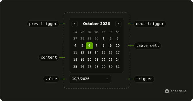
Usage
<DatePicker closeOnSelect={false} defaultFocusedValue={initialDates[0]} onValueChange={handleValueChange} positioning={positioning} selectionMode="multiple" value={value}><DatePickerTrigger>{#snippet asChild(props)}<Button {...props({ class: "w-70 justify-start font-normal" })} variant="outline"><CalendarIcon aria-hidden="true" data-icon="inline-start" /><span>{label}</span></Button>{/snippet}</DatePickerTrigger><DatePickerContent><CalendarViewControl><CalendarPrevTrigger /><CalendarViewDate /><CalendarNextTrigger /></CalendarViewControl><CalendarTable><CalendarWeekDays /><CalendarTableDays /></CalendarTable></DatePickerContent></DatePicker>FAQ
How does multiple selection work?
selectionMode="multiple" on DatePicker. Clicking a day toggles it in the value, which is a list of dates in the order they were picked.
Why doesn't the picker close after a click?
closeOnSelect is false, so you can pick several days in one go. Escape, a click outside or the button close it.
What does the button say?
1 date selected, 3 dates selected and so on, or Pick dates when none are selected. Show the dates themselves under the picker if people need to check them.
Can I cap how many days are picked?
Yes. In the value change handler, ignore the new value when it's longer than your limit, and say so near the picker.
API Reference
Date Picker
Sets closeOnSelect={false}, defaultFocusedValue={initialDates[0]}, onValueChange={handleValueChange}, positioning={positioning}, selectionMode="multiple" and value={value}. The rest is on the Date Picker page.
Button
Sets props, w-70, justify-start, font-normal and variant="outline". The rest is on the Button page.
Calendar
No extra props in this demo. The rest is on the Calendar page.